Tuesday, August 31, 2021

Newest Acquisitions (Virtual "Show & Tell") ~ part 248

As promised, here's the other new Delta fountain pen recently acquired by Jerred!

(all photos courtesy of Jerred ~ please click on images to enlarge)


Jerred: "This lovely pen is a Delta 'Smorfia'. This particular model was called the 'Lucky' in North American markets, but that's not a perfect translation of the original Italian name. 'Smorfia' is a system of dream interpretation, where numbers are assigned to elements or parts of a dream to generate 'lucky numbers' that could be used in the lottery or for other purposes. An interesting idea to base a pen around to be sure, and perfectly in line with what I would expect from a company like Delta. 

 The pen here is in black, though it also came in red and Delta's terracotta orange acrylic, called the 'Dolcevita Lucky'. There was a second, slightly downmarket version of this pen that came in other finishes, but they are difficult to find information on."


"One of the more interesting design features is the clip. Contained in the clip is a small, screw-out chili pepper charm that's meant to protect the owner from the 'evil eye' which is a curse cast by an evil or scornful glaze. Again, fits pretty well with the overall theme."


"This pen also has a carved, sterling silver cap ring that was a common feature on Delta's mid-to-high range pens:"


"This pen comes with a 14k gold, #5.5 nib. As was often the case with Delta pens, it's a lovely writer:"


Back in May, we shone a spotlight on another Delta fountain pen with a quirky design (a sort of cousin to the Delta 'Smorfia") - Jerred's lovely Delta 'WE Aromatherapy' pen; that blog post can be found here. Our thanks to Jerred for sharing his photos and research on these interesting pens with all of us!

Sunday, August 29, 2021

Newest Acquisitions (Virtual "Show & Tell") ~ part 247

It was a pleasure to hear that Jerred had recently added to his wonderful collection of Delta pens. One of his newest additions is this beautiful sterling silver Delta fountain pen below:

(all photos courtesy of Jerred ~ please click on images to enlarge)

Jerred: "This is an interesting fountain pen from Delta, an un-released prototype of the 'Profili'. The Profili is an 8 sided, faceted, medium sized pen with a screw cap that came in both resin and solid sterling silver models. There were a couple of different variations of this pen, one of which I've shown before.

This particular pen, however, is different. As mentioned, this is an unreleased prototype of the original Profili design. The seller from whom I bought the pen stated that it was likely not released in this design due to its similarity to another Italian made pen, the Montegrappa 'Symphony'. This prototype does share a number of design similarities with the retailed pen, including an 8 sided, faceted design, resin finial, grip, cap band and end cap, guilloche etching on alternating facets, a #5.5 sized nib, and a slightly hour-glass shaped grip. The big difference between the two models is the cap; While the cap of the retail pen has an extended and conical finial as well as a standard ball clip, this prototype has a flat finial and a clip with a rolling wheel instead." (*see image below*)

"I'll be honest and say I actually like the looks of the prototype better, as I think the flatter finial makes the pen look a bit more balanced on the whole. Both are lovely pens, though, and I'm glad I have both."

"The nib is Delta's standard #5.5 nib in stainless steel, and it's a lovely writer."

(Side note: We posted Jerred's full review of that Delta 'Profili' model with the red cap finial here back in November 2020).

We'll be featuring Jerred's other new Delta fountain pen on Tuesday, so keep your eyes peeled! Many thanks to Jerred for sharing these beautiful fountain pens with us :)

Friday, August 27, 2021

Newest Acquisitions (Virtual "Show & Tell") ~ part 246

Today we're featuring a vintage Sheaffer desk set Stuart acquired a few weeks ago--a handsome brown and butterscotch-coloured desk base with a matching brown desk pen:

(all photos courtesy of Stuart ~ please click on images to enlarge)


Stuart: "The desk-set looks rather nice on the top of my old desk, doesn’t it? :)"

Stuart initially thought the desk base was made of Bakelite (apparently, there are a variety of ways to identify it), but after finding an old Sheaffer catalog with his desk set in it, he sent an update, saying: "I don’t think it is Bakelite after all - that 1941 Sheaffer catalog distinguishes between plastic and Bakelite in the descriptions, and that one’s given as plastic. Anyway it’s a cool set!"

Here's the catalog information Stuart found:

Stuart's desk set in the 1941 Sheaffer catalog:
(scan courtesy of the Pen Collectors of America - link to catalog )


The desk set is on page 17 of that catalog and its description is: "G355 ABJOM, Brown and Cream Plastic. 3½ x 5 inches. Gold trim. With No. 5 Brown Pen. $7.50".

Love that butterscotch & brown colour combo--it reminds me of a Reese's' Peanut Butter Cup :) Our thanks, as always, to Stuart for sharing his latest vintage "goodies" with us! 

Wednesday, August 25, 2021

Newest Acquisitions (Virtual "Show & Tell") ~ part 245

A few days ago, VPC member Christopher sent me a photo and a great write-up for our pen club's blog about a new acquisition (in his words: "...an addition which I am quite pleased with and using this week in my pen round up" ) -- his vintage Parker '21 Deluxe' fountain pen:

(photo courtesy of Christopher ~ please click on image to enlarge)


Christopher writes:

"As much as I have been drawn to the Parker 51 over the years, I do remember fellow students at my prep school using the Parker 21, a pen that seemed to appear in the classroom after Christmas or birthdays. I also remember the 21 being sold at the Woodward pen counter, and even in the early 1950s and through to the mid 1960s at Birks. But I think in more current times it is a pen which has been somewhat discounted and a bit ignored by collectors in favor of the Parker 51. Still, I truly believe that the Parker 21 is worth looking at and, as a fine quality pen, considered. Plus and regarding the 21, the different models seem almost limitless. It is with that attitude that I very quickly moved this Parker 21 Deluxe into my vintage pen collection and, may I add, without hesitation

First off, there is the lovely almost forest green barrel colour and the fact that, in following the 51, this pen has the Parker dependable and easy-to-use Aerometric filler... a pen filler that Kenneth Parker, son of George Parker the company’s founder, had a hand in developing. The Parker Aerometric filler was designed to offset the pen leaking when airborne. And better still, on each and every Parker Aerometric steel filler sleeve are the filling instructions, plain and simple. Then, moving on up the pen to its business end, there is a metal clutch to hold the cap on the barrel without threads and, above that, the famous Parker hooded section. Underneath this hooded grip is a collector, which was designed to keep the feed and nib always ready with enough ink to write immediately on use. The feed is tiny, but sure does the job and, better still, a very special Parker designed 8 alloy Parker nib that was years in the making. The capability of this nib to applying ink to paper is equally impressive. 

But I have saved the best for last, because the Parker 21 Deluxe cap is, in its own right, both beautiful and unique. The main part of this cap is steel but equipped with fine raised vertical lines making the finish almost look brushed. Imprinted at the bottom over these raised lines is the company branding along with the country of origin and, below that, a plain steel banding. Moving on up to the top of the cap, there is another thinner steel band, separating the main body of the cap from the domed 14K gold filled clip screw. The clip in this case also reflects the 21 Mark II model and is referred to as the Parker 21 ‘Ridged’ clip, finished in 14K gold filled to match the cap screw. When you put all this great stuff together you have the Parker 21 Deluxe Mark II in all its glory."

Many thanks to Christopher for sharing his new find with us, and shining a spotlight on an underrated vintage Parker fountain pen model!

Tuesday, August 24, 2021

Happy 35th anniversary, Charals!

(photo courtesy of Charals' official Instagram)

This month, Charals is celebrating their 35th anniversary and to mark the occasion, they're having an anniversary sale!

The store carries a wide variety of writing instruments, inks, stationery and gift items, and selected items are on sale for the entire month of August, both in-store and at their online store (Charals.com). They offer free shipping within Canada on online orders over $99 CAD pre-tax (*free shipping not available in territories*) so if you can't visit the store in person, you can always shop from the comfort of your home.

Their beautiful store is located at 171 Robson Street in downtown Vancouver, and is open six days a week for your shopping convenience. Store hours are: Mon-Fri: 10am – 5:30 pm; Saturday 10am – 5pm; Closed on Sundays & all public holidays.

Congratulations to Charals' owners Al and Shelina on reaching this milestone, and best wishes for many more successful years!

Monday, August 23, 2021

Newest Acquisitions (Virtual "Show & Tell") ~ part 244

"Back to School" Pens ~ Part 2

Today's featured school pens are a couple of very inexpensive fountain pens I recently acquired--the Jinhao '993' model, commonly referred to as the Jinhao 'Shark"...

(please click on images to enlarge) 

I first saw one of these pens back in September 2017, when VPCer Mindy brought hers to our pen club meeting, The second time was at our April 2019 meeting when Candice and Dana both brought in their Jinhao 'Shark' pens for our topic "Fountain Pens with Animal Themes". I love sharks but I thought the cap design was a bit goofy, so it kind of put me off buying one for myself...

Fast-forward to July 2021, when I got an email from Goulet Pens advertising the pens during "Shark Week" (nice tie-in!) and finally decided to buy one. I didn't have anything else to buy from the Goulets at the time (and I didn't want to spend a lot of money on shipping), so I bought my "Shark" pens from Chinese seller 'jewelrymathematics' on eBay. I actually ordered two---the light blue one shown above, and its jet black counterpart in the photos below. Total cost including shipping for the two pens was just $7.90 USD. The pens arrived safe and sound, carefully packed but without a Jinhao box (not surprising, given their low cost!).

(If you've ever seen a Pilot 'Penmanship' or Pilot 'Plumix' fountain pen, you'll be instantly reminded of those two models when you see the Jinhao '993' :)

Like the Pilot pens, the Jinhaos are entirely made of resin--except for their nibs, of course--so they're very light (weight of each Jinhao = 11 grams). The capped length of the Jinhaos is 15.4 cm/6.1 inches. The posted length of the turquoise one is actually the same as its capped length, but th
e black pen is slightly longer when posted because its nib is a tiny bit longer (it has an open nib vs. the turquoise's hooded nib). At ~4.9 inches uncapped, however, both fountain pens can be used comfortably without their caps on...unless you prefer a longer pen, of course. 

The pens post very securely, and their caps (being made of a light plastic) don't add much weight to the barrel ends. The end result is two light, well-balanced writing instruments that can be used posted or unposted.

I switched the sections on the pens (photo directly above) just to see how they'd look. Turns out I prefer the sections to match the pen bodies ... which shouldn't have been a shock as I've always liked pens with matching sections! The two sections are perfectly interchangeable with each other, though, so if you want to swap them around, it's easy to do. The fountain pens come in a wide variety of colours (currently twelve colours, I believe), with clear sections that match the colour of the cap and barrel.

Unlike the sandpaper-y texture of a real shark's skin, the Jinhao "Shark" fountain pen is very smooth and feels nice to the touch. The sections are triangular and really comfortable to hold, and paired with the pens' light weight, make them ideal for long writing sessions.

When I looked on eBay, I noticed that the pen was available with two different types of stainless steel nibs---a hooded nib and an open nib---so I chose one of each. Both the hooded nib and the Jinhao-branded open nib (marked F) wrote well. The F (Fine) open nib did write more like a Western XF (Extra Fine), though, but I expected that. The open nib can be pulled out easily from the section (it's friction-fitted) and replaced with another nib of the same size, if you so choose (the same nib can be found on the Jinhao '992'). I haven't tried to remove the hooded nib on my turquoise pen because I don't want to damage the pen, and I really like the way it writes (it's /very/ smooth).

The pens take short international cartridges or standard converters (both of mine came with Jinhao converters), but can also be converted to eyedropper fillers.
A word of warning regarding using them as eyedropper-fillers : Take care when unscrewing the cap that you don't accidentally unscrew the barrel. It's a very easy (and very messy) mistake to make!


My new Jinhao with my new Laurige zippered pen pouch in black leather that I bought from Amazon.ca's Warehouse recently for $10.76 CAD (more than 50% off because it was listed as "Used - Very Good" condtion). The pouch measures 6.75 x 1.5 x 1.375 inches, and can hold the two Jinhaos and a Lamy Safari fountain pen comfortably inside when zippered. I couldn't find any damage to the leather pouch at all, so I think I got a great deal :)

"He ain't heavy, he's my brother (or a distant marine cousin)???"


The only indication that this pen was made by Jinhao is the Jinhao name and chariot logo tastefully embossed on the underside of the cap (not shown in photo above). The cap has a simple rendering of a shark's head (complete with gills) and its streamlined shape nicely complements the sleekness of the barrel. The dorsal fin on the cap also doubles as a roll stop to prevent the pen from rolling off a desk. Although I was put off by it years ago, I now think the cap is a fun, playful design (the cap design actually looks a bit more subtle in real life than it does in my photos).

All in all, I think the Jinhao '993' "Shark" fountain pen would make a nice, inexpensive gift for a young shark fan (or his/her adult counterpart)... or a younger student looking for a cheap fountain pen. It's light, easy to carry, reliable...and it's definitely a conversation starter!

Interested in learning a bit more about these graceful endangered species? Here are 7 fascinating facts about sharks - link to World Wildlife Fund page

~ Review & photos by Maja ~

Saturday, August 21, 2021

Newest Acquisitions (Virtual "Show & Tell") ~ part 243

From one nice vintage Sheaffer desk set of Stuart's to another...

(all photos courtesy of Stuart ~ please click on images to enlarge)

Stuart: "Here's some pics of my new baby! It’s from Madison Fine Pens, and this time they packed it properly so it arrived safe and sound, unlike the one I got from them last year that had its holder broken in transit. This one is green onyx mounted on a brass base, 5 inches long by 3 1/2 wide, and surprisingly heavy for the size." 

"The glue holding the narrower, front piece of onyx has worn out and the stone is loose, but as long as the base is just sitting on my desk it’s fine. I don’t think Madison caused this - I assume the glue was pretty well gone when they packed the set, and jostling in transit loosened it altogether. It’s not broken, just loose."

"Otherwise the stone is in great shape, no chipped corners or anything. Going by the design of the holder, and the colour of the pen, I’d guess it’s 1934-35 or thereabouts."

"It’s hard to be certain, as the pen has ambered quite a bit, but I think it’s the Marine Green marbled celluloid, used from 1930 to 1935. It might be the cream and black version, but I think it’s green, just darkened a lot over time. The sac is good, whether original or a replacement, and the nib is lovely, either a generous Fine or possibly Medium-Fine. Smooth and a joy to write with!"

A day or two after he sent in the photos and write-up above, Stuart sent me this:

He writes: "A quick shot of the new desk-pen catching the light coming in through the window blinds!  I believe more than ever that it’s the Marine Green.  A beautiful effect."

It is a beautiful effect! Many thanks to Stuart for sharing this lovely desk set with us :)

Thursday, August 19, 2021

Newest Acquisitions (Virtual "Show & Tell") ~ part 242

We'll be featuring more school pens starting next Monday, but in the meantime, here is one of Stuart's newest acquisitions - another lovely vintage Sheaffer desk set!

(all photos courtesy of Stuart ~ please click on images to enlarge)

Stuart: "Intelcom delivered this prize this morning, from Canyon, Texas. On p. 66 of the 1930 Sheaffer catalog, it’s desk base S-16. The design is photo plated - I’m not sure what that is, but it might be an old term for photo-etching. The base was $10.00 without a pen. The pen it came with is lying in the pen-rest groove in the first shot - it’s in great shape, but, as usual needs a sac." 


"In the second shot is the pen I’m using in it for now, which came with a set from Pendemonium."


"The third shot is a closer view of the design, which is so beautiful. A hunting scene, so this was for the gentlemen hunter with thoroughbred hunting dogs! The stand is larger than it looks, 7 inches long by 5 1/2 inches across, and an inch high, solid glass, so it weighs like lead!

Needless to say I’m delighted with this one. I’d seen a few others on eBay but this one was much lower in price, so I decided to grab it. It’s not common. Patience pays off, if you keep hunting - appropriate word!"

Congratulations on another great desk set, Stuart -- it's a real beauty!

Tuesday, August 17, 2021

Newest Acquisitions (Virtual "Show & Tell") ~ part 241

"Back to School" Pens ~ Part 1

I was at my local Walmart this past weekend and saw a lot of back-to-school supplies on display. There were no fountain pens among them, but it inspired me to make this post, which features a Schneider 'Voice' fountain pen I bought three months ago from The Online Pen Company  for just £4.36 ($7.80 CAD, at the time of purchase).

(please click on images to enlarge)

The 'Voice' is a German-made pen created by a company that has a long history of making affordable writing instruments for all ages. This particular model was marketed towards students, but it can be held comfortably and used by adults who are looking for an inexpensive, reliable, knockaround fountain pen to carry around.

A few months ago, I saw a very similar Schneider model called the Schneider 'Easy' that VPCer Ben R. owned (it was a gift from his mother, purchased overseas). I'd originally intended to buy exactly the same pen as Ben's, but when I spotted my orange 'Voice' fountain pen, I wound up choosing it because I loved the colour and graphics; mine has a cool "connect-the-dots" pattern on its barrel, but the pen is available in other colours and patterns.

My 'Voice' pen also reminded me of another Schneider fountain pen model, the more-expensive 'Ceod Classic' that I blogged about here last year. That pen was a smooth writer, so I decided to take a chance on the 'Voice' and added it to my online order. It arrived safe and sound from the U.K, along with the other two items I ordered at the same time. The shipping was very reasonable and The Online Pen Company's customer service was excellent--highly recommended!

The Schneider 'Voice' is a very light plastic fountain pen, which makes it good for long writing sessions such as note-taking during classes or long meetings. The capped length of the pen is about 15 cm/5.9 inches; uncapped, it's around 13.5 cm/5.3 inches. The weight of the capped pen is 15 grams with no cartridge/converter in place, and uncapped it comes in at 9 grams empty.

The posted length (as shown above) is 17 cm if you push the cap in as far as possible. That's a whopping 6.7 inches posted, but since the pen so light, it's still well-balanced and comfortable to use when posted.

The pen uses short and long standard international ink cartridges, and can also take a standard international converter. My pen came with a Schneider-branded short cartridge filled with erasable Royal Blue ink (for which you need the Schneider "Corry" ink eraser/correction pen). The barrel is long enough to hold a spare short cartridge, which is very convenient for students.


The snap-on cap, like the barrel end of the pen, is slanted and suits the pen's modern, youthful design; the matching cap and barrel ends also create a nice symmetry. The clip is sturdy and yet quite flexible. With this degree of flexibility, though, comes the risk of accidental breakage during use; for this student model, Schneider wisely designed a clip with extra plastic at the pivot point (see above).

The molded ergonomic section is rubberized to enhance the user's grip on the pen, and is triangular in shape, to facilitate proper finger positioning. All in all, it's very comfortable to hold and use. On their website, Schenider states that it's "equally suitable for both left-handed and right-handed users".

The pen's steel nib has no nib width marked on it that I could see, but mine writes like a true Medium. The nib seems a bit too small for the pen (in my opinion) but is engraved with some cool geometric swirls. At first glance, it looks exactly like the nib on the Schneider 'Ceod Classic' I mentioned earlier in this post....

 ...but where is its tipping material??!?

Answer:  It has no tipping!

Unlike the 'Ceod Classic', the 'Voice's nib has no tipping material because it has a "butterfly nib", a nib with a writing surface that was created by folding the tines inwards. These types of nibs were used in cheap vintage fountain pens, but I've seen them on some other modern pens, too (including the Schneider 'Easy'). My pen's untipped steel nib actually writes quite smoothly, but your mileage may vary, as the saying goes. If your nib is a bit scratchy, you could try aligning the tines gently (and carefully) with your fingernail, but exercise caution so you don't damage the tines.

In summary, if you're looking for a light, inexpensive, reliable plastic fountain pen that you can take to school or use in other settings, you might want to consider the Schneider 'Voice'. It's also a handy pen to have around the house; I often find myself grabbing it to make quick notes because it doesn't dry up between uses. If you like the look of the pen, but don't want a fountain pen, it also comes in rollerball form.

~ Review & photos by Maja ~


P.S. One last photo (I used a filter on this one) - my fountain pen laying on a Hilroy exercise book.
This beloved brand was founded in Toronto by Roy Corson Hill and celebrated its 100th anniversary in 2018. I have fond memories of using Hilroy exercise books in elementary school, so I was pleased to see that (a) they're still around, (b) they look very similar to the ones from my childhood (although the Canadian map on the front has been updated with the addition of Nunavut), and (c) they're still being made right here in Canada! Hilroys are considered
the industry standard for exercise books, they've been used by countless schoolchildren over the last century and are a true Canadian classic :)

Best of luck to all students, educators and their support staff in the new school year!
~Maja 

Sunday, August 15, 2021

Newest Acquisitions (Virtual "Show & Tell") ~ part 240

Continuing on with more of Christopher's recently-acquired vintage treasures (which, interestingly, all feature different filling mechanisms--syringe-filling, Touchdown-filling and Vacumatic)...

(all photos courtesy of Christopher ~ please click on images to enlarge)

Christopher: "Over the years, I have had a good number of syringe filler pens and just as many from the late 1930s. But, for some reason, they are challenging to service. So to get one in almost mint working condition was truly a good score. The Federal 1283 is an early war period pen which could have possibly been a sub brand of the Travelers Pen company. The clear plastic barrel is often amber yellow and the syringe rod jet black, as is the grip section. Although the nib is gold plated, I found this pen to be an excellent writer and the mottled greyed blue and pearl finish on the long blind cap and cap is really something to write home about. To finish, the cap has a long steel Federal branded clip and matching steel cap band. OK, maybe a third-tier pen, but a pen well worth considering."

"Since I seem to be more taken with the Sterling these days, I should report picking up a fine Sheaffer Sterling banded, crisscross overall barrel and cap etched design fountain and it was once again a must have. This pen is a Sheaffer Touchdown with a beautiful inlaid 14K gold nib. The section is black and the clip, with a white dot Sheaffer warranty appointment, is 14K gold filled. The model is definitely from the Sheaffer Imperial line and its Touchdown filler is in perfect working condition. Although this pen dates Circa 1969, thinking back I vividly remember visiting the Woodard’s pen counter with my Mum in 1959 at the newly opened Oakridge shopping Mall where we selected and purchased a super Sheaffer Imperial fountain pen in a rich Burgundy finish for her - a pen I have in my own collection to this day."

"It is always nice as a vintage pen collector to pick up a pen that is not only attractive in its finish but functional in its design. Considering the Parker 51 was the workhorse of its entire original existence and the pen of choice for so many, it is wonderful to come across an early example in such a lovely colour as Parker’s ‘Dove Grey’. The exquisite cap is complemented with an empire sterling silver banding and finished with a solid 14K gold blue diamond warranty appointed Parker arrow clip. The hooded nib is also solid 14K gold and being an early example, this 51 has a Vacumatic filler. The condition is outstanding and in inking this pen I was very surprised and pleased to find that it was in good working condition. This Parker 51 hails from 1943 but a few years from the Parker 51’s introduction." 

Many thanks to Christopher, as always, for contributing to our online "show & tell" with his latest cool vintage finds!

Friday, August 13, 2021

Newest Acquisitions (Virtual "Show & Tell") ~ part 239

From vacation-inspired pens to birthday pens! Today's blog post features some lovely writing instruments that longtime VPC member Christopher recently received for his special day...

(all photos courtesy of Christopher ~ please click on images to enlarge)


Christopher: "Admittedly, for years I avoided retaining every Wearever pen, something I felt (from past and more current advice) was sensible. Turning the clock back to the 1950s, Wearever pens were commonplace in most retail outlets. Cheap and often found to leak, they were not pens which I remember with any sort of fondness. More currently, in chatting with other collectors, I was warned that investing in a Wearever pen was not something done with any hope of future value. Still, and suddenly in the now, Wearever pens started to be both popular and sought after. The truth of the matter was that Wearever made so many different models over the years that some were actually real eyecatchers. In turn, at the end of the 1930s, Mr. David Kahn the founder and commander-in-chief of the Wearever company, made a firm decision to formally go after the upper-end pen market. Starting during the war in 1940, in support of this interest to capture the quality pen market, he developed a small number of models which were simply amazing. The best of them at that time was the Pacemaker.

Kahn was a known copier and in this case he selected the Parker Duofold button filler with its brilliant vertical lined Laidtone finish. Although soon to become the Parker Duovac with a Vacumatic filler, Kahn stuck with the simple, less complex, and reliable Parker style button filler for his Pacemaker. To this, he added a high quality Button filler pressure bar and topped it off with a clear ruby red plastic button, over Parker’s plain Jane brass one. The clip was much more similar to the Parker Duofold’s and straight tapered, plus--just to be on the safe side-- all the fittings on his Pacemaker were 14K Gold filled. But where I see a sheer stroke of economy was in the Pacemaker’s blind cap. Kahn’s company, with the war effort, was making the tire valve caps for the US Military jeeps and he simply used a barrel end thread that would accommodate these valve caps as blind caps for the Pacemaker. The molds were already standing so the cost saving was impressive.

With all this in mind, it was not hard for me to just have to have a really good Wearever Pacemaker set for my collection. Thankfully, a perfect example surfaced, finished in the emerald and pearl with jet vertical lines and coming to me in the most brilliant clear plastic display box (Wearever imprinted on the lid). Needless to say, I was delighted to find a set as such seemingly old store stock with the pen in very fine unused condition. And when inked, a terrific writer with its solid 14K gold nib coming out in front. And yes, this is one of only three Wearever pens to sport a real 14K sold gold nib. Of course, it made it even more special to get this set as a birthday gift from my wife, Chris."


"One vintage point which had not found its way into my collection was the Targa by Sheaffer. And I guess part of the reason was I just never seemed to find one which I really liked. There was something about the clip which needed to be matched with a finish that I felt complimented the clip design. Well, wouldn’t you know it, as soon as l laid eyes on the Targa 1000 in brilliant mirror steel with a matching polished steel nib, I was sold. This pen set as shown ended up as a birthday gift from my daughter, Claire and son-in-law Jamie and could not be more welcome in my collection."


"Years ago, Mark Harcourt called me over to see a big pen collection he had just acquired. What impressed me right off the bat, was the good number of Parker pens involved, along with a large original Parker display case. I ended up with a Parker ‘First Year’ Jotter prototype, but there was a small number of another Parker pen I had never seen before. As it turned out, it was the Parker 41. In the years that followed, from time to time I would think back to those 41s, but other pens seemed a lot more important. Besides, I was busy building a Parker Vacumatic collection and that really was on the forefront. But in checking back more currently, I was amazed to see that the prices on the Parker 41 had skyrocketed since that day at Mark’s. Needless to say, it was imperative that I check that Parker 41 box in my vintage pen collection and it was none other than my good friend Rene from our pen club who came to my aid.


I was really blown out of the water with a lovely, very fine condition Turquoise 41 as his birthday gift. I can say nothing but good things about this pen, which I now have in hand. Equipped with the same terrific special Parker 8-metal alloy nib, which may I add writes as smooth as glass, the pen feels every bit as comfortable as any of my Parker 51s. Equipped with an Aerometric filler in good working condition, I keep turning back to the brilliant finish, which is hard to miss. The cap is brushed steel and sports a Parker arrow feather clip, held in place with a jet black cap jewel. This pen is a real winner in my books and many thanks Rene." 

Happy belated birthday, Christopher, and many thanks for sharing these thoughtful gifts with us! 

Wednesday, August 11, 2021

Newest Acquisitions (Virtual "Show & Tell") ~ part 238

 "Vacation Dreams" Pens ~ Part 3

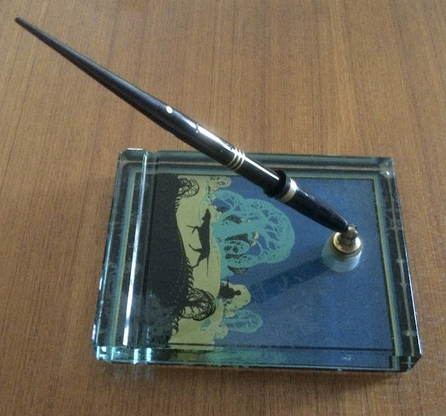
Today's featured "vacation-inspired" pen purchase is my beautiful new Russian-made Benu 'Euphora' fountain pen!. The material it's made of is named after a famous island (actually a small island group) in the South Pacific that's featured in the book below...

(please click on images to enlarge)

Here's a photo of it in the book above. It's part of French Polynesia and about 275 km northwest of Tahiti.....Can you guess what it is?

Yes, it's Bora Bora, "the world's most beautiful island", according to the author of "1,000 Places to See Before You Die"!

Benu take a great deal of pride in making their own resins for their writing instruments. The material they created for the "Bora Bora" is stunning, and my photos really don't do it justice. The resin they created for this pen beautifully captures the turquoise-blue of the crystal-clear water surrounding this small island group. The silvery flakes embedded in the resin mimic the glittering white sands of Bora Bora's beaches, and the gold flakes its golden sunsets.

My new Benu fountain pen & its box resting on a colourful beach blanket....

I saw the pen for sale on Buchan's Kerrisdale Stationery website and picked it up at the store the next day. It looked gorgeous in online photos, but I know how some pens look better in photos, so I was extremely happy to discover that it looked as beautiful in real life.

I bought a Benu 'Briolette' a few weeks ago (and wrote about it here) and I love using it, but I wanted a larger fountain pen, or one that was well-balanced when posted (the 'Briolette' cannot be posted due to its complex faceted design). At ~13.5 cm unposted (from nib tip to barrel end), the 'Euphoria' is the perfect size for my hands. At ~18cm posted, it's very long, but well-balanced and, given its lighter weight, could be used that way.

Specs for the 'Euphoria' fountain pen: (from BenuPen.com):

Material: high quality resin
Clip material: stainless steel
Length Capped: 14.9 cm / 5.86 inches
Weight: 26 gr
Cap: Screw On, the cap can be posted
Nib: #6, Schmidt, stainless steel, available nib width - F,M,B
Refill: Standard large international size converter and ink cartridge (72 mm / 2.8 inches ).

The resin is a combination of dreamy shades of blue and blue-green and glittery silver and gold particles... and it all works so well together. Benu is known for combining resin with metallic flakes to create some stunning writing instruments, and I applaud their boldness in choosing these materials for their pens. Oh, and due to the manufacturing process, no two pens are alike!

The 'Euphoria' is a ten-sided pen, and its facets are very smooth to the touch, another example of Benu's fine craftsmanship. There is no cap finial or barrel end cap on the pen, and I think this was a wise design choice; the pen's material is so lovely and it encircles the pen, uninterruped...like the vast ocean surrounding Bora Bora's tiny islands. The wide black plastic cap band (stamped with the name 'BENU' in an Art Deco font) might turn some people off, but I don't mind it at all; it's a large pen, so it can handle a wider cap band. On other pens, a wide, black cap band might overshadow the rest of the pen, but not on this blingy number!

The nib on the 'Euphoria' is a stainless steel #6 Schmidt nib. Mine is a Medium, but they also come in Broad and Fine. It's a smooth writer---as expected---and I haven't had problems with it in the brief time I've owned it (less than a week).


My Benu 'Briolette' in "Luminous Amber" with my new Benu 'Euphoria'...

I love Benu's clipless pens so I wasn't sure if I wanted to get a version with a clip, but the 'Euphoria's clip doesn't protrude very much. In fact, the end of its clip is recessed, so it lies a bit more flat to the barrel. It's a nice design touch and shows how much care and attention Benu put into their writing instrument designs.

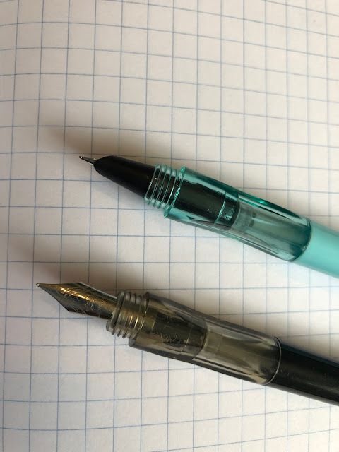
(As you can see, the 'Euphoria's' #6 size nib is much larger than the 'Briolette's' #5 nib)

Unlike my 'Briolette in "Luminous Amber", my particular 'Euphoria' model does not glow in the dark; some 'Euphoria' models (currently - the "Love Story", "Ocean Breeze" and "Scent of Irises" models) do. Benu's online store makes it easy for you to find which models glow in the dark, and which ones don't, so I'd highly suggest checking it when looking for these kind of pens. Love the designs but don't want a fountain pen? The same pens come in rollerball form!

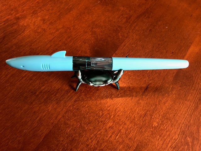
                                                   Mr. Crab says "Where's the beach??"


Playing around with the iPiccy hue editing feature in the two photos below....

Benu's description of the 'Euphoria' model is: "A collection of pens devoted to different sources of simple, hedonistic pleasures, such as favorite music, a beautiful scene, an exquisite cocktail, or a delicacy". Each pen is inspired by different things that bring us joy and add a great deal of color to our everyday lives." They currently have a 'Euphoria' "Vodka on the Rocks" model and the 'Euphoria' "Bourbon" model is coming soon... so why not a couple of pens named after some refreshing, colourful non-alcoholic drinks?

If this material actually existed, I'd call it "Orange Crush"...

...and this one would be "Grape Blast" :)

Thanks for reading this (long) review of my new Benu 'Euphoria' "Bora Bora" fountain pen. Many thanks to Buchan's (especially Yugo) for the pen and their excellent customer service. Even though I can't make it to Bora Bora itself this year, looking at and using its gorgeous namesake lifts my spirits. May your own fountain pens--whatever they look like---do the same for you!

~ Review & photos by Maja ~