Monday, January 31, 2022

Newest Acquisitions (Virtual "Show & Tell") ~ part 320

Speaking of nice pocket fountain pens....

Here's Stuart's new Kaweco 'Sport' in "Cyan" colour, along with three new Robert Oster "Muddy" inks, all recently purchased at the Vancouver Pen Shop in downtown Vancouver:

(all photos courtesy of Stuart ~ please click on images to enlarge)


Stuart says: "The inks are hard to capture, they look duller and less interesting than they do in person. I used the glass dip pen, which deepened the colour of Muddy Bucket, so it’s more brown and less yellowy than when used in an FP."

Love the colours of the inks....and that Cyan 'Sport' pen pairs beautifully with the Montblanc 'Maya' ink! Thank you, Stuart, for sharing your new purchases with us :)

Saturday, January 29, 2022

Newest Acquisitions (Virtual "Show & Tell") ~ part 319

Last month, a little package arrived, unexpectedly, in the mail. In it was a beautiful vintage Japanese long/short pocket pen. "What are long/short pocket pens?", you ask? Well, here's an excerpt from the blurb for "Japanese Pocket Pens" (written by nibmeister Richard Binder) that explains their background, and why they were referred to by that name:

"In the early 1960s, the space race and Hideo Shima’s radical new bullet train, perhaps leavened by the futuristic American automotive stylings of Harley Earl, spawned great changes in the Japanese aesthetic, and a new type of fountain pen burst onto the market. Called “pocket pens,” these pens appeared in myriad trim variations under dozens of manufacturers’ names. Their unifying characteristic was an extraordinarily long gripping section mated with a very stubby barrel, a design concept explored before and since by a number of Western manufacturers."

(please click on images to enlarge)

The first pocket fountain pen was the Sailor "Mini”, which came out in 1963. The Platinum and Pilot pen companies  followed suit in 1963 and 1964, respectively, with their own pocket pen models. My particular pocket pen (pictured) is a second generation Sailor "Mini" fountain pen. It measures about 11cm capped and 14cm when posted, and it weighs a mere 13 grams empty.


These 2nd generation "Mini" pens featured a new open, inlaid nib design (the 1st generation had a semi-hidden nib), sometimes referred to as a "fingernail" nib...

Models with all-metal caps, such as mine, were priced higher than ones with a metal cap and plastic crown...


The early Sailor 'Mini' pens had an unusual spring-less clip made of a strip of folded metal (see above). Apparently, this clip was a modification of a 1920s American patent held by the Chas. H. Ingersoll Dollar Pen Company (source: this excellent "Profile: Japanese Pocket Pens" article by Mr. Binder)

(Above: my pen's section with its manufacturing date code --the letters "EL"-- stamped on it)
The date code is directly below the Japanese characters (my apologies for the photo -- it's really tough to photograph :/

Over the years, Sailor used three different date code systems t
o indicate any given pen's manufacturing date. Some date marks were on the body of the pen, and some on the nib itself. From 1960 to 1970/1971, Sailor imprinted a two-letter code on their pen bodies. The year was represented by a single letter, with  "A" (upper/lowercase) standing for 1960, "B" for 1961, and so on until "K", which stood for 1970 (and possibly, "L" for 1971). The month was similarly represented by a single (upper/lowercase) letter, with the letters "A" through "L" representing the months January through to December. My particular pen (stamped "EL") was, therefore, made in December of 1964.

(info taken from "Japanese Date Coding Systems" article on Richard Binder's website)

The pen's beautiful gold nib features the Sailor logo + a symbol between the pen's two (vertical and horizontal) breather holes. The gold purity ("14K") is engraved below the horizontal breather hole. The pen isn't marked with the nib width, but it lays down what I'd call a "Western Fine" line. There is some flex to the nib, but I wouldn't call it a flexy nib per se. Due to the short length of the barrel, it only takes Sailor's proprietary cartridges (ie. not a Sailor converter).

(Above: the beautiful, 15-sided metal section ring and, above it, the Sailor logo, tastefully engraved at the end of the pen's cap)

A quick word about my pen's provenance:
 It was purchased (new) in Japan by a diplomat as a gift for his wife. Unfortunately, she didn't take a shine to it, but the pen remained with them during their stay in Japan, and when they moved to Germany in 1978, the pen came with them. That's where it resided until it was acquired by its second owner (my fellow pen club member Steve) in a trade in 1982. Steve said he used it for three years and then put it into storage in 1985. In late 2021, I became
this little globetrotter's happy new owner :)

It's in remarkable condition...and not just for its age; I've seen many similar pocket pens from the same era whose caps and barrels were badly scratched. It's an elegant, portable fountain pen with a great design and lovely gold nib, and I'm very proud to have it in my collection. My warmest thanks to Steve for this wonderful pen! 😀

(photos & review by Maja) 

Thursday, January 27, 2022

Newest Acquisitions (Virtual "Show & Tell") ~ part 318

How, here's a vintage pen belonging to Christopher, made by an American company that (at one time) declared itself the "World's Largest Fountain Pen Manufacturer"!

(photo courtesy of Christopher ~ please click on image to enlarge)


 Christopher writes: "Last year, my dear wife Chris gifted me with a lovely Wearever Pacemaker set, but, in showing this set to my good friend Rene from the Vancouver Pen club, he educated me further on the top end of the Wearever brand by informing me that the early Wearever Zenith also sported a 14K Solid Gold nib on the clear C-Flow Wearever feed. So I was just waiting for such a pen to appear at my end."

"Sure enough, one did appear out of the woodwork with an equally lovely Coachman’s Green finish. This pen is yet another Parker copy by the Wearever Company, with a Parker style tapered 14K Gold Filled clip and basic Parker overall design of the cap and barrel. On both end of this pen are attractive clear ruby rounded jewels and, as a lever filler, this pen took quite a good sized ink sack. I was told that the Wearever Gold nibs were not that great to write with, but this Zenith seems to be an exception and lays down the ink with a smooth and consistent line. Over and above the fact that green is by far my favourite colour, I am totally sold on this pen and think it far exceeds a 3rd tier standing. It is subsequently well on its way into my pen collection." 

Our thanks to Christopher for sharing all of his recent vintage acquisitions with us on the blog :)

Tuesday, January 25, 2022

Newest Acquisitions (Virtual "Show & Tell") ~ part 317

Here's another one of Stuart's newest acquisitions - a vintage Sheaffer desk set & matching inkwell made by Silver Crest ...

(all photos courtesy of Stuart)


Stuart writes: "The set has a two-tone bronze base made by Silver Crest of Buffalo, a well-known maker of decorative bronze pieces. It’s fitted with a top-of-the-line Lifetime Sheaffer desk pen."


(above: Sheaffer sticker affixed to the the bottom of the desk pen base)


"Sheaffer called the two-tone bronze Duo Bronze, and offered several sets with this beautiful finish." (see pg. 15 of this 1941 Sheaffer catalog)

"The set includes the matching inkwell...

....which makes for a stunning and impressive ensemble."

What a great set! Thank you, Stuart, for sending in photos of it for our pen club's blog :)

Sunday, January 23, 2022

Newest Acquisitions (Virtual "Show & Tell") ~ part 316

Happy National Handwriting Day!

On their official website, WIMA (the Writing Instrument Manufacturers Association) encourages people to "...use a pen or a pencil to rekindle that creative feeling through a handwritten note, poem, letter or journal entry" on National Handwriting Day. We hope you take part in it today... and throughout the year, too :)

Today's featured writing instrument is a handsome modern fountain pen made by a German pen company (and no, it's not Pelikan or Montblanc!) Hint: the company was founded in Stuttgart, Germany and is celebrating its 100th anniversary this year. Give up?

Meet Stuart's new Diplomat 'Aero' fountain pen!

(all photos courtesy of Stuart ~ please click on images to enlarge)

 Stuart: "The Aero is in the classic zeppelin colour of silver, which suits the pen so well."


"It’s nice in the hand and a lovely smooth writer, one of the best steel nibs I’ve found."


Many thanks to Stuart for his latest contribution to our ongoing virtual "show & tell", and congratulations to Diplomat on their centennial anniversary!

Friday, January 21, 2022

Newest Acquisitions (Virtual "Show & Tell") ~ part 315

As promised, here's another fine vintage fountain pen recently acquired by Christopher. This one was also made by an American pen company over one hundred years ago!

(photo courtesy of Christopher ~ please click on image to enlarge)

Christopher: "The early Black Chased Vulcanized Rubber Moore Pens have always been favourites of mine, and this example is no exception. Definitely an Oversized model, posting a full 7 inches with quite a wide girth. This is a flat top with a plain elegance that is smartly offset by its 14K gold filled fittings. The lever poised to fill this pen is quite small, but adequate, and ends in an equally small flat ball. The grip section is noticeably long, but fits well in the fingers and the pen posted is very well balanced for writing. The nib is a Moore’s 14K gold Number 3 and a very impressive writer with medium flex. I found it quite interesting that the Moore Company also identified the cap clip as ‘The Moore Clip’ in a round circle at the top. This pen has age to it, having been produced just before the so called ‘Roaring 20’s’ in 1919. Once again, I am currently enjoying using this fountain pen and when the rubber sack is dry, the pen will be making its way into my collection."

Congratulations on another great find, Christopher, and many thanks for your review!

Wednesday, January 19, 2022

Newest Acquisitions (Virtual "Show & Tell") ~ part 314

Today we're shining a spotlight on not one but two vintage fountain pens recently acquired by Christopher! Both fountain pens were made by an American pen company founded in Chicago in the mid-1880s...

(all photos courtesy of Christopher ~ please click on images to enlarge)

Christopher writes: "I was not familiar with the Grieshaber company or their line of pens, but recently I had an opportunity to get up close and really have a good look at several. The first, which I will describe now, is a Circa 1900 Lady’s short ribbon ring top eye dropper, sporting two 14K Gold Filled decorative barrel bands. 

This got me thinking of a much similar pen, the Parker number 6 from the 1894 period. What is more, and as it turned out, there is evidence that the Parker company made pens during this early period for the Grieshaber company in exchange for the Grieshaber high quality gold nibs. Both the Parker number 6 and this lady’s Grieshaber were made of the same black chased hard rubber, but along with the ring top on my Grieshaber cap is a rather attractive nickel plated accommodation clip. So back in the day, as a lady, you could hang this pen from a elegant silk ribbon around your neck like jewelry or clip it into a pocket if you so desired. For posting at a full 5 ¼ inches, this lady’s Grieshaber has a short indented barrel end which the cap can be slipped over. Still, when capped back responsibly, it has a reasonably short and pocketable length of 4 ¼ inches. 

As for application to paper, the original Grieshaber gold 14K Gold nib is a joy to write with, but does tend to offer more of a fine line. In turn, I was very happy, once restored and serviced, to add this fine pen to my collection."

Christopher continues: "The second Grieshaber fountain is a much larger pen measuring a full 6 ½ inches posted, but capping back to a tad over 5 inches. Unlike the lady’s ring top, the Black Hard Rubber is void of any chasing. It is a lever filler model with 14K Gold Filled fittings. The lever is actually very slim and elegant with a round flat ball end. The cap is quite long and flat topped but sports no banding. The 14K Gold Filled clip tapers to a round ball end and is vertically branded with the company’s name and place of origin, Chicago. The Grieshaber Company moved away from the eye dropper fillers in 1920, adopting the lever filler as a better option for their customers. And again it was rumoured that the Parker company was still and definitely involved in the production of this pen. 

But I have saved the best for last since the real beauty of this piece revolves around its nib. Saying that, the 14K sold gold point to my mind is not original, but an early Warranted replacement. Not a large nib, by any means, but the most glorious writer with a generous amount of impressive flex. So much so that after restoration and servicing I was just blown off the page with the way the nib performed. So, to sum up, a most attractive quality produced early vintage pen with a nib that few pen collectors would pass up on. It will be in my pen round up for this week and, in turn, making its way into my collection to be used many times in the future."

Our thanks to Christopher for sharing his new-found vintage treasures with us; we'll be featuring another vintage acquisition of his on Friday, so stay tuned!

Monday, January 17, 2022

Newest Acquisitions (Virtual "Show & Tell") ~ part 313

And now, here's another entertaining review by VPC's own Andy, who recently acquired a handmade Indian fountain pen!

(all photos & text by Andy ~ please click on images to enlarge)

Andy:

"Good day sexy pen friends and Happy New Year.

My first new fountain pen of the year for Show and Tell and there’s a few more sexy ones on the way.

This is the Kama Sutra of fountain pens...a sexy pen from India."


"Let’s start with the unsexy.

Hmm...hand written on cheese cloth...interesting...sex appeal equals zero!"

"If you didn’t catch the company name and contact info on the lid of the box, you’ll be reminded again with a nice sexy business card.

And here is the sexy beast of a pen...an ultra budget, tiny piston filler demonstrator of no name or brand and a free eyedropper."


"Ok...no more kidding...it’s sexy time.

Here is the Ranga Model 3 in a very stealthy and mysterious all sexy black ebonite.

I have opted for the matte brushed finish as it very closely resembles the sexy and iconic Lamy 2000 in feel and texture."


"Currently they have no nib options other than the standard nib sizes in mono color Jowo Steel #6’s.....sex appeal equals zero!

Ah...but for a lot more cash, you can have the ultra sexy Bock Titanium.

I chose the gold in “fine”... and to some, this “naked” nib is kind of.....sexy"

"Taken from the inspiring Parker Duofold shape and size, this pen feels just plain sexy.

The barrel has a slight sexy curve and taper with a texture that is smooth and silky yet still remains fairly grippy."

"Posts very securely and long...meh...not sexy!"


"Thanks

Andy"


Thank you, Andy, for sharing this handsome new fountain pen with us on our pen club's blog!
For more information on this model, check out Ranga's official website.

Saturday, January 15, 2022

Newest Acquisitions (Virtual "Show & Tell") ~ part 312

A couple of months ago, while doing some internet surfing, I discovered a local online pen retailer called Noteworthy Stationery . I'd never heard of them before, but they were located in Burnaby and their website stated "We are an authorized retailer of Caran d' Ache, Dux Sharpeners, El Casco, Graf von Faber-Castell, Kaweco, Lamy, Traveler's Company and many more". 

They offered free Canadian shipping on all orders over $95, but even more attractively to me (pen-budget-wise ;) they offered the choice of paying in installments via Sezzle. I'd used this hassle-free, interest-free payment service for some pen purchases from Fendrihan.ca with zero problems, so I placed an online order with Noteworthy for a Kaweco 'Steel Sport' fountain pen ... and here's the little beauty that arrived a few days later:

(please click on images to enlarge)

The Kaweco 'Steel Sport' model is a German-made, stainless-steel fountain pen with chrome trim and a very attractive brushed metal finish. If it looks familiar, it's because it's essentially a slightly longer (by 0.3cm) but much-heavier version of the ever-popular 'Sport Classic'. The plastic Sport fountain pens weigh a mere 0.33 ounces/9 grams empty and the aluminum ones weigh 0.68 ounces/19 grams empty. Both are considerably lighter than the 'Steel Sport' (1.38 ounces/39 grams empty) and 'Brass Sport' (1.48 ounces/42 grams empty) fountain pens.

I own several plastic 'Sport' fountain pens and yes, they are a lot lighter than my 'Steel Sport', but the steel version still feels comfortable in my hand (when posted, of course--it's too short to use unposted) because it's short and well-balanced. It actually has a *pleasant* heft to it, by which I mean that it feels solid in the hand, but not overly heavy.


The steel Medium nib that came with my 'Sport Steel' is a wonderful writer---very smooth and  consistent in terms of ink flow; I couldn't be happier with it :)

The 'Sport Steel' model comes with
EF, F, M, B and BB nib options, but if you'd prefer a different nib than the one your pen came with, you can buy 'Sport' nibs separately. They come in various nib widths (EF, F, M, B and BB) and different materials (steel, gold-plated steel, black PVD-coated steel, 14K gold - single & two-tone -- and rhodium-plated 14K gold). Kaweco also makes "calligraphy" nibs for the 'Sport' in 1.1mm, 1.5mm, 1.9mm and  2.3mm, but they are only available in "regular" steel (ie. not gold-plated or black PVD-coated steel).

Tip: Jet Pens has a comprehensive guide on how to swap out the 'Sport' nibs here that's worth reading because the nibs on the metal 'Sport' pens (the 'AL Sport', 'AC Carbon', 'Brass' and 'Steel') are removed in a different manner than the plastic versions ('the Classic', 'Ice' and 'Skyline').


I love the look of the pen's brushed steel finish, its texture .. and the fact that the metal has no smell at all, unlike its brass counterpart (not a criticism, just an observation).

Here are CultPens.com's thoughts on the finish: "Brushed steel is a classic finish for pens. It's strong, hardwearing, and looks good. The brushing on these Sport pens is a little unusual, though, as it's brushed on a diagonal, giving it a very subtle pattern that just looks a little different. As with all uncoated metal pens, while it's tough, knocks and scratches will mark the surface, leaving a story of your time with it. Sport pens were made to live, not to be displayed."


And finally, here's a quick shot of my current collection of Kaweco 'Sport' writing instruments:

Photo above (top to bottom): 'Sport Steel' fountain pen, 'Sport Classic' fountain pen in "Bordeaux" colour, 'Skyline Sport' fountain pen in "Fox" colour, 'Sport Ice' fountain pen in "Ice Red", a 'Metallic Sport' (?) rollerball in red/pink, and a 'Sport Classic' ballpoint in black with guilloche pattern (this ballpoint model --the KW 0100 UV-- came out in 1996 and is branded "Kaweco Sport by Diplomat")

Regarding those clips (made by Kaweco) in the photo---There are two different Kaweco 'Sport' clip styles -- one with a curvy shape and etched design that looks like a snake, and another clip type that's straight and unadorned (both types are shown above) The straight clip only comes in two colours (silver and gold) whereas the curvy clip (referred to as the "N clip") comes in four (gold, silver, bronze and black colours). Both clip types are sold separately from the writing instruments, but they're not expensive (less than $4 CAD).

References:

--Not sure which Kaweco 'Sport' model to get? Check out this very helpful article on JetPens.com - 'Kaweco Sport: A Comprehensive Guide'

--An excellent, well-illustrated, in-depth look at the (surprisingly-long) history of the Kaweco 'Sport' writing instruments - 'Kaweco Sport History' document (34 page PDF)

--A Kaweco 'Sport' fan website that might also be of interest is Kaweco-Madness.com. This collector also has a very active YouTube account (OdE on YouTube) with lots of good info about these models (and other fountain pens, too).

 (photos & review by Maja)

Thursday, January 13, 2022

Newest Acquisitions (Virtual "Show & Tell") ~ part 311

Today we're featuring a fountain pen that came out in 2019, but wasn't purchased until 2021 when I bought it as a Christmas self-gift. Well, I wound up getting another pen for that purpose (lol) but I thought I'd review this pen now because it's a winter-themed pen and we've had a lot of snow this month!

(~ please click on images to enlarge ~)


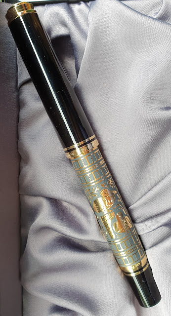
Meet my Moonman 'C1'  Snowflake commemorative edition fountain pen!


I purchased the pen from eBay seller "esybuy" (one of my favourite sellers) back in March 2021 for around $24 USD incuding shipping. It arrived tastefully-packaged and well-protected in a Moonman cardboard box with foam insert. The small instruction booklet that was included is well-illustrated, but there is no English version of the text. No matter---a picture is worth a thousand words, as they say! The pen's box top, however, does have a translation of the Chinese characters on it:"Moonman. feel the temperature of writing!" 

At this point, I should mention that Moonman underwent a name change a few months ago and rebranded themselves as Majohn, so some online sellers are listing this model under the new company name. In fact, seller "esybuy" is still selling this same model on Etsy.com under the name "Majohn C1 Transparent Eyedropper Fountain Pen/ Snowflake Moonman C1 Fountain Pen".


Although it came pre-fitted with an ink converter, the pen was also (primarily?) made to be used as an eyedropper-filler, and Moonman was kind enough to include a glass eyedropper for that purpose. As far as its functioning ink capacity, the pen's barrel can hold between 4 to 5ml. If there was one thing I'd change about the filling system, it'd be to have a converter with a clear stem---the black stem on the supplied converter kind of ruins the pen's aesthetic :/


The acrylic, crystal-clear cap and barrel of the pen are decorated with winter themes---leaping deer (or reindeer), snowflakes, stars, evergreen trees, et al. It's a nice-sized pen, coming in at 138 mm capped and ~126mm from nib tip to barrel end (the pen does not post). At 21 grams capped and 17 grams uncapped, it's light enough to use for long writing sessions while at the same time, feels substantial in the hand.

 (Note: I haven't used the pen as an eyedropper-filler yet, but when I do, I'll use Parker Quink Washable Blue ink in it as I'm a little bit paranoid about barrel staining with this pen. Normally it doesn't really bother me, but this fountain pen looks so pretty with its ice-like cap and barrel...and I'd love for it to stay that way).

I'm not a fan of pens with a large step-down from barrel to grip section, but the section on this one is a nice diameter and very comfortable to hold. The section is made of multi-coloured resin with silvery sparkles in it. I was a bit surprised to see a blue/red combination used for a Christmas/winter-themed pen's section --I'd have expected a green/red combo --but it actually works quite well here as the section colours match blue-shaded inks better than their green counterparts. Apparently, the section patterns and colours vary from pen to pen, but all the 'C1' snowflake fountain pens I've seen online have had blue and red colours in them.

The pen sports a single-tone silvery steel #6-sized Fine nib branded with the Moonman name & logo, the nib size (the letter "F" in a circle) and the silhouette of a mountain range that reminds me of the one on Monteverde's steel nibs. I love the way my F nib writes (like a Western Fine). The nib has a tiny amount of feedback, but I love that and I'm not going to do any nib tuning on it--I love it the way it is!


The cap top and barrel end both have flat ends, and I was pleased to see that the acrylic was considerably thicker there (extra protection from breakage, if the pen nose-dives onto a hard surface).

You can't see it in my photos-- I really tried, but it's challenging to photograph-- but the cylindrical cap and barrel each have one facet to prevent the pen from rolling. The double-threaded cap allows these two facets
to align perfectly with each other when the pen is capped. These two flat areas are the only parts of the pen that don't have any images on them.


The section took me about five turns to unscrew from the barrel, which is reassuring if you're using it as an eyedropper-filler - the extra turns help to prevent ink leakage from the barrel-section joint. There is a small, clear O-ring at the end of the section threads to ensure the section screws tightly onto the barrel. There's also a smaller clear O-ring at the end of the nib collar threads. If you're really worried about barrel leaks, you could apply a bit of pure silicone grease (not supplied) to the section threads.


I like this branch motif on the barrel end. Actually, I really like all of the winter images on this pen--they have a sort of retro look to them, which I find charming. One YouTuber complained about the designs on the pen being upside down (from the user's POV) when the pen was in use. This reminded me of the debate about coffee/tea mug designs--should they be facing away from the person holding the mug, or not? Personally, I find this a non-issue when it comes to pens... but when it comes to mugs, I'm firmly in the "design should face the mug user" camp :)

All in all, I think the Moonman 'C1' snowflake special edition is an attractive fountain pen, a very good value for the money and a fountain pen I'd recommend if you're looking for an eye-catching clipless demonstrator with a large ink capacity.

Before I end this review, I should mention that Moonman used a similar (not exactly the same, though) snowflake theme on another of their clipless demonstrator fountain pens--the Moonman 'M2'--but that model is torpedo-shaped, not cylindrical like the 'C1'. If you're not a fan of the winter designs on either of those pens, both the 'C1' fountain pen and 'M2' come as regular editions without any designs on them.

(photos & review by Maja)

Tuesday, January 11, 2022

Newest Acquisitions (Virtual "Show & Tell") ~ part 310

Today's featured newest acquisition belongs to Glenn Garside (one of our honourary members), who purchased this very special fountain pen for a very special occasion. Intrigued? Read on!

(all text & photos courtesy of Glenn ~ please click on images to enlarge)

 Pelikan Toledo M900.

2021 was the year of our Golden Wedding, a great excuse to treat myself to a ‘golden’ grail pen, especially when Cult Pens offered a discount I could not refuse, making it literally the best price in the world. I know that with certainty because my Scots-Yorkshire ancestry insisted that I do my pricing homework first. I note that their current selling price is considerably higher than on May 12, 2021, when I ordered my pen, so I am extremely glad I ordered it when I did!
I expected my pen to arrive in plenty time for our September 25th anniversary, but, because of industrial unrest and Covid-related supply issues at the Pelikan factory in Germany, it actually arrived the first week of January 2022! So much for my original optimism, but, as the saying goes, ‘better late than never!’
The decorative technique used on Pelikan Toledos originally travelled with the Arabs into Spain, and has been perfected over the centuries, especially in the famous Spanish town of Toledo. It involves engraving a pattern into a metal surface, after which a thin sheet of gold is placed over the pattern and embossed deep into the engraving with the help of a little hammer. To enhance the effect of the gold-filled pattern, the item is heated to approximately 800°C so that the metal surfaces oxidize while the gold shines and contrasts even more brightly.
In 1931 Pelikan adopted this technique for their Toledo pens (M900/910 & M700/710) with so much success that the design has remained virtually unchanged ever since. Every single pen is a unique, craftsman-made art-work. Engraving by hand, one of more than 300 individual steps to create each pen, is slow and limits production to a maximum of 200 pieces per month, even in the best of times.

Each pen is individually numbered on the barrel ring next to the filler knob, and presented in a lovely black, lacquered and silk-lined wooden gift box, together with the signed multi-lingual booklet about the pen.

The standard M800 bi-colour nib is 18ct/750 gold with rhodium accents and comes in the standard four sizes (XF, F, M & B); I chose the Broad option. Similarly, the trim & traditional Pelikan beak clip are the usual polished gold-plate, and the black cap, section & filler knob are made from the high-quality resin used in the other Souveräns.

The decorative barrel sleeve is made from one piece of Sterling Silver, with the motif covered by a layer of 24ct gold (vermeil.) One side of the barrel depicts a pelican with its head bowed, while the other side shows a pelican and its young.

  (To see super-sized images of photos: left-click on photo, then right-click & select "Open image in new tab" /"View image", then left-click on image in the newly-opened tab)

Being based on the M800, the M900 shares its dimensions and ink capacity; however, as you might expect, the Toledo is 9.3gm heavier, courtesy of the vermeil barrel.

That sounds a lot heavier than most pens, and is perhaps not to everyone’s taste, but I note that my Sheaffer Asia Series Bamboo Royal Selangor pen, which is made from Pewter, weighs 41.9gm and is a lovely pen to use, so I don’t anticipate any problem whatsoever.


The Dimensions:

Weight

Total Length

Barrel Length

Cap Length

Diameter

Ink Capacity

38.6 gm

141 mm capped.

165 mm posted.

105 mm

67 mm

13.0 mm

1.35 ml


References:
https://www.pelikan-collectibles.com/en/Pelikan/Models/Souveraen-Series/M900-M910/index.html
https://appelboom.com/pelikan-toledo-m900-fountain-pen/
https://www.pelikanpens.co.uk/products/pelikan-toledo-m900-fountain-pen?_pos=5&_sid=ed5d0f3f2&_ss=r

There are many others, but by and large, everyone uses the same basic text, no doubt supplied by Pelikan in their marketing material; surprisingly, the https://www.pelikan.com/ website doesn’t list any of the Souver
äns at all.

Glenn,
Brisbane, Australia.
Tuesday, 11 January 2022

Our thanks to Glenn for sharing this beautiful fountain pen with all of us! (and belated Golden Wedding Anniversary wishes to Glenn and his wife :)