Showing posts with label kyo-no-oto. Show all posts

Thursday, February 23, 2023

Newest Acquisitions (Virtual "Show & Tell") ~ part 466

I was so happy when Lawrence sent in another installment of his thoughts on his favourite fountain-pen-and-ink matchups (or what he calls "Lavalife and pens"; ). This review (Part 4) continues on after part 1, part 2 and part 3...

Lawrence's review:

This is a fairly small group which only includes a handful of pens. This group I call "Purple Pleasures" (for reasons you'll see later on LOL). This ink/pen group is basically an "offshoot" of the Syrah group (i.e., the "grail group"), and was an "unintended byproduct" of my search for the perfect colour for my grail pens. This group was based on Montblanc's Lavender purple:

(all photos courtesy of Lawrence ~ please click on images to enlarge)


It's a very nice ink actually. And it goes on brilliant purple and dries nicely without losing too much of the colour (some inks tend to become "desaturated" as they dry). I got this ink while I waited for the Syrah. I got it knowing that this is definitely not burgundy, but just want to try to see how it looks (a part of me almost felt like I was having an "affair" of sorts, because I deviated from the original goal / "the one true path"..blah blah blah...basically I know I have "sinned" so there... LOL).

Most of my grail pens are black so they match well with it. But instead of the gothic vampire vibe, this gives me more of a "happy" Sesame Street's The Count vibe. Still good, but not too satisfying for me.

Because of my "hoarding" tendencies LOL, I, of course, have more than one purple/violet ink. The other one I got was J. Herbin's Poussiere de Lune. Most J. Herbin inks have this "faded" look, but this one is actually quite "saturated" (relatively speaking). I admit, I got this ink because of the name LOL (I know it's a silly reason to get an ink but whatever):


Although purples / violets look okay with most of my black pens, I have never really warmed up to them. It's like when stories portray people having affairs, it's usually like a side thing LOL. Anyway joking aside, although these colours are pretty good, they are sort of not quite the "nostalgia blue" nor are they the "grail/Syrah burgundy" group, so they are kind of stuck in the middle, and almost ignored. Until fate intervened....

On a shopping spree at Nikaido, I obtained an unusually coloured pen (at least for me it is). This is the Faber Castell Neo-slim olive green, which I lovingly named my "Tiki pen" (I have reviewed this pen before):

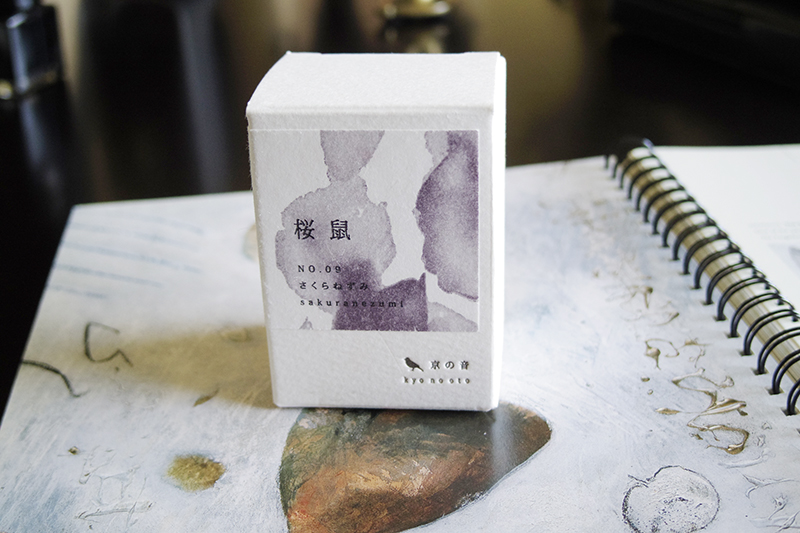
Because I have never had a pen of this colour before, I also decided to look for an ink to match it. Maja helped me find a good match using the colour wheel and I ended up with Kyo no oto sakuranezumi:


This ink was a great match for the Neo-slim. This ink has a similar consistency to my J. Herbin inks, and actually also has this "faded" look. Funnily enough, compared to Poussiere de Lune, it's even more faded. However after a few weeks of using this ink, I found that the Neo-slim, due to its unusual nib design, did not quite love this ink. It writes rather dry and suffers from "hard starts". It's quite a shame. However this incident renewed my interest in purple / violet inks again. Anyway, I discovered a few of my pens (in addition to the Neo-slim) that will occasionally work with this particular colour group from time to time.

My Waterman Elegance is one of these pens. I sort of got the idea from an online review of this pen using purple ink, so I tried it out and it's okay. However I do have another ink group that this pen is more suitable for (which I will talk about in future installments):


Another pen that I tried with this group is the Kaweco sport brass. I don't really feel anything for this particular colour match, but this pen happens to be a 1.3 stub and it shows off a really cool shading effect from the purple inks. The Montblanc Lavender Purple, in particular, looks great with this larger nib size:


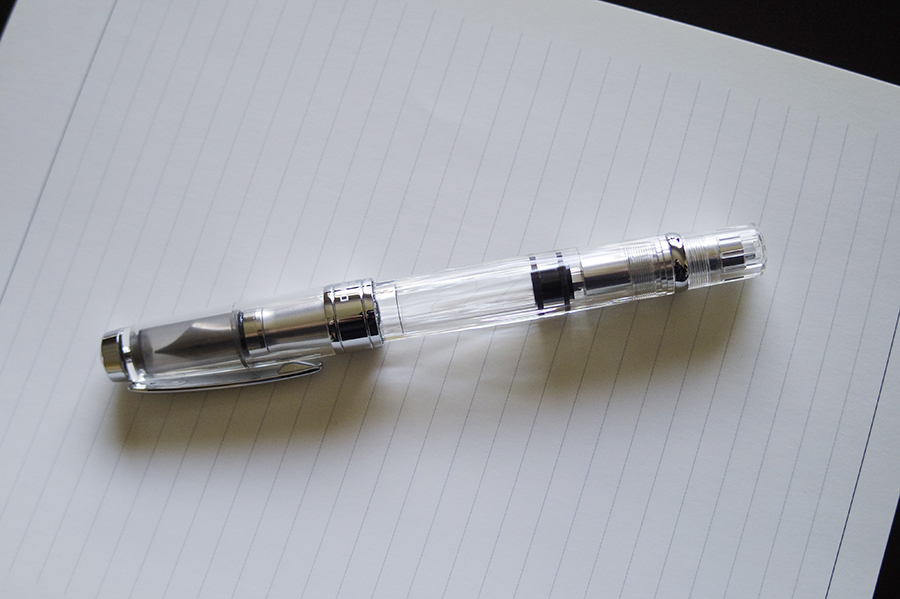
My demonstrators of course will take whatever ink. The one the I have using purple is my TWSBI 580:


The only grail pen I have that ended up regularly sampling the purple is my Visconti Homo Sapiens 1.3 stub. Again, this also because of the stub nib and the way the purple inks look with thicker lines:


As for my Neo-slim, my match-making attempts did not pan out very well. It ended up leaving this group due to the problems it had with the nib drying up. However, there is a nice closure to this saga....as of this writing the Neo-slim is happily on a heavenly escapade with an Italian black ink named Leonardo (courtesy of Maja) LOL.

That's it for this group. 

Wow! Our thanks to Lawrence for another fun and informative review (and all the photos that accompanied it). Thank you for the kind words, Lawrence; I can't wait for the next installment :)

Thursday, April 21, 2022

Newest Acquisitions (Virtual "Show & Tell") ~ part 359

We hadn't featured a new ink in a few months here on our club's blog, so I was pleased to get this review from Lawrence a few days ago.

He writes: "I was not really intending to get any ink at Nikaido's last month, but because I got this greenish Neo Slim pen, I decided to get an ink for it, I ended up with this one. This is called Sakuranezumi from the Japanese ink line Kyo No Oto."

(all photos courtesy of Lawrence ~ please click on images to enlarge)


"The packaging is quite nice. And the ink bottle is also pretty subdued looking, no-nonsense type (and not in the almost gimmicky demi style of Herbin...which I will talk a little about later on)."

"The ink bottle is something reusable....it's fairly non-distinct and I probably can use it for many other things aside from just inks.
Now we get to the ink itself. It is a greyish-violet color. I have my Neo Slim inked with it and it is okay with it. But for this review, I dipped it with one of my calligraphy pens to get more width so we can see the shading a bit more."


"This ink is also fairly resistant to water. If you let the ink dry up more on the paper, it can hold very well. The testing below is after maybe 5 to 6 seconds of putting the ink on paper: "

"After brushing over a couple of times, the ink no longer dissolves and seems to be permanent after (more or less).
This ink reminds me of my Poussier de Lune (Herbin ink). the sample below is the two inks compared. The top one is Sakuranezumi the one below is the Poussiere ink: "


"To make the comparison more clear I sort did a brush test: "

"So the Sakuranezumi is less "magenta" than Poussiere...but in terms of writing feel, they are similar. That is, they write dry. While Pilot Iroshizuku ink has a definite rich liquidity feel (wetter?)...the Sakaruanezumi, like the Poussiere, writes like diluted acrylic ink (not sure how else to describe it) so like diluted acrylic ink, they are water soluble for the first few moments...after that they are kind of permanent.
This ink in a way is not a good combination for my Neo Slim...as the pen has a hard start after a few hours of inactivity. It is probably a combination of the Neo Slim's nib with this dryish ink. It is unfortunate because the color goes so well with the pen.
Overall, this is sort of like a Japanese version of the Herbin ink line. It feels the same and has an ethereal color quality to it (very vintage / faded look). I do like the ink as an alternative to my Herbin, but I may be very selective as to the pen I use it with."

Many thanks to Lawrence for this great ink review, and the photos accompanying it!

Monday, September 12, 2016

August meeting photos!

We had good turnout for our meeting held on August 18, 2016 at Perks pen store on Cambie Street in Vancouver----17 members (including three newcomers---Marzieh, Justin and Terry) showed up, as well as one out-of-town guest (Bill S. from the Seattle Pen Club).
Special thanks to David R for his generous donation of a Kaweco "Liliput" fountain pen for our door prize; the lucky winner was Christopher R!

The evening's topic was "Your Favourite Lesser-Known Fountain Pen Brands".
I snapped a few photos of the pens our members brought in for the theme, but first....these group photos, taken by our pen club host, Richard:
(~CLICK ON IMAGES TO ENLARGE~).

Back row (L to R): Glenn M, Terry, David R, Bill S (from Seattle), me (Maja), Justin, Barry K, Bethany, Ralph (in green shirt).
Middle row (L to R): Jerred, June, Bart, Louise.
Front row (L to R): Christopher R, Stuart, Marzieh, Norm.
The theme for August's meeting was Jerred's idea, so I'll start with a quick shot of the fountain pens he brought in. Pictured below (from left to right): Online Campus Red Dragon, Online Academy Soft Pink, Ohto Rook, Ohto Dude, Muji Round Aluminum, Online Vision Nature Rosewood, Online Icone Midnight and Ohto Tasche.
In the photo below, you can see Stuart's examples of his favourite lesser-known fountain pen brands---a couple of Heiko fountain pens (including a model '442') on the far left, a brown marbled Penco fountain pen next to the Heikos, two Ingersoll metal fountain pens in the middle of the photo, and two Esterbrook 'J' pens on the far right. The Wahl "All-Metal fountain pen to the right of the Penco, the Sheaffer "Balance" next to it and the Pelikan MK10 next to the Balance are all new acquisitions of Stuart's.
A shot of the pens Bill brought in for our theme:
From top to bottom: Nettuno "Barracuda", Paper Mate fountain pen (nib made by Montblanc!), Giuliano Mazzuoli fountain pen, Parafernalia "Revolution" fountain pen:
My (Maja's) three favourite lesser-known fountain pen brands--from L-R: two Levenger "True Writer" fountain pens, two ThINK fountain pens (one in the "Confetti" pattern and one in the brown "Gatsby" pattern) and two Retro 51 fountain pens (a "Postmaster", made with real used postage stamps, and the "Double Eight" model in a limited edition brown marble colour):
I often marvel at the enthusiasm of our members. One of our members (Harry) who couldn't attend the August meeting sent in these photos of a Penol 'Ambassador Jr' as one of his favourite lesser-known fountain pen brands. As Harry writes: "I thought I'd share a few photos of one of my pens for the uncommon brands topic. The pen I'd like to share is from the Copenhagen based brand Penol. The name comes from the combination of "Penn" and "Olson", and was made by the Christian Olson factory. Olson was the Parker distributor for Scandinavia from before WW1 until late in the century. The pen model is Ambassador Jr, and was made in November, 1942. I found it in a vintage shop in Denmark. It writes like a dream!".
Thanks for sharing this with us, Harry!
Our secondary topic is always "Newest Acquisitions". Louise and Norm brought in this older-model Delta fountain pen that Louise found (she also found a nice vintage Mabie-Todd "Swan" fountain pen, but I didn't snap a photo of it):
June's lovely collection of modern and vintage fountain pens, including her newest acquisitions, the three vintage Eversharp 'Doric' fountain pens (the 6, 7 & 8th pens from the left) and a Visconti 'Opera' (the last pen on the right-hand side).
In addition to his cool new Franklin-Christoph 6-pen "Penvelope" pen case, Bart brought in his Pelikan M800 in Burnt Orange (a newer acquisition, which he brought to the June meeting, but I forgot to photograph):
The brass Kaweco "Liliput" fountain pen that David R donated as a door prize. You can see how small the pen is, based on the size of the coin next to it.
Bill S was kind enough to bring his amazing collection of rare and hard-to-find Targa fountain fountain pens all the way from Seattle. They're on the left-hand side of the pen case below. His limited edition Sheaffers are on the right-hand side:
My apologies for the quality of the pics---the store's lights were turned off in order to keep the temperature down, as it was a very warm evening. The photo below shows Bill's "daily user" fountain pens. Many thanks, Bill, for bringing your collections for us to see!


One of our brand-new members, Terry, brought in his collection for us to see. It included several nice Waterman fountain pens (a "Laureat", a vintage hard rubber mdoel "94" in the rare blue ripple, and a gorgeous vintage all-sterling-silver model), a Waterford fountain pen, and a fountain pen that doubled as a Holy Water dispenser! Terry left a bit early so I didn't get a chance to photograph his fountain pens. I also meant to photograph Glenn Marcus' newest fountain pen inks, his two bottles of kyo-no-oto ink, but the photographs on his website are infinitely better than anything I could take :) You can find Glenn's review of this ink on this page .

~~~~~~~~~~~~~~~~~~~~~~~~~~~~~~~~~~~~~~~~~~~~~~~~~~~~~~~~~~~~~~~~~~~~~ Don't forget about our September meeting this week! It's on Thursday September 15, 2016 from 6:30pm to 8:30pm (members may arrive a little bit early---at 6:00pm---to chat beforehand) at Perks pen store, 5844 Cambie St, Vancouver, BC (the usual meeting place). The topic will be BLUE FOUNTAIN PENS! No RSVP's required for meetings held at Perks pen store. Hope to see you there!