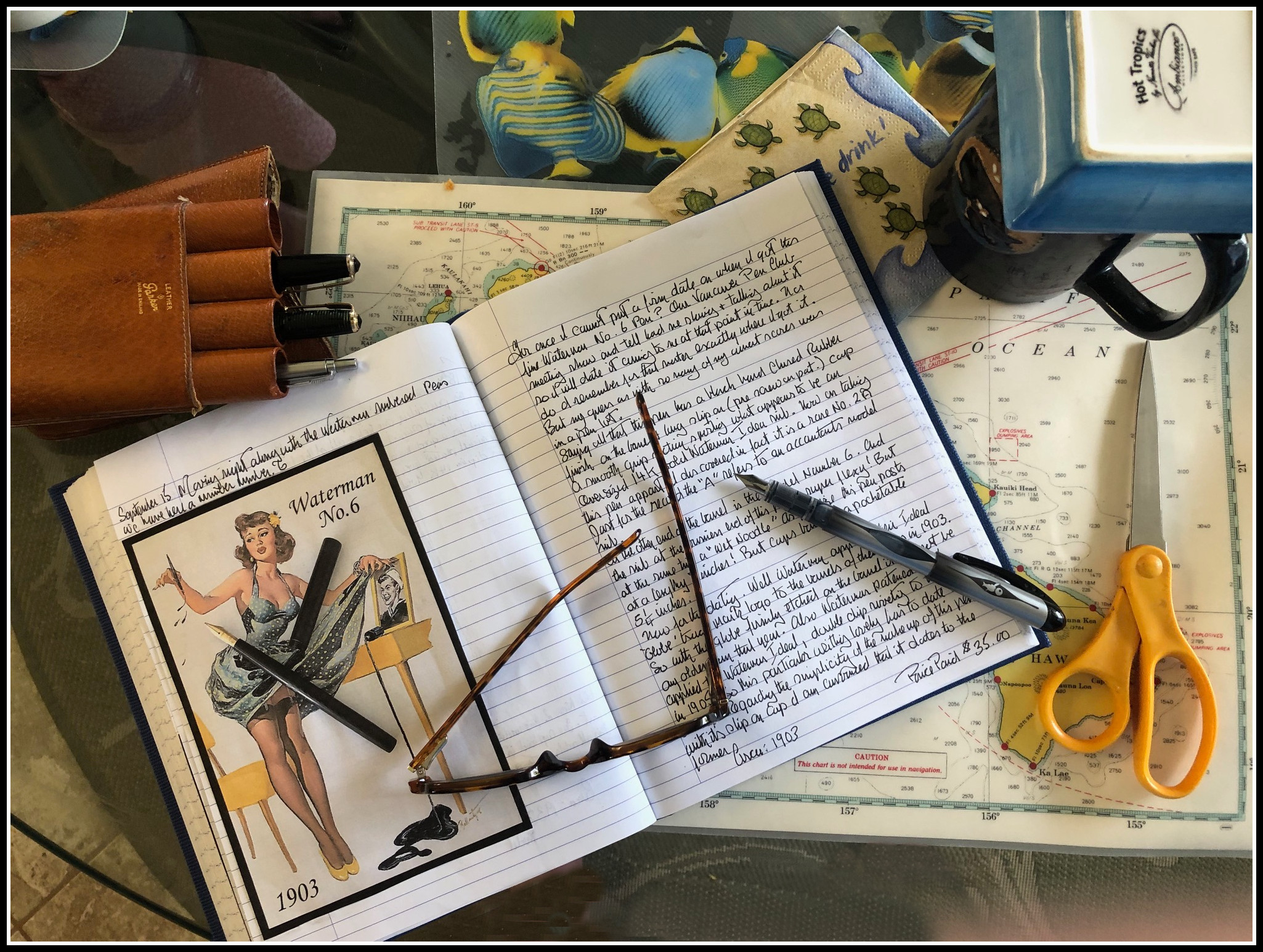
Christopher's vintage pen log book (in which he documents all of his vintage pen-related acquisitions) --photo snapped while he was on vacation in Hawaii:

The Vancouver Pen Club was founded in Vancouver, BC, Canada in 2006 as a way of sharing our knowledge of & enthusiasm for the fountain pen hobby with others
Club meetings are held once a month -- July 2026 meeting info: TBA -- Please check here for meeting information/schedule changes/updates
~Both modern and vintage writing equipment enthusiasts welcome! ~
Questions? Contact us at: vancouverpenclub@gmail.com
(photo courtesy of Christopher~ please click on image to enlarge)

Christopher writes:
"One of the nicest periods in the production of Parker Vacumatic fountain pens was the Third generation between 1942 and 1948 (1955 in Canada). Further streamlining in the overall design was achieved by dropping the second (blind cap) jewel and rounding off the blind cap in a very smart design finish. Although the very successful Speedline filler could have carried on, the Second World War -now in progress- made the use of aluminum questionable. So to offset this, Parker turned to the available plastic (Lucite) for a new Vacumatic filler depressor.
This particular Parker Vacumatic is the Standard model, identified by a triple cap banding and has a Jet black matching cap jewel. As with all standard size Vacumatics, the overall dimensions are quite impressive and second only to the Vacumatic Maxima. Otherwise, most of the other features follow the design of the past Vacumatics regarding this model.
The grip section is also a matching jet black and supports a 14k Gold flexy Parker arrow factory ‘Stubbed’ nib . It is my educated guess that this pen was a special order in its day.
Personally, I was so smitten with this fine writing instrument that I have taken it with us on our vacation in Hawaii, where I will be using it frequently!"
Many thanks to Christopher for his write-up & photo of this handsome vintage fountain pen!
I was so happy when Lawrence sent in another installment of his thoughts on his favourite fountain-pen-and-ink matchups (or what he calls "Lavalife and pens"; ). This review (Part 4) continues on after part 1, part 2 and part 3...
Lawrence's review:
This is a fairly small group which only includes a handful of pens. This group I call "Purple Pleasures" (for reasons you'll see later on LOL). This ink/pen group is basically an "offshoot" of the Syrah group (i.e., the "grail group"), and was an "unintended byproduct" of my search for the perfect colour for my grail pens. This group was based on Montblanc's Lavender purple:
(all photos courtesy of Lawrence ~ please click on images to enlarge)


As for my Neo-slim, my match-making attempts did not pan out very well. It ended up leaving this group due to the problems it had with the nib drying up. However, there is a nice closure to this saga....as of this writing the Neo-slim is happily on a heavenly escapade with an Italian black ink named Leonardo (courtesy of Maja) LOL.
That's it for this group.
Wow! Our thanks to Lawrence for another fun and informative review (and all the photos that accompanied it). Thank you for the kind words, Lawrence; I can't wait for the next installment :)


Brand-new member Akemi brought a bright red Jinhao 'X450' and her uber-cool Benu 'Skull and Roses' "Red Rose" fountain pen for our meeting theme!

(From Benu's official website: "Inspired by one of the most popular motifs that represents the eternal struggle of good vs evil, the Red Rose fountain pen has been crafted in the dramatic red color.")
 We also saw several very nice vintage fountain pens at our meeting, including this red Esterbrook 'SJ' model (photo above) belonging to Phil ...

We also saw a modern red Esterbrook fountain pen---Julienne's aptly-named Esterbrook 'Estie Oversize' "Sparkle"! Below it is her new London Pen Company 'Christopher 13' fountain pen, made by Sean Allott, a pen maker located in London, Ontario.

Sally--another brand-new VPC member---brought her own London Pen Company fountain pen to the meeting- a 'Christopher 14' model (which is the same length as the 'Christopher '13', but chunkier) in Jonathon Brooks' amazing "Primary Manipulation" resin. Sally's pen is shown sporting a custom (reground) nib.

Above: Julienne's London Pen Company pen next to a stylish burgundy Pilot 'Elite 95S' fountain pen belonging to new VPC member Mandy. The Pilot is a pocket pen, but when posted, becomes a full-sized pen.
 Hadi's handsome Pilot 'Custom 845' (made of ebonite and coated with urushi lacquer) which he purchased in Japan...
 Rene brought a multitude of red fountain pens to show us, including this
stunning Platinum ' 3776 Century Limited Edition - Kinshu" (which came out in 2021), and a vintage flat-top made of mottled red hard
rubber.
Rene brought a multitude of red fountain pens to show us, including this
stunning Platinum ' 3776 Century Limited Edition - Kinshu" (which came out in 2021), and a vintage flat-top made of mottled red hard
rubber. More of Rene's red pens (top to bottom): a nice mottled red hard
rubber vintage pen with a domed cap, a Jinhao '5000' dragon fountain pen, a mysterious hand-painted fountain pen marked "Secap" and "Made in Japan" that Rene found in Paris several years ago, a
Kaweco 'Special Red' (part of Kaweco's 'Collection' line) and a vintage Parker '45'.
More of Rene's red pens (top to bottom): a nice mottled red hard
rubber vintage pen with a domed cap, a Jinhao '5000' dragon fountain pen, a mysterious hand-painted fountain pen marked "Secap" and "Made in Japan" that Rene found in Paris several years ago, a
Kaweco 'Special Red' (part of Kaweco's 'Collection' line) and a vintage Parker '45'.  Alejandra's elegant Pilot 'Decimo', a slimmer version of Pilot's ever-popular 'Vanishing Point' model...

Chris' beautiful 'Platinum '3776 Century' "Bourgogne" and my brand-new Platinum '3776 Balance Maestro' in black below it...

They might look very similar but, unlike the '3776 Century' model, the lower-priced '3776 Balance Maestro' comes with a gold-plated steel nib and doesn't have Platinum's "Slip & Seal" cap closure mechanism to prevent the capped pen from drying out (I'll do a review of it in the near future, but I wanted to show it next to its "rich cousin" in this blog post!)

Over time, the semi-transparent natural urushi lacquer matures and becomes more transparent, allowing the base layer colour (in this case, a deep red) to become visible --a wonderful, natural transformation...
 Next to my new Jinhao 'X450' (top pen) is a Aurora 'Optima' in "Bordeaux" resin that I brought in for the meeting's primary theme (your favourite red fountain pens/inks). I bought the Aurora from a fellow Fountain Pen Network member in 2010, and it was probably the most I'd spent on a fountain pen up to that time.
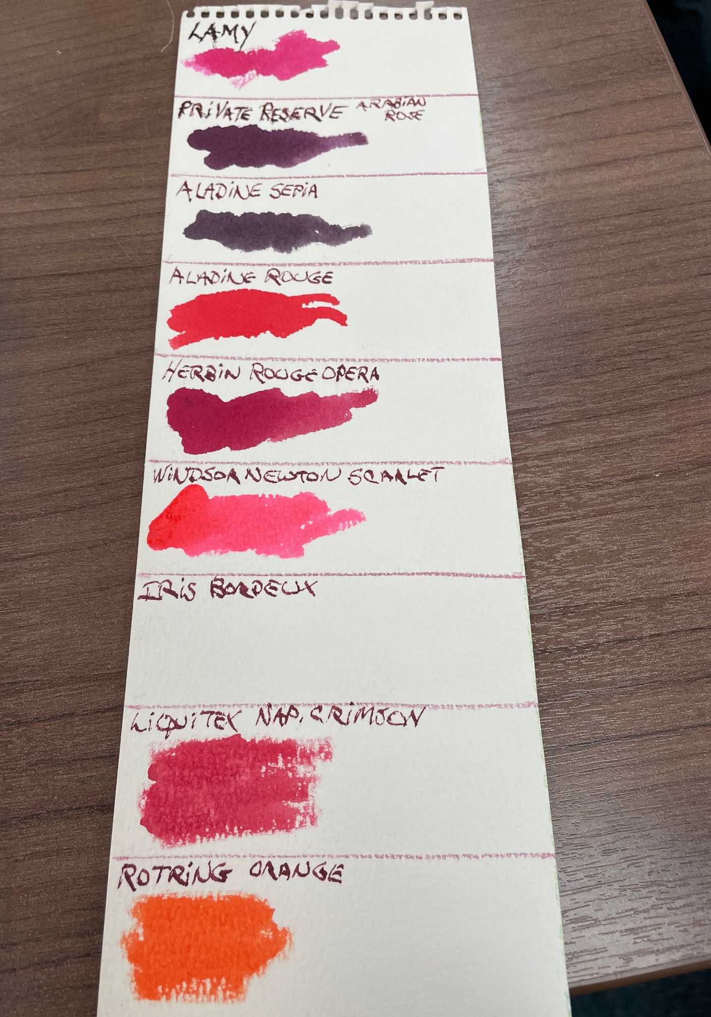 We also saw some really nice red inks...and ink swatches! Our thanks go out to John for bringing in the swatches above; there's nothing like seeing how an ink looks on paper! (the way ink looks on a screen can be very different, as we all know :/
 Anna was good enough to fill her new "Mint Blue" TWSBI 'Eco-T' (oops!) with Robert Oster 'Australian Syrah' ink, so I wrote a few words with it. As you can see, it's a lovely, rich colour...
Our secondary meeting theme is always "Newest Acquisitions" so I brought my new Jinhao 'X450' in spiral red lacquer, and my little orange and white Kaigelu '316 Mini' fountain pen (purchased from one of my favourite sellers on Etsy - 'esybuy')
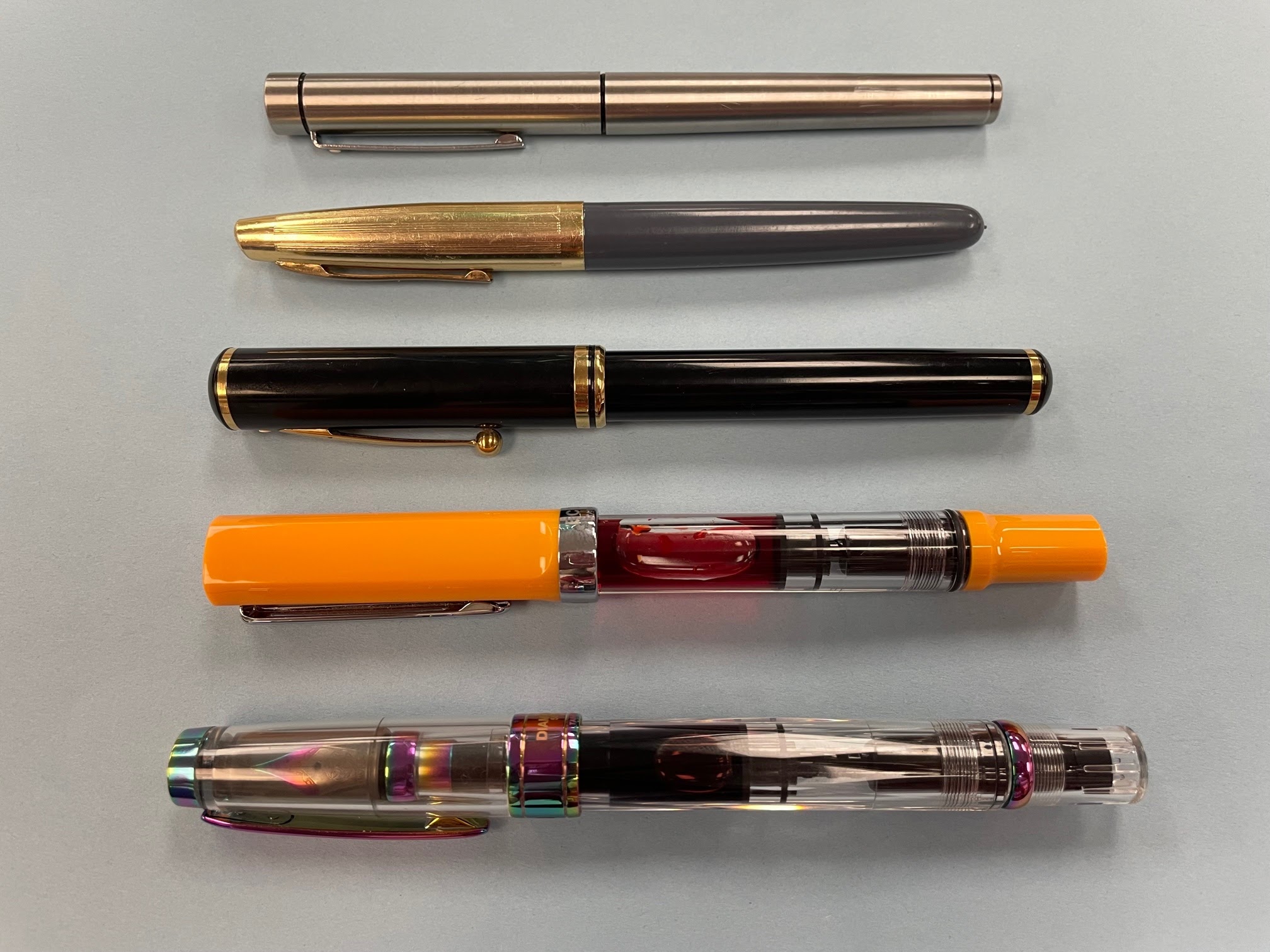
More new acquisitions brought in by our members! (top to bottom): Jerred's brushed stainless steel Sheaffer 'Targa' with factory italic nib, an Italian-made syringe-filler owned by Rene, a Sheaffer Levenger 'Connaisseur' (not sure whose it is, but it's a very nice pen), and two eye-catching fountain pens recently acquired by John--- a cheery TWSBI 'Eco-T' "Saffron" and an iridescent TWSBI 'Diamond 580' "Iris".

More new pens - (above photo, bottom to top) Anna's new Kaweco 'Sport' in "Smooth Sage" and her black vintage Pilot 'Elite' (which she filled with Diamine "Strauss" ink), Alejandra's vintage Eversharp 'Skyline' and a TWSBI '580 ALR' "Punch Pink" (I can't remember who brought it in, but I own one and love mine!)
 Above: Some of Rene's newest acquisitions--two tiny vintage fountain pens, a vintage fountain pen with a snake clip, and a vintage Parker 'Duofold Senior' Lapis" that Rene bought as a "self-gift" for his birthday (happy belated birthday, Rene! :)
 A closer look at that cool snake clip...
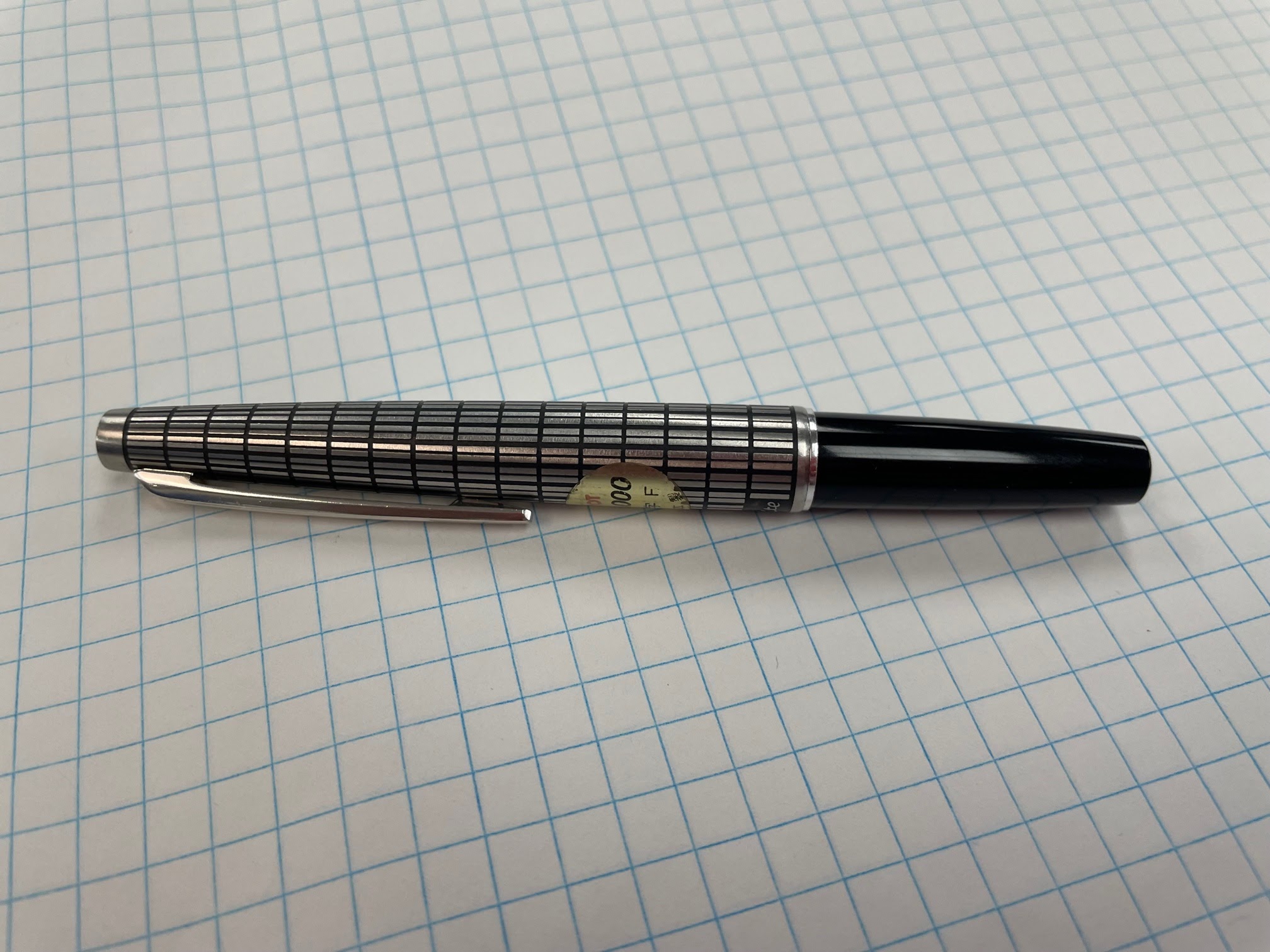
Alvin's classy stainless steel Pilot 'Elite' with crosshatch pattern, which came out in the 1970s. For more info on Japanese pocket fountain pens, check out this superb article on Richard Binder's excellent reference site.
 Phil's modern Kaweco 'Original' (top) fountain pen and Anna's vintage Montblanc '32' fountain pen...
 The Montblanc '32' has a 14K inset nib and was first produced between 1946 and 1970, according to the informative CollectibleStars.com website...
 Last, but certainly not least--a charming miniature silver notebook and mechanical pencil belonging to Stuart! The inscription reads: "Compliments of Bauman-Massa Jewelry Co. Commercial Building St Louis, MO"). Stuart thinks it was made around the turn of the previous century.
Stuart also brought in some items he previously reviewed for this site --a gorgeous Sheaffer desk base made of Norwegian marble (reviewed here), a Sheaffer ballpoint counter set (reviewed here), a handsome Sheaffer 'PFM V' fountain pen in burgundy (shown here), and one of his Faber-Castell 'Ambition' fountain pens (this one) that he filled with his favourite red ink--Graf von Faber-Castell's "India Red". Stuart also showed us two new fountain pens---a brand-new Parker 'Sonnet' in brushed stainless steel he bought from the Vancouver Pen Shop at their new location's grand opening and a vintage Waterman C/F.
Many thanks to all of our new members for coming to your first Vancouver Pen Club meeting, and for bringing some pens for us to see. I didn't photograph them, but I remember Gurmeet's lovely Parker 'Jotter XL' "Rose Gold" ballpoint, the beautiful vintage (ca. 1929) Morrison fountain pen with gold overlay that Lisa showed us, Luc's marvelous red fountain pens (a Penlux, a Conklin 'Duragraph" "Elements - Fire", and a Pilot 'Vanishing Point'), as well as a wonderful vintage Waterman '52' with gold overlay that Syd brought in.
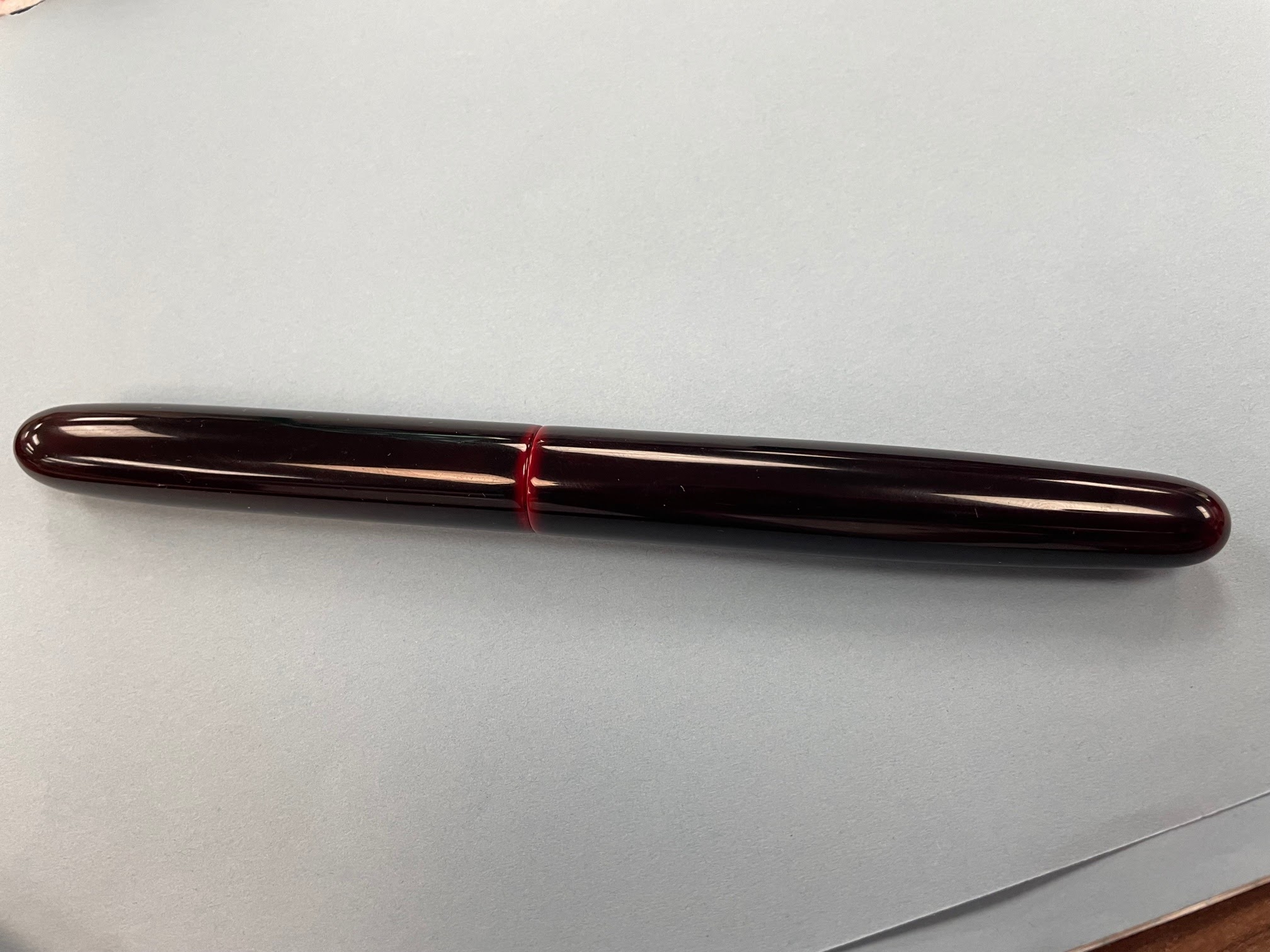
I'm still working on the blog post about our meeting on Thursday, so here's one last review from Christopher to tide you over. Our thanks to Christopher for all of his reviews -- more recently, and in the past!
(photo courtesy of Christopher ~ please click on image to enlarge)

He writes: "Although ballpoints have not been my main focus of vintage pen collecting, I will admit that I do have a special place in my heart for the Parker Jotter. Attractive, well designed and dependable are the benchmarks of the Jotter. And may I add that it has definitely stood the test of time. And if you require a new refill to fit even the first year of Jotter production, 1954, a simple trip to any number of stores in most cities will do you proud and keep your faithful Parker Jotter writing at its best.
Still, I have been after a all metal Jotter that comes off as a gold pen. And as luck would have it, the other day I happened on just the one. Finished throughout in 1/10th 12K gold filled, it just happened to be a cap-activated 51 complete with the pearlized grey plastic cap jewel. The Parker arrow clip is unmistakably the 51. And vertically down the cap and barrel are repeated groups of chased lines which identifies this fine pen as one of the Custom models. As for dating, I would have to say mid 1950s. So you can bet that I will be visiting my local office supply shop to acquire a Parker refill to get this golden beauty up and writing."
The Parker 51 'Jotter' was discontinued many years ago, but the Parker 'Jotter' ballpoint is still going strong after 69 years; it now comes in a multitude of colours/finishes (and two sizes---standard and 'XL'), so check it out next time you're in a pen shop or office supply store!
Many thanks to all who attended our meeting tonight! I'll post some meeting photos here in the next few days. In the meantime, enjoy this review of another one of Christopher's newest finds--a Parker Vacumatic Streamline Standard with Star Clip!
(all photos courtesy of Christopher ~ please click on images to enlarge)

Christopher: "When the Parker Company followed the current trend back in the day, their pens and mechanical pencils took on a new stylish look. It was a wave of the future and most pen companies never looked back. Gone was the tubular and in was the streamlined and the buying public welcomed it, providing companies like Parker with strong sales. Behind it all was the ever so innovative Kenneth Parker, who understood the strength of design with his product.
This particular Parker Vacumatic is dated coded 1940 and shortly after the
company streamlined their pens and mechanical pencils. It also sports
the new split feathered Parker arrow clip with the company branding
running vertically down the middle. Still, if you look closely, you will
also see that unlike most Parker pens that sport the Blue Diamond
Warranty directly above the feathers, this pen features a five pointed
‘Star’. The so called Star clips are quite rare because shortly after
the star was applied to represent a Parker pen warranty, it was decided
that the star symbol was just not appropriate, thus replaced with the
blue diamond."

"The all matching finish on this pen is the Emerald pearl and the barrel transparency is red ambered, but otherwise nice and clear. The 14K Vacumatic nib has the two tone platinum mask and, at the other end, a long screw on matching blind cap covers the newly offered Parker Speedline filler. The fittings are 14K gold filled throughout and when you step back from this fine pen, the condition and exterior brilliance is impressive. The nib also has quite a bit of flex, but lays down the ink smoothly. I was lucky to get this pen and happy indeed to add it to my collection."
 (Photo above: Parker Pen counter, 1940)
Our thanks to Christopher for the review of this gorgeous vintage fountain pen!

Questions? Please contact us at vancouverpenclub@gmail.com
Hope to see you there! (no RSVPs needed!)

Our next meeting (which is this Thursday--Feb. 16) will feature red fountain pens and inks, so I thought I'd post a quick review of a red pen I bought in Richmond last month at Nikaido-- my new Platinum 'Prefounte' fountain pen' in "Crimson Red"!
(please click on images to enlarge)

The design is minimalist --a slender cylinder with flat, softly-rounded ends and no trim rings or adornments (and no branding in huge letters on the barrel--I'm looking at *you*, Platinum 'Preppy'!!). The body of the 'Prefounte' is made of highly-polished polycarbonate resin and comes in five clear colours -- Crimson Red, Dark Emerald, Vermilion Orange, Graphite Blue and Night Sea (a bright blue).
The pen only takes Platinum's proprietary ink cartridges or a Platinum converter, but it comes with one blue black Platinum cartridge to get you started. Platinum ink converters cost around $10-$12 CAD (which almost doubles the price of the pen), but as the barrel lacks holes, you could easily convert the pen to an eyedropper-filler and save yourself some money. If you decide to do this, make sure you apply some silicone grease to the section threads to prevent ink leakage.
Late addition: I totally forgot about the Platinum cartridge adapter (sold separately) that allows you to use international ink cartridges in your Platinum fountain pens! I picked one up from Nikaido for under $3 CAD yesterday (as an aside, Nikaido is now open again on Mondays!)

Like several other Platinum models, the 'Prefounte' uses Platinum's “Slip & Seal" mechanism in its (snap) cap. This mechanism consists of a spring-loaded inner cap that--according to the Platinum USA website--"prevents ink from drying out in the pen with the cap on for one year". The cap snaps on firmly with an audible "click" and stays on securely. The pen's model name is screen-printed on the front of the cap, while the back of the cap has the nib width ("0.5M", in my pen's case), manufacturer's name (Platinum's stylized "P" logo and the word "Platinum"), and country of origin ("Made in Japan").
The elegant, chrome-plated stainless steel clip has a raised elongated pentagon at its top--a classy little touch--and clips onto paper and fabrics well. It is a bit tight, but I don't think this is the type of pen you'd clip onto a dress shirt pocket.

The pen's length is 13.8 cm capped, about 12 cm uncapped (nib tip to barrel end), 15.2 cm posted, and weighs 10.6 grams with no cartridge inside.
The section is very subtly tapered and 10.6 mm in diameter (according to Jet Pens) nearest the section-barrel joint. The section is a decent width for my hands and there's very little step-down from barrel to section, so I find it very comfortable to hold and use. The pen is light and well-balanced when posted, and the cap posts deeply, so I always use the pen posted.

(I love sections that match the rest of the pen, but I'm glad the section is colourless, so you can see that crazy-long collector!)
The stainless steel nib, feed and grip section are the same as the ones on Platinum's highly-popular 'Preppy' pocket fountain pens, so if don't like the nib on your 'Prefounte', you can easily swap in a 'Preppy' nib. The nibs slide off their feeds, but it's actually easier to swap out the nib-feed unit (gently -- the feed has a long, thin "tail") or the whole section. The 'Prefounte' comes in two nib widths -- 0.3mm and 0.5mm-- and the nib widths are engraved on the nibs, below the Platinum logo. The 0.5mm nib on mine writes very smoothly and lays down a Medium-Fine line. The ink flow is very good, and I've had no hard-starting issues with it.
Cleaning the pen out can be a bit challenging because of the aforementioned collector (the grey thing with all the fins, in the photo above); the collector is friction-fitted into the section and -apparently- impossible to remove without breaking it. What I do is: I remove the nib and feed together by pulling them out of the collector (again, take care not to break the feed), fill the collector with water using a syringe and shake the liquid out and/or suction it out with the syringe.
Another great turnout! I counted 35 members in attendance at our May meeting (which was held at the Renfrew branch of the Vancouver Public L...
