This review is Part 6 of Lawrence's series and features sepia/brown inks; it continues on after part 1, part 2, part 3, part 4 and part 5, all posted here on our blog.
(all text + photos courtesy of Lawrence ~ please click on images to enlarge)
"This batch of ink is what I call the “Belle Epoque” group. This is because it is all based on my Waterman Elegance Ivory – the pen that started this “high end” pen fever in me. This pen had this Art Nouveau feel to it and the sepia / brown inks work very well to keep this mood going. The moment I saw the pen, I wanted to use a sepia / brown ink with it. So. in a way. this is like my Syrah pen group, as it is based on wanting to match a single pen with a particular ink, sort of like “Syrah group lite” LOL.
This pen took three tries from Amazon to get to the one that wrote well enough for me, but I had already acquired the ink while waiting for it; I ended up getting Sheaffer Skrip Brown from Perks:
This is pretty “bright brown”, almost orange, but it dries to a more subdued brown, which is fine. It matches the Elegance very well, as the pen is ivory with gold accents. The Elegance is not a pen that I use often; it is more of a “appreciate its visual awesomeness” kind of pen for me. So, to make sure that this brown ink got used in some way, I did have a whole bunch of pens try it out. And surprisingly this ink group works with quite a few of my pens. Technically, of course, it will work with my black grail pens…but those pens tend to stay with the red inks.
The pen that worked very well colour-wise with this ink is my Montegrappa Ducale Brown Emperador. This pen writes a bit on the dry side with this ink, however, so I may end up getting a “wetter” brown ink for it. But I like the colour combo so far. Occasionally this pen uses black, but brown/sepia is its colour of choice for the time being.
Another Waterman pen that I have is the Carene. It is one of my non-black grail pens and it uses mainly black (instead of red) obviously; however it looks fine with this Sheaffer Skrip Brown. And the Carene writes very well and seems to work with almost any ink I give it. The Carene is one of the few pens in my collection that has two steady matching ink colours from different ink groups: black and brown (menage a trois….yes, tres tres French) .
The other pen in this “two-timing” category is my vintage Lady Sheaffer (I guess it is a Sheaffer, so it matches). This pen is usually in my black ink group, but sometimes I don't want this pen to be so “serious” about things and so the Sheaffer Skrip Brown is a good one to lighten things up a bit, and it works very well with the gold patterns on the pen.
My twin Faber Castell Basics (medium and fine ) sometimes use this ink as well. These are gray / silver pens that normally belong to the blue nostalgia group, but the brown ink looks extra vibrant with these pens somehow (maybe because the pens are sort of “grayish” and so their colours don’t interfere with the ink’s…not sure…but I like the effect).
The other Faber Castell I have that uses the Skrip brown is my Faber Castell Ambition Pearwood. I don't use this pen as much due to the section being a bit uncomfortable for long writing sessions, but when I use it I tend to use blues and I probably will put this pen in the blue ink category; however, the “orangey” colour of the pear wood matches the ink very well.
I did want to look for more brown inks for variety, and I came across J. Herbin’s Cacao du Bresil. It is kind of brown, gray, and bronze. It has a murky mix of colours depending on lighting and what not, but I categorize it under the brown category I mean the name translates as Brazilian Chocolate....right?)
This colour looks great with my Elegance, but because it has this grayish almost metallic look to it, the ink actually works with many of my other pens as well. The Ducale uses this ink more than the other pens in this group.
The other pen that uses this colour is my Kaweco Brass Sport. The metallic feel of the pen works well with this ink.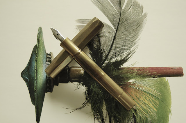
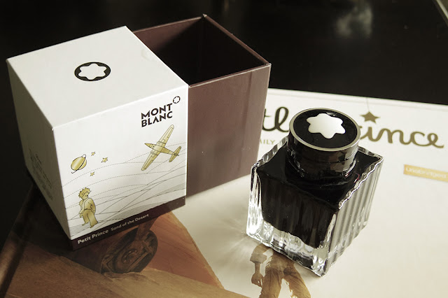
Finally, another variant of the brown ink group I got is my Montblanc Petit Prince Sand of the Desert (limited edition). I got this ink as a gift with my purchase of the Little Prince Solitaire. I had a choice between a lighter brown (I think it is called The Fox) and this darker brown version.
As the lighter version sort of resembles my Sheaffer Skrip Brown, I chose this darker brown instead. I have not really used this ink yet and so I’m using this post as an opportunity for first time unboxing LOL. As with all typical higher-end inks, the packaging is pretty nice with all the matching “whatevers” that it needs to have. This ink will work with my Little Prince Solitaire (and with most blue coloured pens I would think), but, for now that particular pen is using a blue-green ink. Perhaps when I’m ready to use this brown ink I will have the Little Prince Solitaire use it."
Lawrence, thank you so much for the great review and the wonderful photos that accompanied it so well!
