Saturday, November 26, 2022

Photos from our Vancouver Pen Shop get-together/November meeting ~ Part 2

Here's the second set of photos taken during our pen club's recent get-together hosted by the good folks at the Vancouver Pen Shop on November 17th (* see previous blog post for other photos *). This event was held at their store's old location on West Hastings; since then, the store has moved to its new location at 555 Howe Street!

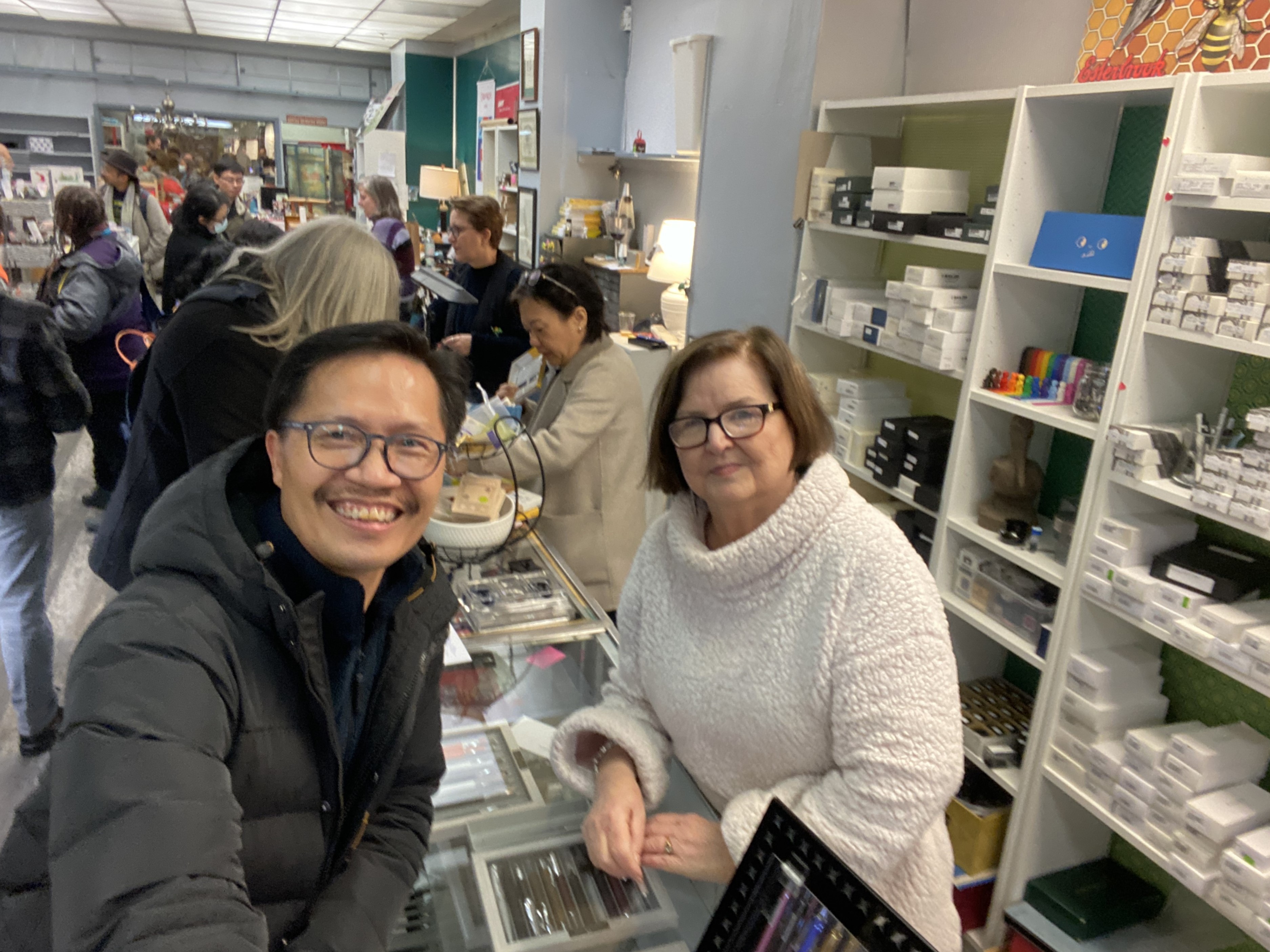
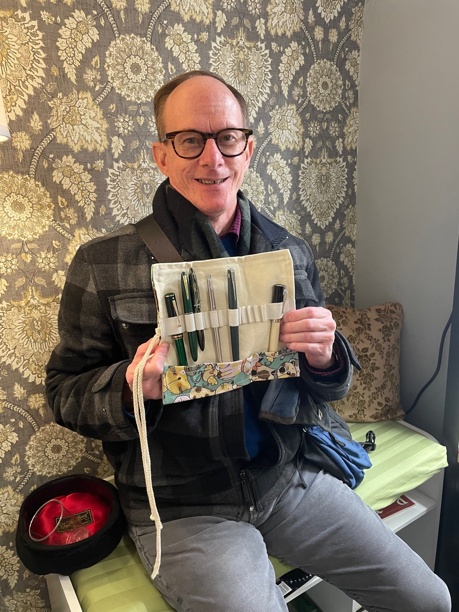
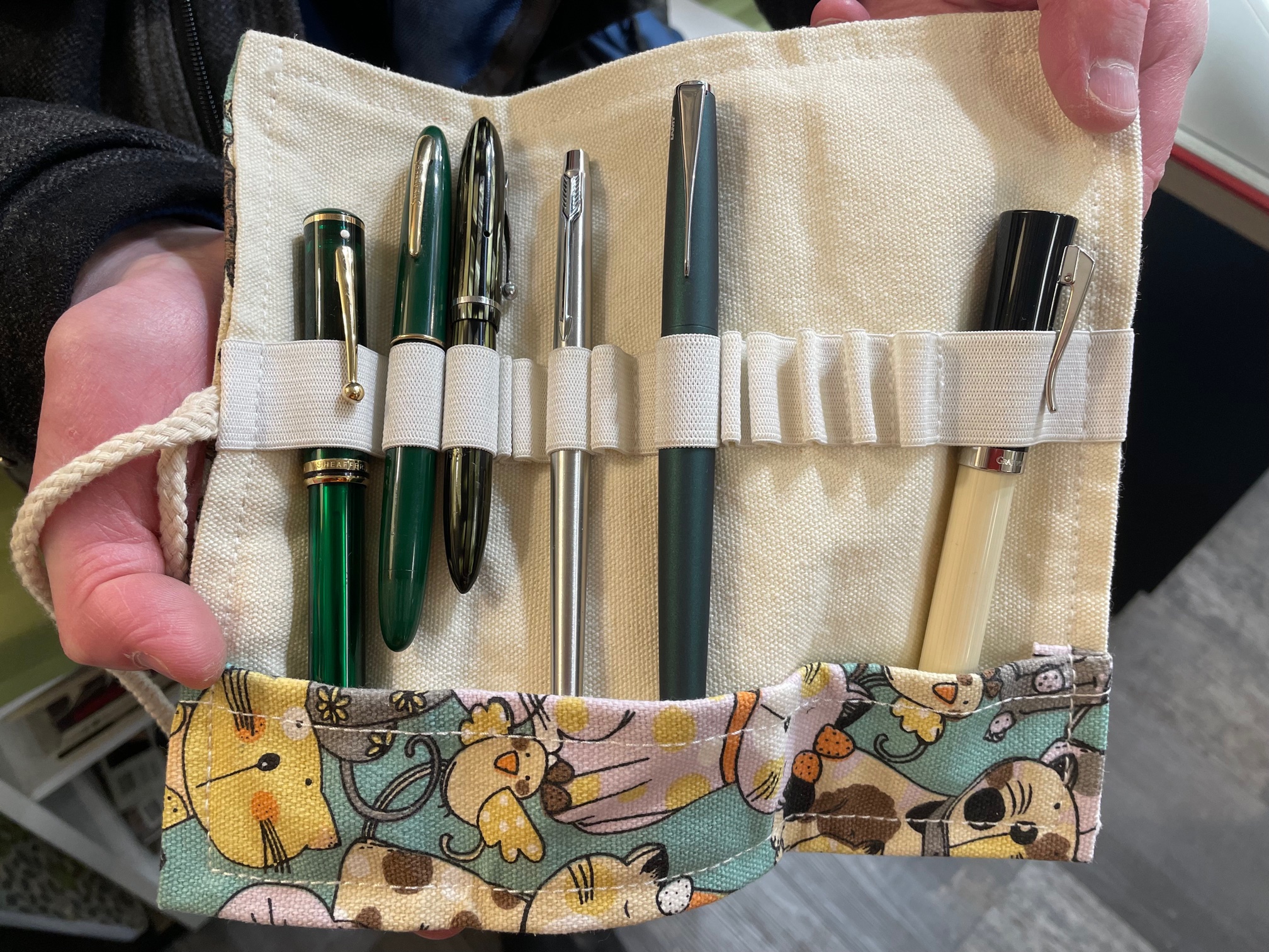
This get-together wasn't like a regular meeting of our club, but a couple of meeting themes were suggested and implemented --"Green Fountain Pens" (store manager Shannon's idea) and "Your Favourite Pen Purchased from the Vancouver Pen Shop"
, which was suggested by a longtime member of our pen club and one of the Vancouver Pen Shop's most loyal customers -- the gentleman you see below... Stuart!

(all photos by Maja, except where noted ~ please click on images to enlarge)
If you've been following the virtual "show & tell" here on our blog, you know that Stuart has purchased many pens and pen-related items from the Vancouver Pen Shop over the years. For our meeting themes, he brought along a few green fountain pens and his very favourite pen purchase from the Pen Shop - the gorgeous Graf von Faber-Castell 'Intuition' fountain pen on the extreme right of the photo below...

Above: (L-R) Sheaffer Levenger Connaisseur in the "Aegean Sea" colour, vintage Sheaffer 'Craftsman', vintage Sheaffer 'Balance', Parker 'Classic' fountain pen (the first pen Stuart purchased from Van Pen... way back in 1988!), Lamy 'Studio' in "Racing Green"(another Van Pen purchase) and the Graf von F-C 'Intuition'. Stuart's adorable cat & bird pen roll was bought at the Pen Shop as well.

(~ photo courtesy of Sherman ~)

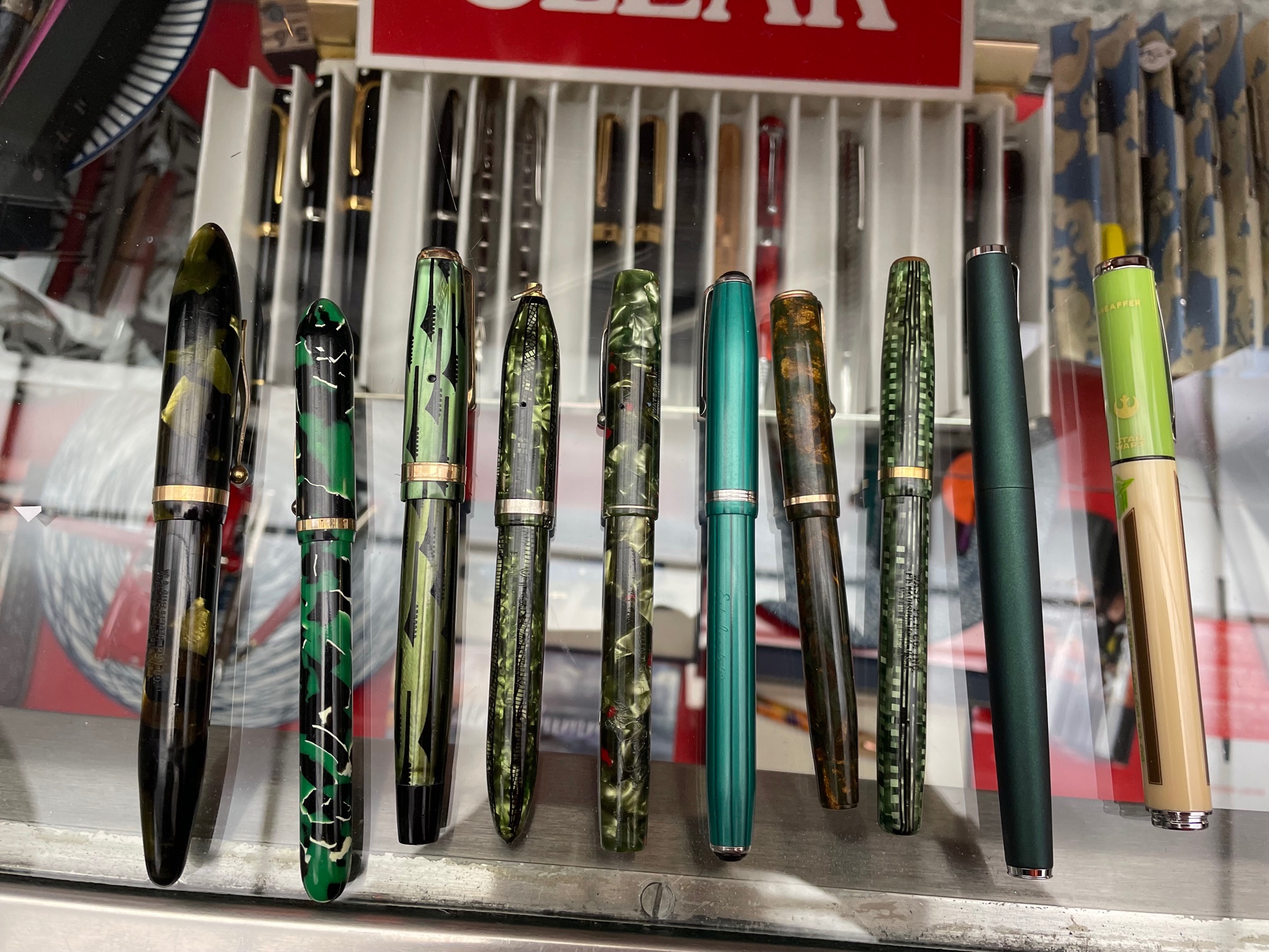
Many thanks to Sherman for sending in this photograph of the pens he brought to the meeting! He was busy taking those great selfies (which I posted in Part 1 of this blog post) and I was busy mingling with our members and the Van Pen staff, so I never got around to photographing them. Along with the photo, Sherman added: "Enclosed please find the green pens that I brought to the event. The Platinium 3776 was for the 2nd theme, to remind that I have bought a Black one there and they wrapped it so nice as I was gifting it. Was so impressed how kind they were."

Photo above (L-R): Platinum President Wine Red, Kaweco Student 60’s Swing, Pelikan Souverän® M400 Black-Green, Visconti Rembrandt Special Ops Limited Edition, LAMY AL-Star Turmaline Special Edition 2020, Franklin-Christoph Model 02 Intrinsic Retro Emerald & Ice, élysée Lyric Rouge (30 Line), élysée Laque Jade (80 Line - Design Line), Conklin Mark Twain Crescent Filler™ Spring Green/Gold Leaf Marble.

Above: Louise's beautiful Rickshaw Bags 8-pen roll (featuring the famous "Great Wave" print by Hokusai)  with some lovely fountain pens peeking out from it, like her new Leonardo 'Momento Zero Grande 2.0' in "Angel Skin" resin (the third pen from the left), and a couple of cheery green TWSBI 'Eco' fountain pens - a "Glow Green" (which glows in the dark!) and a "Jade" model.

Above: A sampling of some green fountain pens that I own---(left to right): a UK-made Parker 'Duofold', Parker '17 Super Duofold', Parker 'Insignia', Sheaffer Lifetime flat top Jr. (ca. 1924-26), Sheaffer 'Triumph 1000 Lifetime'-Vac-Fil, Sheaffer 'Tuckaway', Pelikan M200 matching fountain pen & ballpoint in marbled green, Parker 'Vector XL', Waterman 'Allure', Yiren '405' (an iridescent Lamy Safari "tribute") and a Lamy 'Accent' (with Karelia Wood grip section) that I purchased from Amy that night (thanks, Amy!)

Side note: I purchased the Pelikan M200 fountain pen on April 16, 2002 from the Vancouver Pen Shop (I still have the receipt!) from the late Mrs. Margaret Leveque, who was the store's first owner. She and her husband Paul (who did pen repairs) ran the store for many years, and I clearly remember buying the pen from her and how she mentioned liking broad nibs. The pen has an OB (Oblique Broad) nib, but it's not an italic oblique---it's a round oblique...not something you see every day. I liked the pen so much that I bought its matching ballpoint from Van Pen three months later. Memories!


Rene always has a lot of interesting vintage pens to show during our meetings and these are no exception. From left to right, we have: an Oversized Sheaffer 'Balance' , a colorful pen by E. Faber, a Parker 'Geometric Duofold' (nicknamed the "Toothbrush Duofold" because of its pattern), an attractive Eclipse, a Waterman '4' model, an Esterbrook 'LJ' in the harder-to-find "Icicle" material, a Parker 'Moderne, a Sheaffer WASP 'Clipper' (in a plastic fondly referred to by some as "Circuit board"), a Lamy 'Studio' in "Racing Green" (like Stuart's!) and a Sheaffer ' Pop' Star Wars fountain pen featuring Jedi Master Yoda.

I apologize for the blurry photo above---my camera focused on the pens inside the display case---but this is Rene's Lamy 'Studio' in brushed stainless steel, the first fountain pen he bought from the Vancouver Pen Shop


Here's that stellar new find of Nathan's that I mentioned in Part 1 of our meeting blog post. It's a genuine Montblanc 'M' fountain pen that he recently acquired for a pittance via Facebook. The seller worked on the nib himself, but wound up nearly wrecking it, so rather than paying a small fortune to buy a replacement nib, he decided to sell it. Nathan was the lucky buyer, and after he applied his nib-smoothing/nib-grinding skills to the nib, he made it into a wonderfully-smooth writer.

I love the pen's grooved section and the shape of the 14K gold nib (which is like a semi-wraparound nib). There are knockoffs of this model to be found online, but their nibs don't look anything like the real thing ... and they sure don't write as nicely as the genuine article; this is one stylish fountain pen that's a dream to write with!


Nathan 's leather 6-slot pen case (made of 100% vegetable-tanned leather) that he acquired via Aliexpress...

The pens are separated and well-protected by molded slots so they can't knock against each other and cause damage. The case closes via a hidden magnetic snap, and is available in an assortment of colours.


Here's a closer look at the fountain pens inside Nathan's pen case (bottom to top)---a black  TWSBI 'Eco' that was the first not-cheap pen that Nathan bought on his fountain pen journey (and yes, it was from the Vancouver Pen Shop!), a 3D-printed pen made by Hex Pens in Hong Kong, the aforementioned Montblanc 'M', a vintage OMAS Extra Lucens 556/F, a 'Soyuz' fountain pen made in the U.S.S.R, and a NOS (New Old Stock) 'Chollima Brand' fountain pen from North Korea (!)

Above: a cool 3D-printed ink holder made by Nathan that holds six bottles of Robert Oster ink

And speaking of Robert Oster ink... Here's a writing sample (done by talented calligrapher & Pen Shop staffer Renz) of the special edition Robert Oster ink that was made for the Vancouver Pen Shop's 35th anniversary! The colour's official name is "Vanpen 86", so named because 1986 was the year in which the store opened.

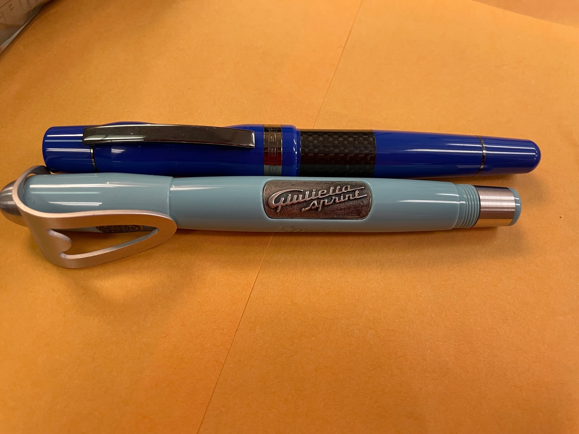
Now for something completely different---two intriguing Delta fountain pens belonging to Jerred (who has an amazing collection of Delta pens--check out his reviews on this site). These new acquisitions are a blue Delta 'Horsepower" (inspired by high-performance European cars) and another car-inspired pen--a grayish-blue Delta 'Alfa Romeo Giulietta Sprint 50th Anniversary' Limited Edition made for the 50th anniversary of Alfa Romeo's legendary "Giulietta Sprint" model (only 954 of the Limited Edition fountain pens were produced).

The pens have some very interesting design features that make them stand out in a sea of fountain pens. The 'Horsepower's' bulbous cap (seen above) is shaped to mimic the lines of a Formula 1 race car when viewed from above, and the pen's barrel has a wide decorative band made of real black carbon fiber (a material widely used in Formula 1 race cars). The 'Giulietta Sprint's hand-crafted sterling silver clip (seen in the photo above this one) was made to resemble the grill work on the original classic 'Giulietta Spirit' automobile.

Here's a much more familiar-looking fountain pen -- Alvin's Platinum 'Century 3776', which he purchased from the Vancouver Pen Shop a while back. It's in the original packaging, which included a Platinum pen pouch. I forgot to photograph the fountain pen that his wife Yen bought at the Pen Shop that night -- a modern Esterbrook 'Estie' fountain pen in the Limited Edition "Maui" material.

I tried to take photos of most of the pens that were brought in by our members, but I apologize to those whose pens I missed. Glenn Marcus (who joined our club a long time ago and was at our club's get-together at Van Pen) has been a regular customer of the Vancouver Pen Shop for many years and wrote a very nice piece on the store on his wonderful website - GlennsPens.com


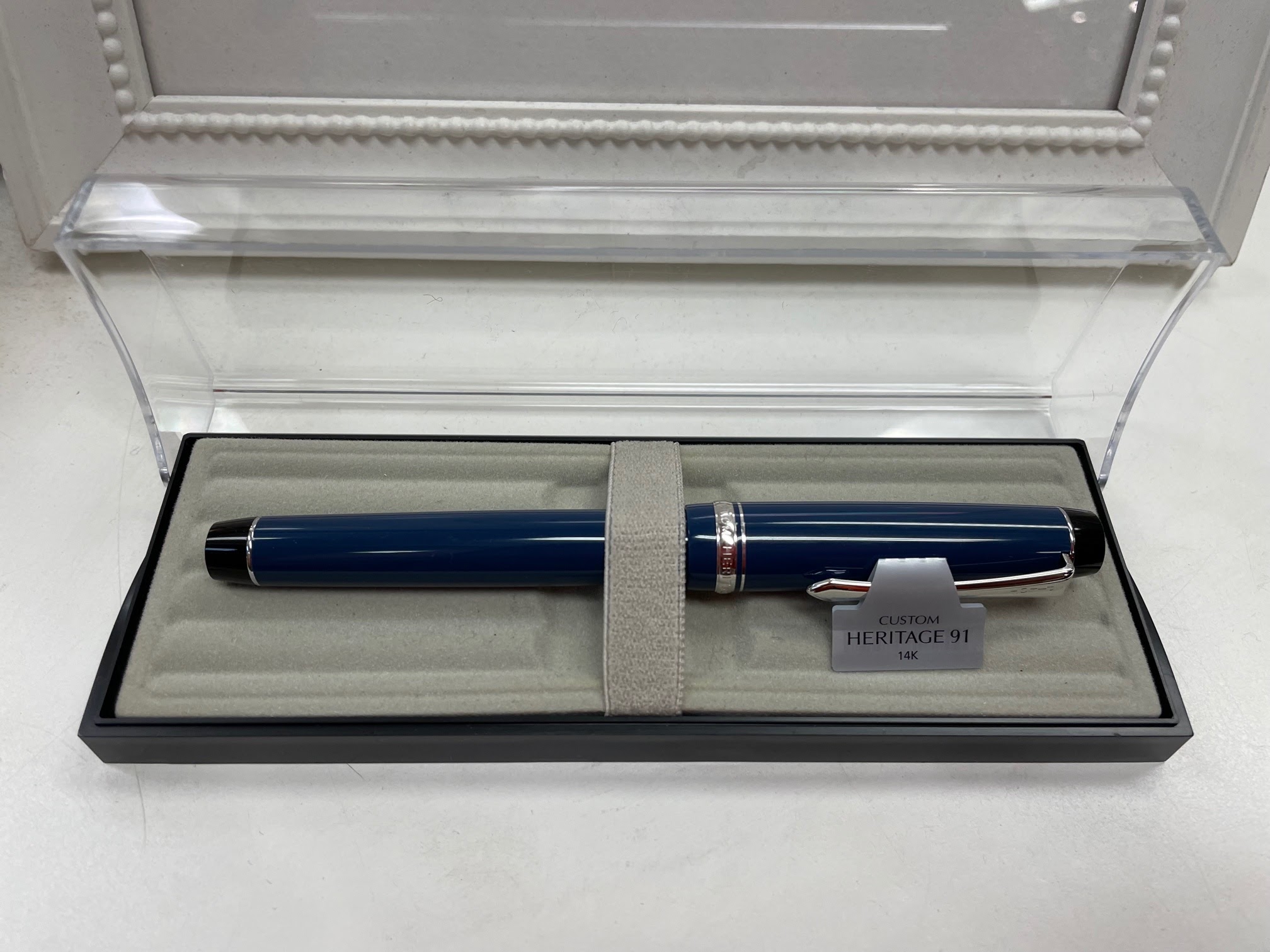
Last, but not least, is the fountain pen that new Vancouver Pen Club member Phil bought at the Pen Shop during our meeting---a handsome Pilot 'Custom Heritage 91'


As the sign above says, the Vancouver Pen Shop's location is now 555 Howe Street (between Dunsmuir and Pender) --they actually had their grand opening on November 23! By all accounts, the new store looks great (and it's more spacious + has more natural light) and it's conveniently located one block from the Expo Line's Granville Skytrain station and two blocks from the Canada Line's Vancouver City Centre Skytrain station. Check it out if you're in the area -- their store hours are: 10:00am - 6:00pm Monday through Saturday.

Once again, our sincere thanks to owner Margot, manager Shannon, the staff at the Vancouver Pen Shop who were on that night ---Fernie, Marlon and Sunshine---and helper Jacqueline for hosting our meeting. We had a wonderful time! 😊

(~blog post & photos by Maja~)

Wednesday, November 23, 2022

Photos from our Vancouver Pen Shop get-together/November meeting ~ Part 1

Many thanks to the Vancouver Pen Shop for hosting our November get-together! I knew it'd turn out to be more of a party than a regular meeting lol, but the party atmosphere was only fitting, as the following day (November 18) was the store's last at this location. Happily, their new location at 555 Howe Street is supposed to open on November 23 (ie. later today)!

VPCer Sherman was kind enough to document the evening with his phone and trusty selfie stick, so here are the photos he snapped last Thursday at our get-together at the Vancouver Pen Shop (thank you, Sherman!!)...

 (all photos courtesy of Sherman ~ please click on images to enlarge)

As you can see, the shop had a full house that night! (I counted 26 VPC members in attendance) 
Our meeting started at 6:30pm and went to nearly 9:00pm. Fortunately, the till was still open for in-store purchases, and a lot of our members took advantage of the store's big sale :)

That's Fernie and Marlon behind the till, in the photo above. The store's owner Margot (wearing a white turtleneck sweater) is to Fernie's right, and ever-helpful Sunshine (who's worked at the Pen Shop for 13 years, I believe) is at the very back of the store assisting customers. Store manager Shannon (wearing a knitted toque, in the foreground of the photo) is trying to duck out of sight lol

Sherman with Margot, the Vancouver Pen Shop's gracious owner...


Above: Jacqueline (who was kind enough to help out that night) and longtime Vancouver Pen Shop stalwarts Shannon & Fernie behind the counter. On the other side of the counter are Rene (peeking out of the photo's left side), Alvin and Sherman. 

Shannon and Fernie started working at the store 27 years ago (there's a nice article on the Pen Shop's history here) and enjoyed looking at some of the pens our members brought in for the evening's themes ("Green Fountain Pens" and "Your Favourite Pen Purchased from the Vancouver Pen Shop"); we'll be featuring some of those pens in Part 2 of our blog post. I forgot to photograph the pens Alvin and Sherman brought in--sorry, guys!--but they're on the counter in Sherman's photo above (update--Sherman sent me photos of the pens he brought; they're in part 2 of the blog post!).

(L-R) Nathan, longtime Vancouver Pen Club member (and loyal Van Pen customer) Stuart and Sherman (note: there's a clearer picture of Stuart in the second set of photos I'll be posting lol)

(L-R) Alvin, me (Maja), Yen, Sam and Sherman standing by the store's front doors; you can see some of the window's Christmas display in the background.

The Vancouver Pen Shop has been at this location since 1986, but due to renovations on this heritage building, they had to move this month. The new location (at 555 Howe St.) is half a block from the Dunsmuir Street entrance to the Pacific Centre Mall, and just one block from the Granville Skytrain station. I can't wait to see the new store!


(L-R) Alvin, Maja, April, Louise, Amy and Sherman. The Van Pen staff thoughtfully provided food for us to nibble on while we chatted and shopped :)

That's our photographer Sherman with Amy (far left) and April, who both joined our club last month and attended the October meeting....

... and that's Sherman standing next to Nathan, who is holding his recent stellar pen find (which you'll see in the second set of photos). New VPC member Phil and Rene are in the background looking at some pens; Phil bought a really nice Pilot fountain pen that night that you'll also see it in part 2 of our meeting report.

(L-R) Sherman, Yen, Liz and Maja. I didn't realize just how much ink the store carried! You can see some of the bottles in the upper right of the photo. Apparently, the store's new location is even more spacious!
Margot in the background talking to one of our members (Linda C, I think) while Sherman, Rene (with hat) and Sam pose for a great photo :)


That's new VPC member Vladan in the middle, flanked by Yen and Sherman. Vladan was brave enough to take on the 2022 Vancouver Pelikan Hub "Hubmaster" duties for this year's event (which was held the day after this meeting). Behind them (talking to Fernie, behind the counter) are (L-R): Phil, Liz, Julienne and brand-new pen club member Sophia.


Our thanks again to the lovely folks at the Vancouver Pen Shop for their hospitality -- we had a blast talking pens, inks & paper with you (and each other) and reminiscing about your wonderful store. We wish you all the very best at your new location in downtown Vancouver!

(The Pen Shop gang posted some more photos from this evening on their Facebook page here
*and* on their Instagram account here that you can enjoy until I post Part 2 of this blog post later this week ;) Update -- Part 2 of the meeting photos posted here!

(~Blog post by Maja~)

Saturday, November 19, 2022

Newest Acquisitions (Virtual "Show & Tell") ~ part 439

A big "THANK YOU!" to the Vancouver Pen Shop for hosting our pen club at their store on Thursday! A wonderful time was had by all who attended 😁

We wish the Van Pen gang all the best as they finish moving to their new location at 555 Howe Street (between Dunsmuir & Pender), with the grand opening scheduled for November 23rd (but please check their Facebook page for any updates). I'm working on a blog post about Thursday's get-together at their old location (which is now permanently closed 😢) ... but in the meantime, here's one of Christopher's newest acquisitions--a vintage fountain pen/mechanical pencil combo in a very attractive material:

(all text and photos courtesy of Christopher ~ please click on images to enlarge)

Christopher begins: "Although there are many different vintage pen/pencil combos, I have found that it is rather a challenge to find one in good condition. Strangely, a lot of them I have run across have been somewhat warped. So when a good one in very fine condition shows up, I am first in line to acquire it."

"Such was the case with this lovely mottled red and black Barrett. Over and above its superb finish, the fittings are 14K gold filled, and on a matching grip section presented is a outstanding Barrett 14K Gold, No.4 flexy nib. Granted, with the pencil option, the pen part of the equation does not hold a lot of ink, but the overall design and condition makes this an item that few vintage pen collectors could pass by.

 This is a flat top from the later half of the 1920s with a tapered ball ended clip. The cap sports several well placed cap bands and there is a rounded jet insert covering 80 percent of the flat top cap. The lever filler pressure bar was interesting, to say the least. When I took the unit apart to restore and service it, I was surprised to find a very short ‘Slide’ pressure bar, which just fit over the rubber sac and in turn with its tabs, slid onto the inside end of the lever filler. It is professionally very well made and served its purpose perfectly. The pencil at the other end of the fountain pen,can be unscrewed from the main part of the barrel. Inside was a good size eraser which, when easily removed, allowed for leads to be loaded into the back of the pencil.

 The unit posts well at either end, at a little over 6 inches but does not decrease in length that much when capped at a little under 5 ¾ inches. Still a pocketable item of very good quality. The C.E. Barrett company was in the business of making parts for other pen companies, but had a strong tie to the National Pen & Pencil company throughout their history. They also supplied fully made pens and pen parts to department stores throughout the US but more or less had had their day by the early 1950s. Admittedly, I do not have very many pen/pencil combos in my vintage pen collection, but this wonderful writing instrument will definitely be allowed to join the ranks."


"Post script: The grip section actually is only matching up to a certain point, because it is black with the red swirls. Truly a nice and thoughtful touch by the manufacturer."

 Many thanks to Christopher for sharing this interesting find with us!

Wednesday, November 16, 2022

Reminder - in-person meeting tomorrow at the Vancouver Pen Shop!


Don't forget our in-person meeting tomorrow - Thursday November 17 - at the VANCOUVER PEN SHOP (512 West Hastings Street, downtown Vancouver) from 6:30PM - 8:30 PM !

Our meeting themes/topics will be "Green Fountain Pens" (Modern & Vintage) and "Your Favourite Pen Purchased from the Vancouver Pen Shop".

SALE!  The shop's annual sale has been extended to November 18, 2022! This will be the last day the store is open at its old location before they move to a new location in downtown Vancouver the following week! (info about new location here)

Tuesday, November 15, 2022

Newest Acquisitions (Virtual "Show & Tell") ~ part 438

 And now for something completely different.... (and wonderful :)

My fellow pen club member Lawrence is obsessed with a big fan of matching fountain pens with certain inks - in fact, he labels his pen-and-ink-matching "OCD". A while back, he mentioned to me that he was thinking of doing a series of blog posts about the inks he likes to use in certain fountain pens. I expressed a lot of interest in this, so he asked if I thought it might be of interest to other readers of this blog. I replied with an enthusiastic "Yes!", so a few weeks later, he sent me the following text and photos. I hope you enjoy reading about the inks Lawrence uses in his fountain pens as much as I did :)

(all text & photos by Lawrence ~ please click on images to enlarge)

"Okay, so this is not a review, but it may fall into the category of "crazy show and tell".  I'm not sure if I'm the only person that "practices" this pen-ink-matching quirk.  I will be curious to see if other people in the club do it, and what kind of matches they come up with.  I tend to organize my inks into colour groups and that will be the format in which I will present this multipart post.

The first group is what I called my "childhood nostalgia" inks.  These are inks that I used in school or have colours similar to this.  The "cult-leader" of this group is my faithful Parker washable blue:


And the inks in this group are sort of variants of this color:


It's the most basic of basics.  No nonsense type of ink.  And this is sort of in my mind what I think of the color "blue" in general. 

There are variations of this group that I sort of lump together. One of them is the indigo-ish variant that S.T. Dupont has:


Compared to the Parker, this is a bit more "violet" (???).   And the other extreme is the blue-black variant; Parker Blue-Black (which is not featured here) is one example. 

The one I do have featured though, is the Caran D'ache ink:


So, this entire group contains ink colours that I used in school (these are also the main group that the school will allow and "blue-black" is already pushing it for those students who want to be "edgy" LOL).  And, of course, the main pens that I use with them are my "nostalgic childhood" ones:

Yes, they are all Parkers. Starting with the Parker 95 from the left, the two 45s in the middle, and my most precious possession: the Parker 21 (my "default school pen"). I can review some of them in the future perhaps. I match them with this nostalgia blue because they are indeed from my childhood and maybe psychologically I am already hard programmed that they will only use the nostalgia blue. Sometimes I will try black ink in them, but rarely. I feel "safer and comforted" when they write in blue LOL.

I do have some modern pens that I write with using this ink group:

 
The Faber Castell Basic (left), a Monteverde Artista, and a MB "tribute" pen.  The Monteverde, because it's a demonstrator, can get away with a lot more colors than the other two.  So, in the other pen-ink installments, the demonstrator pens may appear again.  

Both these groups of pens are predominantly silver / chrome pens (that Parker 21 however is mainly blue-green, but it also happens to rule my world so it gets away with it LOL), so matching them with this blue shade works well.  I do try other colors with these pens, but I always come back to this combo. 

There is another blue group that I will probably work on next, as it's related to this post."


Lawrence - thank you so much for this :)  I'm really looking forward to another installment of your pen & ink matching series, sometime down the road!

Sunday, November 13, 2022

Newest Acquisitions (Virtual "Show & Tell") ~ part 437

I always learn something from Christopher's vintage pen reviews, and this one is no exception. Our thanks, as always, to Christopher for sharing his knowledge of vintage pens with us!

(all text by Christopher)

"When is a Waterman 52 that looks like a ripple, not a ripple? Well, I do not think that it is common knowledge that the Waterman Company varied their red ripple vulcanized rubber finish with a just as attractive vulcanized rubber ‘Woodgrain’ finish. In fact, I have on occasion seen images listed with a red ripple finish, when they are in fact the woodgrain finish. The difference is usually a deeper red/orange and instead of the ripple swirls, vertical and or wavy lines much like the ones on a piece of wood. I believe, although I could be mistaken, that the Waterman woodgrain finish from the later twenties period is rarer still and, subsequently, not exactly easily to find."
(photo courtesy of Christopher ~ please click on image to enlarge)

"This fine Waterman pen came to me with another unusual feature. Usually, the Waterman 52 ½ is accompanied with a V. The 5 refers to the pen being a lever filler, the 2 is the nib size, while the ½ means that the pen is slim or slender and, finally, the V indicates that the pen is a short one in length. But, this Waterman which has come to me has a 52 ½ imprinting on the flat end of the barrel with no V. And most short ribbon ring tops are made short, with a lady in mind or to slip into a gentleman’s vest pocket. But my newly acquired pen is all of 5 ½ inches capped and a full 7 inches posted, but sporting a short ribbon ring on the top of the cap. Personally, I like this unusual combination which has, as far as I am concerned, an unmatched elegance, if you add the lovely woodgrain finish.

Overall, the pen is in just remarkable condition and in restoring and servicing it, I am convinced that it was never used. Even the Waterman’s IDEAL branding imprint on the barrel has the remains of its original white colouring embellishment in the letters. The fittings are 14K Gold Filled and on a matching woodgrain finish grip section is one beautiful flexy Waterman Ideal No.2 14K Gold nib. This is a Canadian Waterman product, which probably had its roots in the Toronto Waterman plant. One nice pen which I am already using in my pen round up for the week up and coming."


Wednesday, November 9, 2022

Newest Acquisitions (Virtual "Show & Tell") ~ part 436

Don't forget our November in-person meeting next Thursday --November 17-- at the Vancouver Pen Shop --all details here!

In the meantime, here's a nice write-up about one of Christopher's newest acquisitions--a handsome vintage British fountain pen--and the presentation box he made for it....

Christopher begins: "I think we can call this one.....’Onoto Just For Fun’..."

He continues: "Quite honestly, I was not that familiar with Onoto fountain pens until just recently. What’s more, at first glance, I thought their manufacturer hailed from France. The name Del a Rue certainly had that ring about it. Still, Mr. Thomas Del a Rue was a master printer who emigrated from Saint Peter Port on the island of Guernsey to London, England in 1821, where he set up a high quality printing business which flourished for many years. In turn, it cornered the local market for the reproduction of currency and postage stamps. With the strength and success of his printing, in 1906 he turned his attention to writing instruments, amongst other things. Above all, though, his focus --as it had been with commercial printing-- was to produce a high quality self-filling fountain pen. To this end, he introduced and had patented an advanced fountain pen pneumatic filler. He also chose a name for his line of pens that was both unique and catchy. The Onoto pen or, as he branded it, ‘The Pen’ caught on and stuck around until 1958. Quite a lengthy run for any line of writing instruments."
"More recently, I stumbled across a Del a Rue Onoto, but a pen produced by the company in its twilight years. Dated circa 1954, with the Del a Rue code number of 16, this pen sports a lever filler. Shiny jet black in colour, but far from a plain Jane, I was immediately impressed with the quality. The fittings are 14K Gold filled and although there is an absence of the original ball ended clip (which I will replace in time), a very attractive Atkin Lambert, Mercantile accommodation clip sits well on the pen’s cap. The grip section is matching in finish and houses an exquisite Warranted Del a Rue branded flexy 14K Gold nib. Admittedly I was a bit confused that a so called Warranted nib would carry a manufacturer’s branding, but found that in the UK this was often the case."

"Now when I labeled this text ‘Just for Fun’, this is definitely where my fun began. I wanted to have a suitable pen box for my new acquisition and to this end, had a mid 1930s pen box that was perfect for my interest. It had no box top label so I sourced a suitable Del a Rue, Onoto label on the internet and printed out a label which just complimented the box top perfectly. For the inside of the box lid, I chose a midnight blue card stock and cut it to fit into the box top but at the same time, I wanted this inside area to house a Del a Rue, Onoto printed piece of ephemera. So I cut matching midnight blue cloth ribbons and attached them in place to hold the Onoto ephemera. I, in turn, used an acid-free book binder’s glue to mount the inside box top insert. Once this was effectively done, I sourced a suitable Del a Rue, Onoto printed piece of ephemera and printed it to size, and folded it to fit into the inside of the box lid. And just to make it more in keeping with the period, I stained the paper stock ephemera with several bags of British Breakfast tea.

Next, I turned to the box bottom and made a insert tie down card with a suitable angle to show off my lovely Del a Rue, Onoto. This I covered with the same midnight blue card stock as the box lid insert. Then, it was simply a mater of punching the holes for the elasticated tie down cord to hold the pen in place. As a final touch I sourced, once again on the internet, a Del A Rue triangle logo and cut and glued it into a complementary spot on the lower right side of the box tie down card insert. Although this pen case is far from original, it is extremely satisfying and sets off and protects my brilliant Del a Rue to perfection. In time, I will enjoy using this pen but, for now, it will join the other vintage pens in my collection." 

Nicely done, Christopher :) Thank you for the photos and review of your latest vintage find!

Saturday, November 5, 2022

Newest Acquisitions (Virtual "Show & Tell") ~ part 435

Happy November, everyone! I've been meaning to do a proper review of this one for a while....

Inspired by the beauty of gemstones and semi-precious stones, the Pineider 'La Grande Bellezza - Gemstone' line was launched in early 2018. The pens were made in Italy at Pineider's factory near Firenze (Florence) and designed by the legendary pen designer
Dante Del Vecchio, one of Visconti's co-founders.

(~please click on images to enlarge~)

Background:
After leaving Visconti, Signor Del Vecchio became the head of the pen department (his official title is "Pen Expert") at Pineider and, within a few months, produced the Pineider
'Grande Bellezza' Limited Edition (LE) in 2017. This was the one of the very first Pineider pens made under his stewardship. A total of 774 'Grande Bellezza' LE pieces were produced, each pen having an MSRP of $798 USD. The pen was available in two colours ("Dolomite Green" and "Sunset Red") and sported a two-tone 18K nib. The "Grande Bellezza - Gemstone" (the pen I'm reviewing today) is a descendant of this LE, but it was made of a different type of material and came with a brand-new 14K nib (also designed by Dante Del Vecchio) --the Pineider 'Quill' nib.


The Pineider company was founded in 1774 by Francesco Pineider and started out as a maker of luxury stationery, opening its first shop in the Piazza della Signoria in the heart of Florence (Firenze). 
Pineider paper is still made using traditional methods, and the company obviously takes great pride in their products (the Pineidor logo & crest are everywhere on the packaging above--debossed on the outside of the box and printed on both of the box's inner flaps). Their fine stationery was used by Italian nobility, Napoleon, Elizabeth Taylor, Maria Callas, Rudolf Nureyev, Lord Byron, Charles Dickens & others, and is available in stores around the globe.

My pen came in this lovely dark green, hinged, leather(ette?) gift box (which resembles a portable writing desk) that's lined with a very soft, cream-coloured material. The box came with the pen's warranty and a
sampling of Pineider's luxurious stationery, consisting of six cards with matching envelopes. I was curious as to the cost of the stationery, and discovered that a set of twelve cards with matching envelopes retails for $45 here in Canada.

             My Pineider 'La Grande Bellezza - Gemstones' fountain pen in "Lapis Blue"
 

The Italian phrase "La Grande Bellezza" translates to "The Great Beauty" ... and wow, is this pen beautiful! The writing instruments in Pineider's 'Grande Bellezza - Gemstones' line are made of a resin-based material with a high percentage of marble dust (per this Goulet Pens video, the marble dust content is around 30%). The marble dust is incorporated into the resin for several reasons--to create a harder compound that allows the pens to be polished to a high gloss, to add more weight to the pens (giving them a nice heft) and because it can be dyed to the desired colour(s). The "Gemstones" line consists of fountain pen, ballpoints and rollerballs in "Stone Black", "Hematite Grey","Lapis Blue", "Malachite Green", "Rodolite Red", and "Tiger's Eye" .

The model uses a new magnetic closing system (Pineider's patented Twist Magnetic Lock) for capping and posting, as well as uncapping the pen; twisting the cap of a capped pen a half turn causes the magnets in the cap & section to repel each other, gently pushing the cap off. Not only does the magnetic system allow for faster cap removal, but it also prevents the barrel from being scratched, as it can be with friction-posting.

The pen weighs 38 grams when capped, 23 grams uncapped, and is approximately 5.5 inches/14 cm capped, 5 inches/12.7 cm uncapped, and 6.4 inches/16.3 cm posted. It fills using a cartridge/converter system and comes fitted with a Pineider-branded standard international ink converter.

The elegant, hourglass-shaped metal section is highly-polished and very smooth, but is textured at the nib end; one reviewer suggested that this was done to prevent the user's fingers from slipping and touching the rough edge of the magnetic ring at the very end of the section.

I find the section very comfortable to hold and not slippery; your own experience may vary. I love its ergonomic design and how its weight moves the center of balance to the nib end. I prefer to use this pen unposted as I find it a bit too long to use posted; the unposted pen has a nice weight to it, and feels really good in the hand.

The graceful, spring-loaded metal clip is made of highly-polished marine steel, and its feather/quill shape is both a tribute to the early days of writing and Pineider's origins as a maker of fine stationery. The clip is designed to clip onto thick materials and works well with just the right amount of tension. The underside of the clip is also smooth, which facilitates unclipping.

All modern Pineider fountain pens have a feather/quill-shaped clip and the clips differ from model to model.
After watching a video interview with Mr. Del Vecchio, I found out that Pineider clips are designed with the end users of the particular model in mind--e.g. more modern-looking clips are used on pens which might appeal to younger users.

The cap's finial is a subtly-domed silver disc with a lightly-textured surface that features the Pineider name in raised cursive. I didn't photograph the metal finial (disc) on the barrel end of the pen, but it's flat and smooth. The fact that the barrel finial isn't also domed and textured like the cap finial bothers some people but, surprisingly, not me - the Queen of Symmetry lol.

The cap band is textured like the end of the pen's section, and has the Pineider name in raised cursive on the front. I expected the back of the cap band (photo above) to have the words "Firenze - Italy" or perhaps the model name on it, so I was surprised to see the world's most famous pangram -"the quick brown fox jumps over the lazy dog"--there instead! Some people really dislike this embellishment, but (a) it's on the back of the cap band, so it's unobtrusive and (b) this is a pen that was designed for fountain pen lovers---it has a special nib on it, and its clip looks like a quill --- so why not put something on the cap band that's associated with writing with a fountain pen (and, specifically trying a new fountain pen for the very first time)? Well, those are my thoughts, anyway...

Onto the nib now!
The first thing you probably notice is that the nib has a cutaway design -- deep notches that enhance the nib's flexibility. In addition to being functional, I think it looks very cool :)


                                                       The Pineider "Quill" nib

This special nib was designed by Dante Del Vecchio and is made of 14K gold, which is either rhodium-plated or palladium-plated (I've seen it described both ways). According to well-known pen retailer Joost Appelboom, the nib's unique breather hole is shaped like a burin handle, part of an engraving tool traditionally used by Pineider's craftsmen. The Pineider name and crest are beautifully engraved on the nib and bracketed by some nice scroll work, and below the Pineider name are the words QUILL NIB and 14KT 585 in block letters. The nib was made by Bock and is available in XF, F, M, B and Stub (1.3mm) widths. The nib and its plastic feed are part of a nib unit that screws in and out of the section.

So, how does it write? Well, my particular pen has a Fine nib on it... and thank goodness I tried the pen before I bought it because it lays down a very wide line *and* it's very wet (I almost bought a red version with a Broad nib on eBay - I'm so relieved I didn't!) In the Goulet Pens video introducing this model, it was mentioned that the wider Quill nibs seemed to have less line variation. Speaking of which...Despite the fact that the nib is referred to by Pineider as the "Hyperflex Quill" nib, the amount of line variation I got from mine isn't anything like that from a vintage "wet noodle" nib. According to Mr. Del Vecchio, however, that wasn't the purpose of the Quill nib. It is, however, a very soft nib--as it was designed to be--- that has a lot of bounce to it, and it writes very smoothly.

The pen's retail price (MRSP: $498 USD) is admittedly hefty, but I got mine for a fraction of that thanks to the great deal I got from my fellow pen club member Jerred. Now, I just realized that Jerred did a review of the same pen--ie. the one I bought from him--in July 2021! He did his review before he fixed its nib, though; the nib worked beautifully by the time I bought it from him. Anyway, many thanks, Jerred, for this gorgeous fountain pen! This might just be my favourite new pen of 2022 (so far ;)

( ~ photos and review by Maja ~ )