Thursday, December 31, 2020

For whom the bell tolls...

It's not a new pen-related acquisition, but it's the 80th anniversary of these two classics, so here are some photos of them, courtesy of longtime VPC member Stuart...

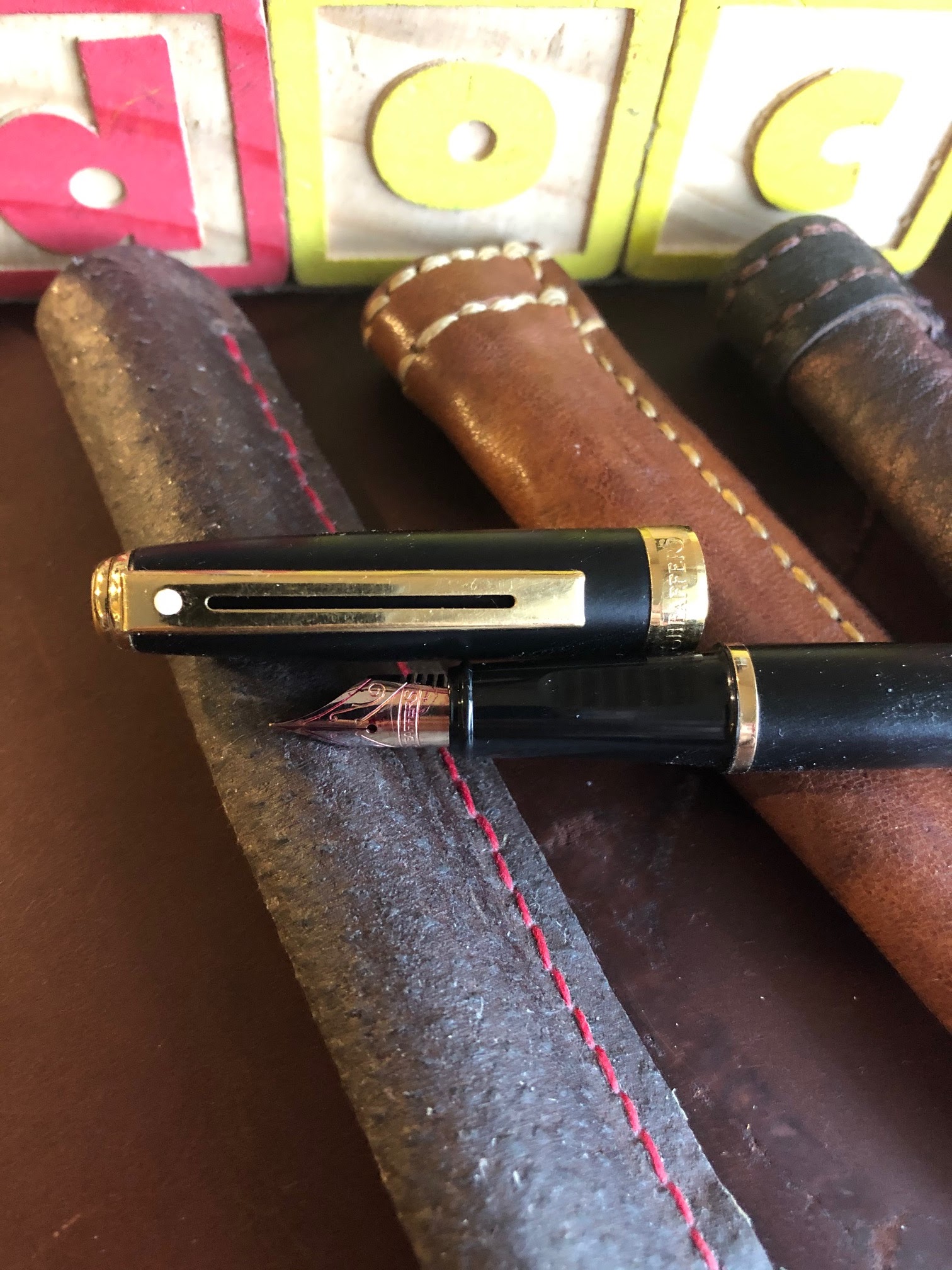
Stuart: "Here’s a couple of shots I just did for the heck of it - two classics from 1940.  The pen is a Sheaffer Balance with the military, or service, clip, in Golden Brown Striated celluloid.  It’s a marriage of a White Dot barrel and nib with a Feathertouch's cap, used in place of the damaged original of the same size and colour."

(please click on photos to enlarge)

Stuart: "The book is a first edition 1943 printing - the book appeared in 1940.  As you can see the dust-jacket is well-worn but it’s all there, and the book is a good reading copy.  The second shot shows the cover’s reproduction of Hemingway’s great signature!"


What is a military clip, you ask? Well, it's a type of clip that allowed its user to carry a pen or pencil in the shirt pocket of a military uniform while adhering to the following regulation:

Soldiers will ensure that articles carried in pockets do not protrude from the pocket or present a bulky appearance. — U.S. Army Regulation AR670-1, paragraph 1-9a(1) 

From RichardsPens.com:
"Sheaffer’s military clip (U.S. Patent No D123,485), used on Balance models, is an inspired piece of design. By extending the clip and wrapping it over the top of the cap so that it mounts on the back side, Sheaffer maintained the streamlined look that had characterized the Balance since its inception a little over a decade earlier. The new clip, because it is not attached to the front of the cap at all, allows the pen to sit lower in the pocket than any competing design."

The book's title was inspired by these lines by John Donne (1572-1631) from "Meditation 17" of "Devotions upon Emergent Occasions":

No man is an island,
Entire of itself.
Each is a piece of the continent,
A part of the main.
If a clod be washed away by the sea,
Europe is the less.
As well as if a promontory were.
As well as if a manor of thine own
Or of thine friend's were.
Each man's death diminishes me,
For I am involved in mankind.
Therefore, send not to know
For whom the bell tolls,
It tolls for thee.

Donne is, of course, talking about the interconnectedness of humanity, something that's often forgotten as we go about our busy lives... until a global crisis like COVID-19 comes along. This year will be remembered primarily for that terrible pandemic, but 2020 is (finally!) drawing to a close tonight. Let's hope the New Year 2021 is kinder to us all.

My heartfelt thanks to my fellow Vancouver Pen Club members for their enthusiasm, support and contributions to our meetings and online "show & tell" this year--this club wouldn't be what it is without you!
Warmest wishes,
~Maja
Vancouver Pen Club President

Wednesday, December 30, 2020

Newest Acquisitions (Virtual "Show & Tell") ~ part 128

Have you noticed how many pens with rose gold trim were released in the last year or two?

The popularity of rose gold (and I'm referring to the colour here, not necessarily the material, which is actually an alloy of yellow gold, copper and silver) has waxed and waned in popularity over the decades. Many think its most recent rise in popularity is due to Apple's launch of the rose gold iPhone 6S line in late 2015. I've certainly noticed a lot more pen manufacturers using it now, both as a trim and nib colour option

I'd subscribed to their newsletter a few months ago, so when I got an email from Buchan's Stationery about their Black Friday sale in late November, I immediately placed an order for not one, but three new pens with rose gold trim :) Here are some quick shots of them....

(all photos by Maja ~ please click on images to enlarge)

My Buchan's "haul" from their (week-long) Black Friday Sale, November 23rd-29th

Rose gold - the trim of 2020!

(Above) My two new Caran d'Ache '849' ballpoints (I think I'm developing a soft spot for these little ballpoints...). The '849' is a Swiss-made, all-metal pocket ballpoint that was first produced in 1969. They come in a huge variety of colours and designs, but all have the same iconic hexagonal shape. Although they come with a Caran d'Ache  "Goliath" ballpoint refill, you can also use a Parker-style ballpoint /gel refill in them, or the even-more economical Caran d'Ache "Swissride" ballpoint refill.

(Above) Caran d'Ache 849 "Brut Rosé" ballpoint. From the official Caran d'Ache website:

"The new version of this iconic Caran d’Ache’s pen is superbly elegant, distinguished like a fine wine, lively as a birthday party, yet always refined and gentle. Its name: 849 Brut Rosé. Its secret: a heady pink gold colour that sparkles with the pleasure of writing.

Exhilarating like a gala evening, delightfully chic and deliciously trendy, this is the 849 at its most glamorous. Sparkling with femininity, this new version of the famous pen from Caran d’Ache has so much to love. Firstly its colour. A pink that’s as precious as gold. Both dazzling and dignified, the bronzed pink captivates the world of fashion.

The 849 Brut Rosé stands out with its iconic shape that sits so comfortably in the hand, and also with its presentation, the famous “so slim, so glam” slimpack that flatters its graceful silhouette. Ideal as a gift, it is a must-have accessory for women who aim for elegance in every detail. The 849 Brut Rosé embodies the slightly flirty femininity of the truly confident woman, combining a light dusting of glitter with discreet refinement."

Wow.


(Above) Caran d'Ache 849 "Alexander Girard" Check Stripes pink" Special Edition ballpoint.
I first saw this design this summer, after Stuart got its black & white "Double Triangles" counterpart. I loved the black and white design, but I was on bit of a rose gold "kick", so I ordered this version. The pattern on mine is one that Girard used for decorative panels.

(Above) Parker 'Jotter XL' ballpoint in rose gold. In 2018, Parker introduced a larger version (7% larger, to be exact) of their classic 'Jotter' ballpoint called the 'Jotter XL. It has both a longer body and a wider grip. It may be be more comfortable for some users, but I find the regular Jotter size is fine for my hands.


Total pre-tax price for all three (deeply-discounted) ballpoints was $100 CAD, including free shipping via Purolator- a great deal on three wonderful writing instruments. Many thanks to Buchan's for their fast shipping and excellent customer service!

~Review by Maja

Monday, December 28, 2020

Newest Acquisitions (Virtual "Show & Tell") ~ part 127

Continuing on with Daryl's newest acquisitions and projects, starting with this nice wooden pen stand that he made...

(all photos courtesy of Daryl ~ please click on images to enlarge)

Daryl: "The wood is red oak. A simple wood prototype before ‘fancy’ woods." 


Daryl: "The ballpoint the left is a Sheaffer sterling silver with a safety clip.  The retract mechanism is built into the pocket clip, such that to pocket the pen, the clip is rocked back and the point retracts, rock the clip forward (which can't be done if the clip is in use) and the point extends.  For some reason I find this very clever! The other pen with the knurled cap is a Monte Mount ballpoint that Wendy ordered on AliExpress.  A very attractive pen with a Montblanc flair."


Daryl : "A memo pad from faf (purchased at Stylus in Edmonton by my son). It is to be used in a holder with binder screws, which I need to make this week. Pages are perforated. Paper is very nice to use. From https://exaclair.com/brands_exacompta_FAF.php :

"FAF (Fabrique en France) metal desk pad is made in Paris in a workshop built by Gustave Eiffel (of eponymous Tower fame.) The FAF pad is a practical and highly functional desk pad with a unique vintage look. It is practically identical to the original FAF pad first manufactured in the 1920s" 

Daryl: "Btw - Stylus in Edmonton is a real treasure (I haven't been to any pen stores on the east coast, but I was impressed)."


 Daryl: "Four images of Elemental notebook. The notebook is super high quality; true to its name, Uranium, Tomoe River paper, cross grid marks, painted edges 'glow' in UV light, two different coloured bookmarks, silver cloth hard bound, and with a hard slipcover. See the description for all the details-https://elementalpaper.com/

Daryl "I'm very pleased to have this.  Although it might be a 'second' as the slipcover is "backwards" (take a paper jacket off a book, turn the book upside down and put the dust jacket back on the book to sense what that means - the cover of the jacket opens to the back of the book - feels 'odd'), and the cover lacks finger cutouts.  Considering all the other details, these are very rough edges :-)"


(the paper's grid marks glow under UV light....


...as do the painted edges!)

Incidentally, the clip on Daryl's sterling silver Sheaffer ballpoint (mentioned earlier in this blog post) is the company's famous "Reminder" clip, first introduced in the 1960s (they're still using it in some current models

Our thanks to Daryl for his contributions to our online "show & tell" and to all our pen club members who sent in photos and reviews of their newest pen-related acquisitions this year. We're up to part 127 of our virtual show & tell, and we're going to keep going in 2021 until we can meet again safely in person!

Saturday, December 26, 2020

Newest Acquisitions (Virtual "Show & Tell") ~ part 126

 I'm always amazed at the creativity of our pen club members--for example, Daryl made these cool pen holders out of old children's wooden blocks that he drilled out and glued together:

(all photos courtesy of Daryl ~ please click on images to enlarge)


Daryl: "The wooden blocks were simply glued with a proper wood glue.  One heads up - the blocks are different sizes from different makers.  Not a big deal.  A drill press will give you more consistent results, but you might prefer the random look of a hand drill. Add a cloth or leather pad to the bottom.  Again, wood glue is fine.  The material cost is $0, so give it a try.  A fun and quick project."

He also made the leather single-pen holders shown above...

"Value Village had some leather jackets and pants that I picked up for the material and to make small projects.  Some turn out ok, others not so much.  And also, some of the leather is really hard to get even novice results.  Again, easy and quick (would be even quicker if I knew how to use and had a sewing machine)."

Daryl said that the fountain pens in the wooden block pen holders are "...the pens I've inked most every day (Photo above, left to right); Lamy Studio with Bobby architect nib, Sheaffer 'Snorkel' from 1952 (both were gifts were from my son), Sheaffer 'No Nonsense' with Fine stub, and colorful Moonman (N2 model)".

Taking a closer look at some of the pens above.....

Above: Lamy 'Studio' fountain pen with "Bobby" architect nib--Regarding this exotic nib, Daryl says: "I'd like it to be smoother on paper, although I use it daily so it can't be too bad."


Above: Moonman 'N2' model pocket fountain pen in colourful acrylic
"It's about the same size as a Kaweco Sport; a little small for me but it was ordered for Wendy, who loves her Kaweco 'Al Sport'.  Story there was it had been on order for so long I'd forgotten all about it until it arrived.  I think it was slightly over 90 days if I remember rightly.  A fun pen."


Above: Sheaffer 'Prelude fountain pen
"The Prelude is from Vancouver Island (via Canada Post in April);  B nib was too broad and wet for me; Margot at the Vancouver Pen Shop had a F nib in her old stock." As with the Bobby architect nib, Daryl says he'd "...prefer the Fine nib to be smoother on paper, but I use it every day so it can't be too bad :-)"

Part 2 of Daryl's new acquisitions to come in the next blog post! Many thanks to Daryl for sharing with us :)

Thursday, December 24, 2020

Newest Acquisitions (Virtual "Show & Tell") ~ part 125

It's been called the most magical time of the year, so on that topic...

Today's featured new acquisitions are courtesy of Lawrence, who sent in lots of photos and a
nice write-up about his new Montegrappa 'Harry Potter' fountain pen duo... 

 (all photos courtesy of Lawrence ~ please click on images to enlarge)


Lawrence:  "They both have stub nibs (1.1mm) and I got them thinking that they will be "fanboi collection" items, without any real intention of using them regularly like my other pens. I never had luck with stubs and I was not expecting much out of these. However, after a change of ink, they both wrote beautifully, smooth and wet.  I have another Montegrappa that wrote dry, and these were initially like that (I had filled them Sheaffer Skrip brown ink), but after filling them up with Pilot Iroshizuku, they behaved like totally different pens. I may change my mind and use them a bit more now."


"I got them both in the largest nib sizes that is available (in this case, it was 1.1mm), because I feel that the stubs give it a very "quasi-pretend wizarding world fancy writing vibe" (I know-fanboism again...).  The pens come in extra fine, fine, med, broad, and stubs. Oh, and the nibs are the normal Montegrappa nibs (I imagine that if they designed a special nib for this the price will probably shoot up)." 


"I got the matching pen cases for them, nice good quality leather ones."

 "There are five variants, Hogwarts and the four wizard houses.  They are all basically the same design but with different embellishments."

"I got the "Hogwarts" pen first, and after much thought (maybe, like, 10 minutes), I got the "Ravenclaw" pen as well.  Iguanasell was having a sale at the time and they were both almost 25% off. Not really a no-brainer (because they are still not what I call cheap), but I can't help it.  Montegrappa also made corresponding inks to go with them, but it's just a simple bottle with the Harry Potter label, so I did not bother with them, as they feel like an afterthought."

 (above) The "Hogwarts" model


(above & below) The "Ravenclaw" model (the writing sample is using the Hogwarts pen inked with Pilot Iroshizuku "Ku-jaku", a peacock blue ink) 


"I think Montegrappa did a pretty decent job not making them look cheesy. I like that they put a lot of effort into the little details like the emblems on the cap and the clip.  They are tame-looking enough that I am comfortable using them in a lot of settings."
 
 
"Ravenclaw" model cap top
 
 
"Ravenclaw" clip emblem 


                                "Ravenclaw" cap


"Hogwarts" clip emblem 


 "Hogwarts" cap detail
 
Many thanks to Lawrence for his photos and review of these two cool fountain pens! 

We'll continue to post our members' newest pen-related acquisitions into the New Year, so VPC members---please keep those photos and reviews coming...and thanks in advance!

Tuesday, December 22, 2020

Newest Acquisitions (Virtual "Show & Tell") ~ part 124

A few months ago, our friend (and honourary VPCer) Glenn in Australia acquired two Lamy 'Al-Star' SEs (Special Editions) - the 50 Years of Design SE & 2018 Chinese Year of the Dog SE. A few weeks ago, he ordered the Lamy 'Al-Star' Gold fountain pen....
 
(all photos courtesy of Glenn ~ please click on images to enlarge)
 

Glenn: "This pen is a bit of a puzzle, given that it is described as a special edition variously for European, Asian, UK and goodness knows what other markets.  It’s also a bit of a challenge to track down at a reasonable price; several sellers from whom I sometimes buy Lamys don’t have it, and it’s not clear if that’s because they never did or they are sold out.  The latest place I found it was at Cult Pens in the UK, where it appears to be a newly stocked item, whereas I bought mine from the remaining stock at Appelboom in the Netherlands. Blesket.com in Brampton, Ontario also carries it (link)"


"At first glance you could be forgiven for mistaking it for the equivalent Lx model, but the resemblance is confined to the section, barrel and cap.  All the fittings are definitely down-market compared to the Lx, at the usual Al-Star level... perfectly adequate, of course, but nothing fancy. I’ve photographed it next to my gold Lx to show the similarity." (photo below)


 (Top: Lamy Al-Star gold; Bottom: Lamy Lx gold)
 
"Some members of the Fountain Pen Network are scathing of it, saying it looks cheap, but basically it’s a normal Al-Star, and I’m happy enough with it.  I’m just a bit surprised that it wasn’t ‘advertised’ in any of the pen sellers’ emails I get."
 
Many thanks to Glenn for sharing the newest member of his Lamy 'Al-Star' family with us!

Monday, December 21, 2020

                                  Happy First Day of Winter! 

(photo courtesy of Goldspot.com~ click on image to enlarge)


Sunday, December 20, 2020

Newest Acquisitions (Virtual "Show & Tell") ~ part 123

It's a known fact that people feel more nostalgic during the holidays--they bring back memories of happy times spent with loved ones, delicious holiday meals shared with friends and family, and perhaps even some special gifts received as a child. Speaking of nostalgia...here's something you don't see very often these days.... 

 (all photos courtesy of Stuart ~ please click on images to enlarge)

Stuart: "It’s a 1959 desk-set, with a ceramic base made for Parker by Haeger, and that was meant to double as an ashtray!  (oh the 50’s!!!) It’s in the original box, which as you can see is quite worn, but the set is great, either unused or used only a little." 


(Parker 'Spherix' ballpoint desk set with a ceramic ashtray made by Haeger Potteries)

Stuart: "It took 12 days from New York to here, which is good.  It was on Etsy, and I hemmed and hawed about it for months before deciding to go for it.  I’m surprised it hung around so long, lucky me!  I’ve seen -online- a 1959 Parker desk-set catalog that shows this set, along with several others by Haeger, including one that doubled as a planter, which makes a little more sense than stubbing out your cig in your desk-set."


Stuart: "The original Jotter refill is dried-up, but replacing it is no problem (as it takes modern Parker ballpoint refills)."


Sadly, Haeger Potteries closed its doors in 2016, after more than 100 years in business. The Haeger ceramic pieces that were part of desk sets don't come up for sale too often, so this was a great find :) Bravo, Stuart, and thanks for sharing it with us!

P.S. Stuart swung by the Vancouver Pen Shop and wanted to mention their Christmas Promo - a Waterman 'Allure' fountain pen, a bottle of Robert Oster ink and a notebook for $60 plus tax (and it's all gift-bagged, too!). Stuart also mentioned that the store will ship to people out of town.

Friday, December 18, 2020

Newest Acquisitions (Virtual "Show & Tell") ~ part 122

Today's featured newest acquisition is owned by Christopher and it's a bit of a mystery (and possibly a prototype), so we'll let Christopher explain....

Christopher: "The pen, which I have attached snaps of, is definitely imprinted Parker Challenger and also carries a date code of the second quarter of 1939. It is, of course, a button filler with the typical late Challenger early 40s rounded black blind cap, but this is where the pen take a quantum leap into the unknown! And I find myself scratching my head wondering exactly what I have in hand?"

(all photos courtesy of Christopher ~ please click on images to enlarge)

"It is a big full-sized pen posting at a full 6 inches, but in spite of capping back to 5 inches has a fair-sized girth. The section is black and has a typical Parker Challenger ink view window, but the cap is really something to write home about! To start off with, it is smooth and bandless and a perfect match in finish and in fit to the barrel. There is no doubt that this is in fact the original cap and not something added at a later date. The top of this cap is totally flat, smooth and rounded with a wee bit of age wear. It also carries the same matching finish as the barrel and the rest of the cap." 


"This cap, like the rest of the pen, is of substantial size and girth, but the clip is very unusual. It is an arrow design squared off at the top end but long and triangular in shape, tapering to an arrow pointed flat ball end. This end carries and finishes the triangular shape right down to its very end. I checked out the attachment of the clip and fastening holes and they are definitely of the manufacturer making and not an afterthought. Clean and originally cut when I checked them under my loupe." 


"The nib is also rather a unique surprise in that it is an original Parker Left hand oblique! And may I add the right Challenger nib for this pen, but date-coded the third quarter of 1937." 


"Everything about this unusual Parker Challenger seems 100% original and the condition and quality is up to Parker standards and impressive. It is a US Parker imprinted pen with nice clear sharp markings. The finish reminds me of a mix between the Parker Vacumatic grey/black/pearl and the Premier (Parker Thrift Depression Pen) with its slight red veining. Truly magnificent. The button filler works well and for some stranger reason I enjoy writing with its unusual nib and it tends to accentuate my serifs. Truly a great and surprising score."

Congratulations to Christopher on this fascinating vintage find, and many thanks to him for sharing it with us!

Wednesday, December 16, 2020

Newest Acquisitions (Virtual "Show & Tell") ~ part 121

While trolling Etsy last month, I came across an interesting-looking fountain pen from a brand I wasn't familiar with. After watching a couple of enthusiastically-positive YouTube reviews about it, I decided to take the plunge and ordered it. Meet my new Kanwrite 'Heritage' fountain pen....

(all photos by Maja ~ please click on images to enlarge)

Made by Kanpur Writers, a family-owned pen manufacturer founded in 1986 and located in Kanpur, India, the 'Heritage' fountain pen is a piston-filling fountain pen that's about the size of a Pelikan M800 (although it's slightly bulbous in the middle). I got mine from 'WriteNowTreasures' on Etsy for $38 USD/$52 CAD, including free trackable shipping from India.


 It's a lovely acrylic pen with a swirly white cap, section & blind cap, and a beautiful, multi-coloured (predominately orange) resin barrel which lives up to its name -"Fire Blast". The Heritage comes in several different acrylics, as well as a demonstrator model.


One of the YouTube reviews I saw mentioned that the pen was reminiscent of an Indian mace called a gada, likely due to its distinctively-shaped, unadorned cap top (see photo above). There's a plastic inner-cap liner to prevent the pen from drying out when inked, which is a nice feature. The cap itself screws on and off the barrel in 2.5 turns (which may or may not irritate some people :) 

The simple 23 gold-plated clip (with "KANWRITE" stamped on it) reminds me of my Noodler's 'Konrad' fountain pens (most of whose parts were made in India), as does its piston-filling mechanism.  If you don't clip your fountain pens to your shirt pocket, the clip should be fine---it clips onto a dozen sheets of paper easily--but it is quite tight. The very top of the cap unscrews, though, and the clip is removable, so theoretically you could adjust the clip tightness by carefully bending the clip slightly outward after removing it.


The section is nicely flared and matches the colour of the cap and blind cap (I think that's what initially drew my eyes to the pen). The ink-view window has two attractive 23K gold-plated rings on either side of it. The ink-view window can't be seen when the pen is capped, but that's a relatively minor point.


The piston-filler unit has a true blind cap that covers the clear plastic turning knob. Note: the plastic turning knob has a smell that many find off-putting (ditto for many Noodler's brand fountain pens). This is from the material the pen is made of - Cellulose Acetate Butyrate (CAB). Thankfully, the blind cap covers the turning knob, so the smell isn't noticeable unless you remove it. On the plus side, CAB is considered eco-friendly and is tougher than Cellulose Acetate.


My 'Heritage' pen has a #6 size, two-tone gold-plated steel BB (double-broad) stub nib, made in-house by the manufacturer. They make both steel and gold nibs in a variety of nib widths (from XXF to BB) and there are also flexy, ultraflexy, oblique and stub options available for their pens.

The BB stub on mine writes very well and lays down a true stub line that's slightly wider than my 1.1mm Lamy italic nib's. There is definitely some "feedback" when writing with the nib, so if you're expecting a butter-smooth writing experience, this might not be the nib for you (unless you want to get yourself some nib-smoothing material and smooth the nib...carefully). Personally, I like the nib's toothiness on rougher paper, and more importantly, I've had no problems with skipping, railroading or hard-starting.


According to the official website's description, the 'Heritage' model's nib and ebonite feed are in a  "replaceable screw in nib unit", but I wasn't able to unscrew it from the section. Erring on the side of caution, I didn't try to force it after a couple of tries. The nib and feed are friction-fitted into the nib unit, though, and can be removed fairly easily (tip: remove the nib first by pulling it straight out-- rubber gloves really help---and then remove the feed).


According to the Etsy seller, the total weight of the pen (uninked) is 28 grams. The length is 6116 inches capped...  


... and 61116in inches posted. Without its cap, it's 5716 inches long - long enough for me to use comfortably unposted. When posted, it is very long, but it's incredibly well-balanced. It's a fairly light but chunky fountain pen with a section diameter just a tad over 0.5 inch (at the barrel threads) that feels really good in the hand.

All in all, an attractive, well-made fountain pen and at slightly over $50 CAD shipped (in an oval metal box with a small cleaning cloth), I think it's a good deal for a piston-filling fountain pen (especially with a factory BB stub nib).

 For a comprehensive review, check out this excellent YouTube video review.

~Write-up & photos by Maja