Showing posts with label j herbin. Show all posts

Tuesday, December 2, 2025

Photos from November meeting at Buchan's!

Many thanks to the good folks at Buchan's Kerrisdale Stationery for hosting our November meeting at their lovely store last month (November 20th, to be exact)! There were refreshments, great prizes, lots of fountain pen eye candy to look at, and the company of our amazing pen club members (and guests), so I think everyone had a good time 😊 Sherman took some photos during the meeting (thank you, Sherman!), so in case you couldn't make it, here's what you missed...

(pics courtesy of Sherman, except where noted ~ click on images to enlarge) "Selfie King" Sherman with (left to right) Linda N, Carmen L and David L.

All smiles! (left to right: Lawrence C, myself/Maja, Nathan, Andrii and Sherman)

Door prize time! That's Buchan's staffer Yugo (who's also in our club :) in the black hoodie recording the prize draws; Yugo made a really nice short video about our meeting and posted it on Buchan's Instagram ➡️ here ⬅️ (thanks so much, Yugo!)

Everyone checking their door prize tickets ... 

Amy H. (above) won one of five Leuchtturm1917 Drehgriffel Nr.1 "Mix & Match" ballpoint door prizes and got to create her own pen (with Paul --in cap--looking on) ! The separate components (barrel, end cap & nose cone) were in the box of Leuchtturm parts shown above, as well as the ("Parker-style") ballpoint/gel pen refills the pens take. The Drehgriffel Nr.1 "Mix & Match" ballpoints aren't sold in stores or online, but the nice thing about the versions you *can* buy is that they come in a multitude of colours :) Our thanks to Leuchtturm1917 Canada for donating the ballpoints! πŸ‘

Grant (who was kind enough to call out the winning numbers--thank you, Grant!) was one of two winners of a stilform pen! Rumi won the other stilform pen, and Stuart was one of two winners of a bottle of Stilform fountain pen ink, a new product Buchan's is now carrying in their store. Congratulations to everyone who won a stilform or Leuchtturm door prize! πŸ‘

From stilform's website:
"stilform is a design studio based in Hamburg, which is operated by Christoph Bohrer and Martin Wagner. It was founded in 2013 and creates high-end office products and pens. Always with the focus on creating visually appealing products with clear lines and esthetic form language, attributes like emotions, function and innovation are of utmost importance in the design process.

All parts are from high-grade titanium or aluminium. The superb materials are well known for the extremely high durability and exceptional light weight. The unique magnetic mechanism makes it easy to open and close the pen in just one movement.
Stilform received the Design Award in 2019 and 2021."


I also won one of the Leuchtturm ballpoints! (that's Asifa on the far left of the photo, Renz --who came all the way from Winnipeg!-- on the far right of the pic, and Buchan's owner Inna in the bright blue top)

A quick shot of me assembling my custom Leuchtturm1917 ballpoint (Liz R and Amy are also in the pic; apologies for not identifying everyone in the photos--it was a packed house!). There were a ton of possible colour combinations, but I immediately knew which combo I wanted -- orange ("Rising Sun" colour) barrel with black end cap & black nose cone! It's not my first Leuchtturm Drehgriffel Nr.1 ballpoint (I bought my first one at Nikaido) but I've always loved the weight and balance of these capless & clipless German-designed pens, which are made of precision-milled aluminium and brass.

Buchan's also had a "Guess the Inks" contest where you had to identify a set of mystery ink swatches! Linda N and Carmen L both got 6/12 correct (that's my photo of the answer key above), and each won a bottle of Ferris Wheel Press ink---bravo! πŸ‘   Thank you to Sheila L of Buchan's (Sheila is also in our pen club :)  for putting the quiz together!

Sherman brought a few pens to the meeting to show our fellow members (and somehow managed to colour-coordinate them with the lovely Christmas card--in the upper left corner above-- he got from Mark & Sharon at PenDen.ca lol)


Sherman's classy Cleo Skribent Classic Gold Bordeaux fountain pen....


....his Rhodia scRipt ballpoint made of brushed aluminum.....

...and his handsome vintage Waterman '52V' Red Ripple fountain pen!

Above: My mini haul from Buchan's---my prize (and prized, LOL!) Leuchtturm1917 Drehgriffel Nr. 1 ballpoint resting on a Leuchtturm1917 A6 Forest Green Notepad (debossed with my name on it), and a bottle of Pilot Iroshizuku "Shin-kai" ink (** Buchan's has complimentary in-store debossing with Leuchtturm notebook purchase until the end of the year! **)

It might not look busy in my photo above, but I counted over 65 people (at least 60 members & guests plus a few folks I didn't recognize) in attendance! Thank you to everyone who came to our November meeting at Buchan's!!

Our warmest thanks to Buchan's owner Inna for her generosity, store manager Irena, and everyone at Buchan's for their great customer service and warm hospitality!
πŸ™

Buchan's is located at 2141 West 41st Avenue in Vancouver, BC and they're open Mon-Sat: 10:00 am - 6:30pm and Sunday: 11:00am - 5:00pm for your shopping convenience. Official web store at https://www.buchanst.com/

(** Update--more photos from our meeting at Buchan's were later posted here)

(~blog post by Maja~)


Saturday, June 24, 2023

Newest Acquisitions (Virtual "Show & Tell") ~ part 505

As promised, here's another installment of Lawrence's thoughts on his preferred fountain-pen-&-ink matchups (what he calls "Lavalife and pens" lol ).

This review is Part 6 of Lawrence's series and features sepia/brown inks; it continues on after part 1, part 2, part 3, part 4 and part 5, all posted here on our blog.

(all text + photos courtesy of Lawrence ~ please click on images to enlarge)

"This batch of ink is what I call the “Belle Epoque” group. This is because it is all based on my Waterman Elegance Ivory – the pen that started this “high end” pen fever in me. This pen had this Art Nouveau feel to it and the sepia / brown inks work very well to keep this mood going. The moment I saw the pen, I wanted to use a sepia / brown ink with it.
So. in a way. this is like my Syrah pen group, as it is based on wanting to match a single pen with a particular ink, sort of like “Syrah group lite” LOL.

This pen took three tries from Amazon to get to the one that wrote well enough for me, but I had already acquired the ink while waiting for it; I ended up getting Sheaffer Skrip Brown from Perks:


This is pretty “bright brown”, almost orange, but it dries to a more subdued brown, which is fine. It matches the Elegance very well, as the pen is ivory with gold accents. The Elegance is not a pen that I use often; it is more of a “appreciate its visual awesomeness” kind of pen for me. So, to make sure that this brown ink got used in some way, I did have a whole bunch of pens try it out. And surprisingly this ink group works with quite a few of my pens. Technically, of course, it will work with my black grail pens…but those pens tend to stay with the red inks.

The pen that worked very well colour-wise with this ink is my Montegrappa Ducale Brown Emperador. This pen writes a bit on the dry side with this ink, however, so I may end up getting a “wetter” brown ink for it. But I like the colour combo so far. Occasionally this pen uses black, but brown/sepia is its colour of choice for the time being.


Another Waterman pen that I have is the Carene. It is one of my non-black grail pens and it uses mainly black (instead of red) obviously; however it looks fine with this Sheaffer Skrip Brown. And the Carene writes very well and seems to work with almost any ink I give it. The Carene is one of the few pens in my collection that has two steady matching ink colours from different ink groups: black and brown (menage a trois….yes, tres tres French) .


The other pen in this “two-timing” category is my vintage Lady Sheaffer (I guess it is a Sheaffer, so it matches). This pen is usually in my black ink group, but sometimes I don't want this pen to be so “serious” about things and so the Sheaffer Skrip Brown is a good one to lighten things up a bit, and it works very well with the gold patterns on the pen.


My twin Faber Castell Basics (medium and fine ) sometimes use this ink as well. These are gray / silver pens that normally belong to the blue nostalgia group, but the brown ink looks extra vibrant with these pens somehow (maybe because the pens are sort of “grayish” and so their colours don’t interfere with the ink’s…not sure…but I like the effect).


The other Faber Castell I have that uses the Skrip brown is my Faber Castell Ambition Pearwood. I don't use this pen as much due to the section being a bit uncomfortable for long writing sessions, but when I use it I tend to use blues and I probably will put this pen in the blue ink category; however, the “orangey” colour of the pear wood matches the ink very well.


I did want to look for more brown inks for variety, and I came across J. Herbin’s Cacao du Bresil. It is kind of brown, gray, and bronze. It has a murky mix of colours depending on lighting and what not, but I categorize it under the brown category  I mean the name translates as Brazilian Chocolate....right?)


This colour looks great with my Elegance, but because it has this grayish almost metallic look to it, the ink actually works with many of my other pens as well. The Ducale uses this ink more than the other pens in this group.

 The other pen that uses this colour is my Kaweco Brass Sport. The metallic feel of the pen works well with this ink.

Finally, another variant of the brown ink group I got is my Montblanc Petit Prince Sand of the Desert (limited edition). I got this ink as a gift with my purchase of the Little Prince Solitaire. I had a choice between a lighter brown (I think it is called The Fox) and this darker brown version.


As the lighter version sort of resembles my Sheaffer Skrip Brown, I chose this darker brown instead. I have not really used this ink yet and so I’m using this post as an opportunity for first time unboxing LOL. As with all typical higher-end inks, the packaging is pretty nice with all the matching “whatevers” that it needs to have. This ink will work with my Little Prince Solitaire (and with most blue coloured pens I would think), but, for now that particular pen is using a blue-green ink. Perhaps when I’m ready to use this brown ink I will have the Little Prince Solitaire use it."

Lawrence, thank you so much for the great review and the wonderful photos that accompanied it so well!

Thursday, February 23, 2023

Newest Acquisitions (Virtual "Show & Tell") ~ part 466

I was so happy when Lawrence sent in another installment of his thoughts on his favourite fountain-pen-and-ink matchups (or what he calls "Lavalife and pens"; ). This review (Part 4) continues on after part 1, part 2 and part 3...

Lawrence's review:

This is a fairly small group which only includes a handful of pens. This group I call "Purple Pleasures" (for reasons you'll see later on LOL). This ink/pen group is basically an "offshoot" of the Syrah group (i.e., the "grail group"), and was an "unintended byproduct" of my search for the perfect colour for my grail pens. This group was based on Montblanc's Lavender purple:

(all photos courtesy of Lawrence ~ please click on images to enlarge)


It's a very nice ink actually. And it goes on brilliant purple and dries nicely without losing too much of the colour (some inks tend to become "desaturated" as they dry). I got this ink while I waited for the Syrah. I got it knowing that this is definitely not burgundy, but just want to try to see how it looks (a part of me almost felt like I was having an "affair" of sorts, because I deviated from the original goal / "the one true path"..blah blah blah...basically I know I have "sinned" so there... LOL).

Most of my grail pens are black so they match well with it. But instead of the gothic vampire vibe, this gives me more of a "happy" Sesame Street's The Count vibe. Still good, but not too satisfying for me.

Because of my "hoarding" tendencies LOL, I, of course, have more than one purple/violet ink. The other one I got was J. Herbin's Poussiere de Lune. Most J. Herbin inks have this "faded" look, but this one is actually quite "saturated" (relatively speaking). I admit, I got this ink because of the name LOL (I know it's a silly reason to get an ink but whatever):


Although purples / violets look okay with most of my black pens, I have never really warmed up to them. It's like when stories portray people having affairs, it's usually like a side thing LOL. Anyway joking aside, although these colours are pretty good, they are sort of not quite the "nostalgia blue" nor are they the "grail/Syrah burgundy" group, so they are kind of stuck in the middle, and almost ignored. Until fate intervened....

On a shopping spree at Nikaido, I obtained an unusually coloured pen (at least for me it is). This is the Faber Castell Neo-slim olive green, which I lovingly named my "Tiki pen" (I have reviewed this pen before):

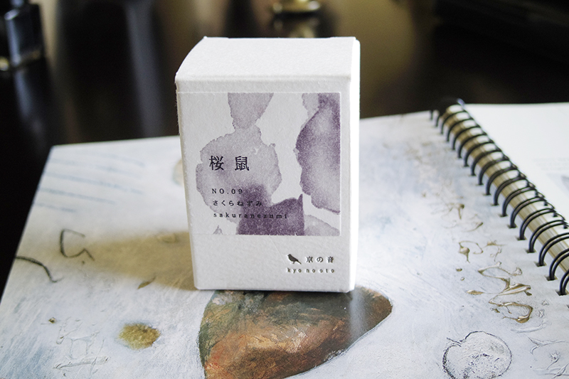
Because I have never had a pen of this colour before, I also decided to look for an ink to match it. Maja helped me find a good match using the colour wheel and I ended up with Kyo no oto sakuranezumi:


This ink was a great match for the Neo-slim. This ink has a similar consistency to my J. Herbin inks, and actually also has this "faded" look. Funnily enough, compared to Poussiere de Lune, it's even more faded. However after a few weeks of using this ink, I found that the Neo-slim, due to its unusual nib design, did not quite love this ink. It writes rather dry and suffers from "hard starts". It's quite a shame. However this incident renewed my interest in purple / violet inks again. Anyway, I discovered a few of my pens (in addition to the Neo-slim) that will occasionally work with this particular colour group from time to time.

My Waterman Elegance is one of these pens. I sort of got the idea from an online review of this pen using purple ink, so I tried it out and it's okay. However I do have another ink group that this pen is more suitable for (which I will talk about in future installments):


Another pen that I tried with this group is the Kaweco sport brass. I don't really feel anything for this particular colour match, but this pen happens to be a 1.3 stub and it shows off a really cool shading effect from the purple inks. The Montblanc Lavender Purple, in particular, looks great with this larger nib size:


My demonstrators of course will take whatever ink. The one the I have using purple is my TWSBI 580:


The only grail pen I have that ended up regularly sampling the purple is my Visconti Homo Sapiens 1.3 stub. Again, this also because of the stub nib and the way the purple inks look with thicker lines:


As for my Neo-slim, my match-making attempts did not pan out very well. It ended up leaving this group due to the problems it had with the nib drying up. However, there is a nice closure to this saga....as of this writing the Neo-slim is happily on a heavenly escapade with an Italian black ink named Leonardo (courtesy of Maja) LOL.

That's it for this group. 

Wow! Our thanks to Lawrence for another fun and informative review (and all the photos that accompanied it). Thank you for the kind words, Lawrence; I can't wait for the next installment :)

Monday, January 9, 2023

Newest Acquisitions (Virtual "Show & Tell") ~ part 449

 Continuing on with Part 3 (part 1 here, part 2 here) of Lawrence's thoughts on his favourite fountain-pen-and-ink matchups (or what he calls "Lavalife and pens" lol)....

Lawrence writes: "Okay, finally the pen/ink matching write-up that started it all. I figure with the two previous "practice" sessions, I think I can organize my thoughts better now to tackle this one. 

 This group is the most important for me, anyway, since it includes a good number of my grail pens, and it's also the beginning of my pen-ink matching craziness. The wonderful ink that started this all: Diamine's Syrah:

(all photos courtesy of Lawrence ~ please click on images to enlarge)
Ironically, Syrah is also the last one to be acquired in the group (I got it just last year); it was out of stock in stores for a while and I basically accumulated a whole bunch of other inks that are sort of close to it, but not quite. So all the rest of the inks in this group are what I have acquired "while working my way towards the Syrah ink". Syrah is what I had in mind as a perfect match for my first grail pen, MB's Daniel Defoe (which I have reviewed here before):
Yes, there are three of them here with different nib sizes. I am not going to dwell on the topic of "bat-s@#t crazy hoarder" at the moment, so we'll just leave it at that LOL. I have always treated them as one pen (maybe to make myself feel less guilty). Anyway, so I had this perfect image of a black pen with burgundy/reddish ink. I am not a "goth" person really, but the combo of black pen with reddish/burgundy ink gives off a gothic vampire vibe, which I think is kind of cool. And of course I can't leave out the "matching" tribute pen for this:
I know it's not the real thing, but whatever, I like it anyway. It looks like the Defoe a great deal but just don't look too close at it. So the Defoe(s) is my default Burgundy pen, and is probably the one that uses this colour the most.

At that time, Syrah was still not available, so I got the most logical one to match my Defoes, which is MB's Burgundy Red. This is also a very nice deep-coloured ink, however, I do find that the ink dries a bit on the greyish/bluish side on certain paper. It does not retain that vibrant burgundy colour when I first put the ink to paper (the picture below shows the ink as it just begins to dry). Regardless, it is still a good match (and I guess an MB pen does go with MB inks, also):


While I waited for Syrah to be available, I also found another ink that I thought would be fine with the Defoe and this is J. Herbin's Larmes de Cassis. As expected of most J. Herbin inks, it has a more washed out effect, but still pretty good. This ink is a bit more purple than MB's burgundy.


In the meantime, I ended up with another black pen, Visconti's Michelangelo (I have reviewed this here as well):
This pen is "black on black on black". At least that is how I would describe it. So I thought perhaps a reddish ink would be perfect. Burgundy works, I'm sure, but I decided to expand the pallete here. So I ended up with J. Herbin's Rouge Opera:
It ended up being a nice bright raspberry instead of red, and of course, it also has this washed out look that is expected of Herbin's inks. The match is okay, though, not perfect but okay. It needs a "stronger" red I think.

By this time, a few other black pens somehow "appeared" in my life (LOL) and I used that as an excuse to search for some more burgundy/reddish ink choices. I found another one that is pretty good: MB's Corn Poppy Red. This ink will go well with the Michelangelo for sure. The contrast will be awesome. It's a very beautiful ink. Nice scathing red. It also seems to retain this colour when the ink dries:

I think Diamine's Oxblood is pretty close to this (I don't have this ink...yet LOL). This ink is also perfect with the Rouge et Noire which "appeared" at this time somehow LOL (I have reviewed this pen here also):
This pen looks like MB's Agatha Christie, so the red ink works very well to give it that "bloody murder mystery feel".

Another ink that I found is Graf von Faber Castell's Garnet Red, although this one has a slight "greyish" look (not sure how else to describe it) compared to MB's Corn Poppy, but this seems to retain this colour when it dries.


This is my largest ink group so far (and I'm still looking to get more). The number of pens in this group is also relatively larger than the rest, as I do have a thing for black pens. Speaking of which, here are other pens in this group:

Visconti Homo Sapiens (a Palladium stub nib, and an 18K F nib....the stub was reviewed here before):


Black and silver Franklin Covey (an impulse buy from Staples):


The TWSBI 580: As mentioned in the last few posts, these demonstrators can take all sorts of different inks. However, because I do love Burgundy/Reddish inks in general, I do fill them up with this ink colour whenever I have the chance.


Montegrappa Ducale: It's not a black pen, and I normally will not feed this pen anything remotely close to red in my OCD world. But I tried the reddish coloured inks on it for fun, and it seems to work well; however, I still prefer another colour with this pen so it will come up again in another (ink) group later on. Occasionally, I do put a reddish ink in it to spice things up..yes I like living on the edge LOL. But no burgundy...just red.


Not to be left out, my Parker 21 (not shown) also tried out this group. But being a "school pen" I tend to stay away from red inks with them. When I was in school, red ink was associated with wrong answers and "nasty" teachers (probably still is)....so....the Parker 21 and I had a "mutual psychological agreement" that we will not revisit childhood traumatic issues. Basically.. any colour except red/burgundy for this pen. This also applies to my other vintage school pens.

Okay that's it for now. The next set will probably be the purples/violets."


Wow - what a great write-up! Many thanks to Lawrence for sharing his thoughts (and photos) on pens & inks with us; I eagerly look forward to the next installment :)