Thursday, April 29, 2021

Newest Acquisitions (Virtual "Show & Tell") ~ part 188

A few days ago, I got an email from VPCer Bruce T, who had been looking for a brown leather fountain pen since last summer. It took a while, but Bruce finally found one he liked!
Here's his story:

Bruce: "I am not a “serious” fountain pen collector but I do dabble in it, I only have about half a dozen pens but I do use one every day.

You may recall that I have been on the search for a leather covered fountain for some time. Occasionally I go online to search but have always been intimidated by price, condition or whatever. There doesn’t seem to be many fountain pens wrapped in leather.

One day in early April, Mrs. Google informed me that there was someone on ETSY who was offering leather clad fountain pens for sale. I had a look and lo and behold there was my pen. I looked closer and it seemed to be just what I was looking for!

It was someone in central China.

I took a chance and ordered one and it arrived here in 18 days."


(all photos courtesy of Bruce ~ please click on images to enlarge)

"As you can see from the photos it is a handsome pen, especially the Dragon Head on the clip complete with sparkly red eyes." 

"It measures 5 ½ inches when capped and 6 ½ inches posted so it's not small."


"The nib reads “Genius” and “Iridium”. It writes very smoothly."


"The top of the barrel (?) reads DIKAWEN and “891”."


"And now for the best part (as if the pen was not enough) it cost me $16.29 Cdn which included delivery and a converter as well as 30 cartridges!!!

I purchased it through ETSY who inform me that my credit card info was not shared with the vendor, so I feel good about that. Who knows what scams are out there in internetland.

The vendor goes by the name of ARCHchoice."

Our thanks to Bruce for sharing this cool new find with us!

Tuesday, April 27, 2021

Newest Acquisitions (Virtual "Show & Tell") ~ part 187

The vintage Parker '51' is a classic fountain pen that was first introduced in 1941. It was extremely popular, tens of millions being sold until Parker stopped official production in 1972. In 2002, the company released the Parker '51' Special Edition, an upscale version with Empire State Building-inspired caps in sterling silver and gold vermeil. The year 2021 saw the release of the all-new Parker '51' fountain pens. Honourary VPC member Glenn G. in Australia recently acquired three of them --a deluxe GT (gold trim) version and two CT (chrome trim) models---and was kind enough to send in a review and some photos for our blog. 

In Glenn's own words:

"The new version of the classic Parker 51 has proved controversial, with many Fountain Pen Network members slamming the new design.

I too wondered why they changed some of the classic features for no obvious functional benefit, but that’s what they did, and adverse comparisons do seem to be more about what the design is not, rather than what it is. That said, I would have liked to see a better range of nib choices… F or M is rather limiting!

Despite this, I bought myself a deluxe GT version in plum, and requested 2 examples of the standard CT version (midnight blue and teal) as more affordable family birthday presents."

(all photos courtesy of Glenn G. ~ please click on images to enlarge)


"The use of a screw cap rather than the traditional click-on design has attracted the ire of many, and it is indeed annoying at first… to my surprise, I kept trying automatically to click the cap on and off as if it were a classic model, but I was also amazed at how quickly I adapted to the change. I’ve not tried reverting to an original 51 to see how I react to the old-style fitting, but it will be interesting when I do. At least twisting the old style cap will not hurt it.

People have complained about scratchy nibs and poor ink flow; I’ve only inked the teal and the plum, both of which have had no such problems, and I have enjoyed using them both. I’m hopeful that the midnight blue will be no different, but I do realise that nib quality control can be an issue in many brands, including the other majors.

I did find that the teal pen tended to dry after a couple of days of disuse, which is a minor irritation that is easily dealt with; I’ve only just inked the plum as my next daily user, so I don’t know if it will be the same, but it seems likely given that they have the same feed/collector. If so, I can live with it."


"What IS annoying is that the CT pens come with a cartridge only, you have to provide your own converter, whereas the deluxe GT pen does have a deluxe converter included. To me, this is cheapskate, penny-pinching and miserly; depending where you buy it, a converter only costs about $11 retail, and is not much to expect when buying a $126 pen (prices are from Cult pens and now include our GST )."


"I rather expected the metal cap jewel to be ugly, not being a fan of the 1970s Parker 51 models’ caps, but I am please to prove myself wrong… it actually looks quite smart. 

As for feel, the new 51s are normal. I have not done a direct comparison. They didn't seem any different to make it worthwhile.

Would I buy a burgundy CT and maybes even a black GT, funds willing?... yes, I would, but it’s a very personal choice. For many others, the pen is anathema, a despised heresy that will never be added to their collections. So, as always, caveat emptor. 

Glenn."

Our thanks to Glenn for sharing his thoughts on this hotly-debated Parker reissue with us :)

Sunday, April 25, 2021

Newest Acquisitions (Virtual "Show & Tell") ~ part 186

Though known for their colourful writing instruments and imaginative designs, Delta's earliest offerings were decidely plainer in appearance. Here's one of those early fountain pens, a recent addition to Jerred's Delta pen collection....

(all photos courtesy of Jerred ~ please click on images to enlarge) 

Jerred: "This Delta pen is a bit of an odd duck. I've mentioned previously that Delta rebranded pens from other makers early on in their career as a brand, and this is one of those pens."


"I'm not sure of the actual maker as it has no markings on the body besides the Delta name engraving. For all the world it looks like a wooden kit pen, with a wooden cap, wooden body, dark gunmetal plated trim, and a plastic section. I've not been able to ascertain the wood used in the manufacture as I've only seen it listed as "burl wood", which does not pertain to any one type of tree."


"The section and nib are also a little bit odd, as the section is plastic, with gold trim and a two-tone gold plated IPG nib. As I said already, it looks more like a "kit" pen than anything from a major manufacturer. The nib is pretty generic, and wasn't very good.

All that being said, I'm quite sure that this is an authentic Delta fountain pen, and even more, I think the strange configuration in which it is shown here may be original as well. I've seen this specific model listed for sale a number of times, and in the same configuration (wood body, gunmetal trim, plastic feed with gold trim, two-tone nib). As always, finding information on these very early Delta pens is extremely difficult." 

Love that wood, whatever it is :) Many thanks to Jerred for sharing another one of his Delta finds with us!

Friday, April 23, 2021

Newest Acquisitions (Virtual "Show & Tell") ~ part 185

Today's spotlight is on three vintage Parker 'Jotter' ballpoints belonging to Trevor, and how he came to acquire them...

Here's the story, in Trevor's own words:

Another Tale of Bad Pictures

I seem to be a sucker for bad pictures, as I have once again looked at an ad for pens with terrible pictures and thought, “Hey, I should buy those.” I am very puzzled by this because nowadays, we all have in our pockets, an amazing photo taking device. Why is it so hard to take a clear picture? I may never know. Anyway, Shanin brought to my attention an ad for a lot of 10 pens from a seller in Nanaimo. If I squinted just right and tilted my head I could recognize 5 out of the 10 items in the lot. I saw three Jotters immediately. There were other things that I will tell about in a future review, but today I will focus on the Jotters. I felt there was enough value in the lot, made the deal, sent the dollars and a few days later a box arrived in the mail!

Upon opening the box I was greeted with the scent of musty car interior and old newspapers, and was taken to my happy place. So much nostalgia from the days spent in the shop with my dad and his restoration projects and visits to antique book stores. Lots of fun in this box of treasures… and now… the Jotters! These are quite special to me as they are my first “Vintage” Jotters. 

(all photos courtesy of Trevor ~ please click on images to enlarge) 

First up is: Black plastic barrel Jotter. Date code AI, made in England. The Date code tells me Q4 1982, but it has a flat button and brass threads… The brass threads were replaced with plastic in 1980, so a bit of a puzzle there. On the black barrel in silver is the H.M.S. Victory. The screening is in good shape considering the age. The Parker Ballpoint refill in blue was not in great shape, so I replaced it with my preferred Monteverde Gel in Blue/Black colour. 


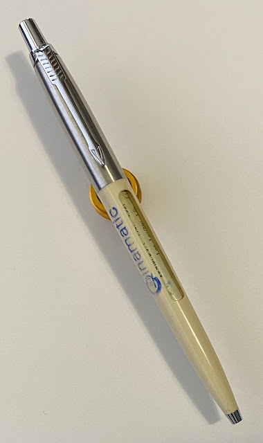
Next up is a USA made Jotter without a date code. Also flat button and brass threads, so estimated 1973-1979 manufacture. It’s a “Window” model personalized for Coinamatic. Visible in the window are measurement conversions printed on the refill. Conversions for Length, Weight, Liquid, and Temperature are visible when actuating the button. Fun! Sadly the refill is bone dry. I’m not replacing it due to the unique nature of the printing. 


 Last but not least of these Jotters is a mid-1960s Parker “Girl” Jotter. Also known as a mini Jotter. Not much information is available on these but what little (see what I did there?) information I have found tells me these were made only for a short time. I was able to find two examples from 1965 and 1967. This one is made in Canada and has a round button and brass threads. Strangely comfortable to write with. The blue Parker refill was mostly dry and didn’t write well, so I installed a Monteverde Gel refill in pink. I’ve run out of Red, which would have matched the barrel. 


There are other interesting pieces in this lot, so I’m glad I took the chance. I’ll tell about the others soon."

The Parker 'Jotter' ballpoint first came out in 1954 and is still going strong, with new colours and patterns coming out every year. Many thanks to Trevor for sharing his thoughts and photos of this classic writing instrument with us!

Wednesday, April 21, 2021

Newest Acquisitions (Virtual "Show & Tell") ~ part 184

In honour of World Stationery Day today, we're featuring what some call stationery's best friend-- fountain pen ink! This particular ink is from the Netherlands and was recently acquired by VPCer Andy, who shares his impressions (and some very nice photos :) of it in this blog post.

In Andy's own words:
 
"Good day pen friends.

This week I would like to share my experience with Akkerman inks.

I believe this is the company's full name...........P.W. Akkerman Bij Koninklijke Beschkking H Of Leverancier Den Haag........oh good grief!?!

With this being my first bottle, I searched the pen forums and it seems one of the most popular blues is their #5 Shocking Blue.

Here are my thoughts:

(all photos courtesy of Andy ~ please click on images to enlarge)

A+ for presentation.

Gift wrap, Coffee candy, Business card

...nice touch!


A very sturdy box that houses the 60ml bottle Akkerman is famous for. 

And this is the famous bottle with the glass marble stopper thing-a-ma-jiggy.


A uniquely shaped bottle with a wide base for stability.

I can't quite place the bottle shape but is sure looks familiar.......Hmm......looks like Barbara Eden might pop out of it if I rub it too hard.

  Here's a writing sample with my trusty PenBBS 308 Blue Cloud with a fine nib. 


Ok.....is the Akkerman #5 Shocking Blue........well......shocking?

No....not really.....it's just ok in my books.

There are similarities in shade and contrast with Waterman Serenity Blue or Iroshizuku Asa-Gao.

I would much prefer the latter two inks.

At 32.23 Euro ($49 CDN) shipped to my door, it is the most I've spent on one bottle of ink. 

There is an upside to this transaction.

The Netherlands make damn fine coffee candy!!!

Thanks,

Andy"


Our thanks to Andy for another great review! (to see Akkerman's ingenious ink bottle in action, check out this segment of a YouTube video review).

Monday, April 19, 2021

Newest Acquisitions (Virtual "Show & Tell") ~ part 183

Two weeks ago, I ordered a Cross 'ATX' fountain pen in "Brush Black" from Amazon's Warehouse, where returned/warehouse-damaged goods are resold, often at a substantial discount. The pen was less than half retail and I'd had *really* good luck with the Warehouse lately, so I thought I was on a roll...

(~ please click on images to enlarge~)

...but this is what arrived (in a Cross 'ATX' box) - a Cross 'Century fountain pen in the same colour and lovely diamond-patterned engraving as the 'ATX' I'd ordered.

(the nib & section have no scratches or defects--it's just the lighting/dust...and my photography ;)

I could have returned the pen, but there wasn't a black 'ATX' fountain pen listed in the Warehouse so I'd have had to pay full price for one. More importantly, the 'Century' fountain pen I got in error was in perfect shape, felt great in the hand (despite its slim profile), and I loved the way its Fine nib wrote... so I kept it. In the end, yes -- I wound up with a lower-priced Cross model, but it's a great fountain pen and a joy to write with :)

(~photos & write-up by Maja ~ )


Side note: Tomorrow marks the one year anniversary of our pen club's little "virtual show & tell"! Since our in-person meetings are on hold due to the pandemic, we've been featuring our members' newest acquisitions every other day (since April 20, 2020) here on our club's website. We're up to post #183 now, and I hope to keep it going until we can safely meet again. Many thanks to everyone who contributed by sending in their photos and write-ups, and special thanks to René for the idea.

Stay safe, everyone!
~Maja

Saturday, April 17, 2021

Newest Acquisitions (Virtual "Show & Tell") ~ part 182

Today's featured acquisition is a beautiful vintage Waterman Nurse’s set (consisting of a thermometer case, matching fountain pen and matching mechanical pencil) belonging to Christopher... 

(photo courtesy of Christopher ~ please click on image to enlarge)


Christopher: "I picked it up downtown from a dealer who has, on occasion, done me proud with the odd point. When I got the set, the boxed was trashed and in need of a lot of TLC. Fortunately, over the years I have had a lot of experience restoring vintage collectable and antique item packaging. As for the pen, it required a replacement nib which I nabbed from a duplicate Waterman nurse’s pen, resacking and a good polishing. The thermometer was in good shape and correct for the vintage and the pencil was news stand mint." 

 Many thanks to Christopher for sharing his lovely set (and great photo :) with us! I did a bit of digging and found an ad for a different version of a vintage Waterman's Nurse's set:


(advertisement from a May 1942 Saturday Evening Post of a Waterman Nurse's set consisting of two fountain pens and a matching mechanical pencil----see detail below---click to enlarge)


The Nurses' set in the ad above consists of a mechanical pencil and two slightly different fountain pens  - "one for day and one for night". It's hard to see, but one pen has a black band near the top of its cap and the other has a red band. The pen with the black band was meant to be filled with black ink and used for charting patient notes during the day, while the other pen was to be used with red ink for night charting by the nurse.

(ad source)

Thursday, April 15, 2021

Newest Acquisitions (Virtual "Show & Tell") ~ part 181

Today we're featuring a handsome, affordable fountain pen made by Osprey Pens of California--the Osprey 'Scholar'--purchased by Stuart from the Vancouver Pen Shop last month ...

(all photos courtesy of Stuart ~ please click on images to enlarge)

Stuart: "Here’s some shots of my Osprey.  I like it very much - nice writer and comfortable in the hand."


  "And I like the way the brand name is rendered on the clip, bold and classic!"


"This pen may be as close as I ever get to a vintage Parker Duofold.  They are pricey!"

According to their website: "The Osprey Scholar was created in honor of the American School System. Machined from solid Acrylic rod stock, it is designed to be a rugged and dependable fountain pen for students and professionals! Available in many vibrant and classic colors, the Scholar has a long and slender feel. It scores well in stress, crack, and drop tests due to its solid construction. This fountain pen was designed to keep writing for decades with minimal maintenance." The site also notes that the first batch of Scholar fountain pens was created in 2016 for a class in California :)

 Stuart--many thanks, as always, for sharing your newest acquisitions with us on our blog!

Tuesday, April 13, 2021

Newest Acquisitions (Virtual "Show & Tell") ~ part 180

A few days ago, I got an email from VPCer Andy with an update regarding his Kaweco 'Dia2' fountain pen's nib. Here's Andy's email and the photos that accompanied it:

Hello pen friends.

As discussed in our last VPC Zoom meeting, I was not too pleased with the number sized nib on the Kaweco Dia2. It sported the stock 060 Kaweco nib/unit as on all their Classic, Sport, and Al / AC Sport models. This Dia2 is a full sized, classy looking pen which deserves a much more proportional nib to go with it.

(all photos courtesy of Andy ~ please click on images to enlarge)


(Looking sharp my friend....Get ready for a nib transplant!!!) 


$35 CDN from Beaufort Inks in the UK.


 A drastic difference in size with the Bock having much larger shoulders and a longer length. The nib unit is identical in size and thread as the stock Kaweco N060. 


The Bock feed is also different and I particularly like this design pattern of the fins.


The stock Kaweco nib/unit. 

And voila....we have successful pen surgery.


It looks and feels completely different. With that little extra length, I find writing more comfortable and precise. 


The Bock nib is smooth and is light to medium wet. I love the Kaweco fine nib which was exactly how this Bock wrote as demonstrated here in my writing sample.

It all worked out great and that's all for now folks.

Take care and see you on the 15th.

Thanks
Andy 

Great to hear that Andy managed to find a nice-looking replacement nib that's more in proportion to the size of the fountain pen...and for a good price, too :) Many thanks for sharing your "nib surgery" story with us, Andy!

Sunday, April 11, 2021

Newest Acquisitions (Virtual "Show & Tell") ~ part 179

A few items I purchased in the last few months, each costing $15 or less...

(photos by Maja ~ please click on images to enlarge)

(Fun fact: 2021 marks the 80th anniversary of the very first appearance of Wonder Woman and the 60th anniversary of Batgirl's debut).

I got this cute superhero-themed pen roll from a Canadian seller on etsy. Actually, that's not 100% true--it was advertised as a crayon roll. The roll isn't really made for longer writing instruments--they stick out and the roll lacks a flap to protect them from accidentally sliding out. It can work for shorter (<5 inches) pens or pencils, though, and if you slide a piece of fabric behind the items and fold it over, it'll cushion them and help prevent them from falling out. So why did I buy this roll if it wasn't really made for fountain pens? Well, I liked the design of the material, and it only cost $7 CAD including shipping! The seller still has some for sale here.


The white fountain pen in the photo above is part of Sheaffer's 'Calligraphy' line, the descendants of the popular Sheaffer 'No Nonsense' pens which first came out in 1969. This pen came as part of a "Mini Kit" with three different italic nib-section units (in 1.0mm, 1.5mm and 2.0mm nib widths) and four Sheaffer ink cartridges (in blue, black, red & green). The pens are ultra-light (12 grams, without a cartridge) and come in an assortment of attractive colours. They can be bought individually without spare nib unit(s), or in a three-pen "Maxi Kit". Their steel nibs lay down very crisp italic lines, so they're not the best nibs to use if you write quickly as their sharp edges might catch on or dig into the writing surface. The barrel's inkview window is very useful in letting you know if you're running low on ink, but it's actually a cutout, so you can't use the pen as an eyedropper-filler. Still, at $14.99 CAD (from a local Staples store), it's a good deal for a pen that'll instantly improve your handwriting.

The bottom pen needs no introduction---it's a Parker 'Jotter' ballpoint, a new addition to my ever-growing 'Jotter' collection. This white example came via Amazon.ca and isn't part of any special edition series. It writes well, it looks good... and it fits in the crayon roll (yay!)

The middle item is a lead holder made by Art Alternatives that I purchased at Sublime (a small local art supply shop) on closeout for $9.99. It holds 2.0mm leads using a three-pronged drop clutch mechanism and is comfortable to hold, thanks to its knurled metal grip section. The barrel's material (described by the company as "heavy-weight plastic") seems quite sturdy, too. I hadn't heard of Art Alternatives before, but Opus stores are currently carrying a lot of their products. I noticed that the lead holder's packaging mentioned that Art Alternatives is "an employee-owned company", and on their website it says: "Our mission is to make artistic expression affordable for anyone who feels inspired to do it!". I think both of those things are pretty cool :)

~Photos & write up by Maja ~

Friday, April 9, 2021

Newest Acquisitions (Virtual "Show & Tell") ~ part 178

A couple more of Christopher's newest acquisitions, and the story behind them...

 (photo courtesy of Christopher ~ please click on image to enlarge)

Christopher: "I ran across a set of Sheaffer Sentinel Ballpoints, which belonged to two gentlemen who founded a jewelry store, which is still running. Both are long gone since their business was established at the beginning of the 1930s, but their names remain imprinted on these two somewhat matching Sheaffer ballpoints. 

There is something rather special about one of these pens and it was Rene who lent credence to that. The Sheaffer Sentinel model was one of their White dot line of pens, but one ballpoint is missing the White dot. Also, Sheaffer placed a tiny bump at the top of their ballpens from that period to identify them as ballpens (to differentiate them from their fountain pens); this tiny indicator, although apparent on the one White Dot pen, is missing on the ballpoint without the White dot. Otherwise, as you will see, the pens are identical. 

The brother who put his name on their jewelry shop also has his name personalized on the White Dot pen with the tiny clip bump. So, Rene figured that a Sheaffer salesperson visited their jewelry shop with samples and the one brother got the non White Dot, bumpless dealer’s salesperson prototype sample, while the other got the full meal deal. Regardless, and once restored, they are a very attractive related set."


What a handsome pair of vintage ballpoints! Around 2013, Sheaffer came out with a new 'Sentinel' ballpoint. That pen, however uses a "click" mechanism and somewhat resembles a Parker 'Jotter', so there is no mistaking the two Sheaffer 'Sentinel' ballpoint models :)

Our thanks to Christopher for sharing his new finds with us!

Wednesday, April 7, 2021

Newest Acquisitions (Virtual "Show & Tell") ~ part 177

If you've been following our ongoing virtual "show & tell", you might have noticed all the new pens Jerred has added to his Delta fountain pen collection. The fountain pen we're featuring today, however, is not a Delta but, rather, an elegant modern Pilot fountain pen Jerred recently acquired...

 (all photos courtesy of Jerred ~ please click on images to enlarge)

Jerred:  "This is a Pilot Grandee Urushi. The Grandee was a long-running model in Pilot's product lineup, and was a mid-range gold-nibbed model that would be similar in placement to the Custom 742 or 912 today. The most common models of the Grandee were made of lacquered brass, but there was also a variant made of wood. They were all quite thin pens overall, and were available as fountain pens, ballpoint pens and pencils. It is common to find the wood and standard lacquered Grandee pens in two-piece sets."

"The particular model here is coated in Urushi lacquer. Urushi is a natural, hard-wearing lacquer that was originally used to protect wood and ebonite products. Urushi often commands a hefty premium over other finishes due to the complicated and time-consuming process required, as every individual layer of lacquer needs to be fully cured (~24 hours) before another layer of lacquer can be applied. The Grandee Urushi was considered a premium finish in the Grandee lineup, and was manufactured during the entire life of the Grandee model which stretched from the 1970s into the 2000s."


"This particular Grandee Urushi is a later model variant, and somewhat uncommon. The most common Grandee models (Urushi, wood, or otherwise) use smaller "clip on" style 14k nibs as well as a split clip. This variant uses a larger nib that wraps almost all the way around the feed, and a solid, hinged clip with "Grandee" stamped into it. The date code for this particular nib is visible in the pictures provided, giving a manufacturing date of May 1992. There are also variants of the Grandee with inlaid and "toenail" style nibs."


"Being a premium finish in the Grandee line of pens, the Grandee Urushi is much less common than other variants and generally commands a higher price. If you're looking to purchase a Grandee Urushi, check the pen over carefully: All Urushi-coated Grandee pens will be labelled as "Urushi" on the pen body, normally just above the cap band. This labeling is shown in the pictures included."

(top: Pilot Grandee Urushi model; below: Pilot Deluxe Urushi)

"There is no directly comparable model in Pilot's current lineup for the Grandee, but the Grandee Urushi itself is comparable to the Pilot Deluxe Urushi, which is currently Pilot's entry-level urushi pen. Both pens are relatively slim, made of brass, and are lacquered on the cap, body and grip section. A picture above is provided for a comparison.

The nib on this particular pen is in Fine, and is a lovely writer."

Measurements:
Length Capped: 133MM
Uncapped: 120MM
Width at Widest Point: 10MM
Grip: 8.5MM

As always, our thanks to Jerred for sharing his recent finds with us via his photos and write-ups :)

Monday, April 5, 2021

Newest Acquisitions (Virtual "Show & Tell") ~ part 176

My new Swiss-made Caran d'Ache '849 ballpoint in the "chocolate" design, along with some Swiss-made chocolates (and two non-chocolate bunnies :)

(~please click on images to enlarge~)

I purchased the ballpoint from La Couronne du Comte's online store in the Netherlands and got it for an excellent price. I opted to get the unboxed version of the pen as the boxed version--though attractive--cost an additional 12 Euros.


The '849' is an iconic writing instrument, instantly recognizable by its hexagonal shape. This pocket-sized all-metal ballpoint was first made in 1969, and comes in a wide variety of colours and designs for every taste. 

A word about refills...

Although it comes furnished with a Caran d'Ache "Goliath" ballpoint refill, the '849' also accepts the (less-expensive) Parker-style ballpoint refills that are available in most stationery stores. An even less-expensive alternative is Caran d'Ache's own "Swissride" ballpoint refill. Though longer and skinnier than its 'Goliath' refill counterpart, the 'Swissride' refill fits perfectly inside the hole of the ballpoint's internal "clicker" mechanism. I got my "Swissride" refills from Nikaido in Richmond for a very reasonable price.


This is my sixth '849' ballpoint and it likely won't be my last -- they're attractive, durable, and
well-made writing instruments that feel good in the hand, despite their smaller size. I have heard that Caran d'Ache will be releasing a larger version of the '849' ballpoint in the near future, though. Stay tuned!

~Photos & write-up by Maja ~

Saturday, April 3, 2021

Newest Acquisitions (Virtual "Show & Tell") ~ part 175

Onto a slightly newer vintage black fountain pen, also belonging to Christopher...

(all photos courtesy of Christopher ~ please click on images to enlarge) 


Christopher: "I now have a near mint Sheaffer Standard Jet Flat-top, Circa the first year the company moved away from the BHR (Black Hard Rubber) to a Dupont plastic for the make up of their pens. 1924 was also the first year of the Sheaffer White Dot Warranty, but this new acquisition is sadly lacking in that department. I should mention that I do have the Jade Green model of this Sheaffer pen which was the second plastic colour that Sheaffer released and am only missing the Coral, which I am sure I will turn up in time. "

"But just how I came to having this fine pen was not just getting out and buying it. I will mention that a while back, I picked up a similar pen but with a cracked barrel, chipped section and broken feed. Still, I retained the cap and nib for future use, and that future happened the other day when I ran across a capless match. And when I say match, it turned out to be (once restored) a perfect match with the barrel screwing into the cap as smooth as glass."


(the original 1924 magazine ad for this pen)


Christopher: "I am also including a snap of both my Standard and Oversized (see above), the latter having the later Humpback clip, but both pens are similar and equally good writers." 

Many thanks to Christopher for sharing these handsome vintage Sheaffer fountain pens with us :)