As per their Instagram post, their webstore (https://www.buchanst.com/) is, thankfully, still open for business. Wishing the good folks at Buchan's all the best as they recover from this flood!
Saturday, December 31, 2022
Buchan's store closed due to flooding! (*Online store still open*)
(photos/screengrab from Buchan's official Instagram account---posted December 30, 2022 -- link)
Newest Acquisitions (Virtual "Show & Tell") ~ part 445
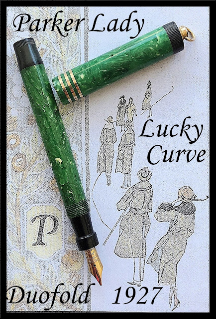
One last newest acqusition to post this year... and it's vintage pen fan Christopher's!
(photo courtesy of Christopher ~ please click on image to enlarge)
He writes:
"It is easy to see how the Parker Pen Company was just so successful with their Duofold line of pens. The Duofold seemed to hit the nail square on the head when it came to a dependable smooth writing and well designed writing instrument. And in that department, there were no exceptions. I was very lucky to pick up a late 1920s deep jade green with the attractive white flecks example, in just brilliant condition, but didn’t get around to restoring and servicing it until I was able to acquire a replacement button filler pressure bar. Still, once that bar was in hand, the pen came together rather quickly.
The thing that really grabbed me about this pen was two-fold. The first was the condition, since a lot of old jade green Duofolds have discoloured barrels, while this one had no sign of discolouration whatsoever. In the late 1920s, the Jade colour finish became darker and, to my mind, much more attractive. Then. with the addition of the white flecks, the effect was no less than stunning.
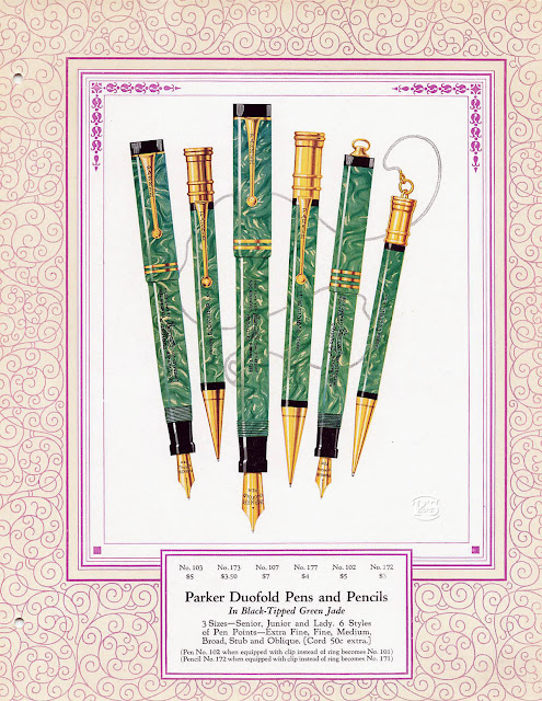
This pen is a short ribbon ring top and not too big at 4 ¾ inches capped, but once posted at a full 6 inches, sits quite well balanced in hand. The cap is long and sports the other point that grabbed me, a triple 14K gold filled banding. And with almost any Parker button filling system, it really can be said that the pen sucks up the ink to fill rather impressively. Atop the barrel, which is capped off at the other end with a black blind cap, is a similar coloured grip section. This section supports a very responsible Parker Duofold marked 14K gold flexy nib. Once inked, I was pleasantly surprised at just how well this pen wrote. I do have a good number of Parker Duofold pens in my vintage pen collection, but this one will be most used and cherished, on going, for both its attractive appearance and writing ability." (to see a closeup of this ad--provided by Christopher-- left-click on the image, then right-click & select "Open image in new tab"/"View image", then left-click in the new tab)
We'll be back with more reviews of new pen-related acquisitions (including some modern fountain pens that I bought fairly recently) next week.
In the meantime, best wishes to everyone for a happy & healthy New Year 2023!
~Maja
~Maja
Thursday, December 29, 2022
Newest Acquisitions (Virtual "Show & Tell") ~ part 444
As promised, here's the lovely vintage American fountain pen that Christopher recently acquired....
(photo courtesy of Christopher ~ please click on image to enlarge)
(text by Christopher)
"It was my understanding that the Conklin Pen Company was one of the bigger pen producers in its day. They were also noteworthy for their product quality and, in particular, a groundbreaking filling system for their fountain pens. But I will have to admit, having just picked up one of their sub brands-- the ‘All American’ -- that the Conklin quality was right across the board. Unlike the Conklin Crescent filler of their earlier days, this All American has a neat little lever filler located further down on its barrel. The finish--sort of a red and pearl Harris Tweed--is, to my mind, outstanding, as is the quality of the plastic that repeats itself on the cap. The overall design of this pen is an attractive substantial cigar shape, which sits well in the hand when the pen is posted. Back to the cap, which sports a 14K Gold Filled double banding and is topped off with one superbly engineered spring pivoting 14K Gold filled clip. By applying a bit of finger pressure on the top of this clip, the bottom comes away from its seating so one can easily slide the pen safely into a breast pocket. This clip also has a patent number imprinted vertically down it’ length Pat.No.1267575, as does the short lever filler No.1561590.
Under the cap, a black grip section supports a very long and narrow feed which in turn supports an amazingly flexible 14K solid Gold nib branded ‘All American’. When restoring and servicing this pen, having knocked out the nib and feed for cleaning, I noted that as flexy as the nib is, the overall length was quite short. Still, can I complain, since the pen is such a good writer. Saying all this, I cannot put this fine vintage pen down and, with it inked, will use it for the rest of this week before adding it to my collection."
Our thanks to Christopher for his review. If any of our pen club members have any recent pen-related acquisitions they'd like to share on this blog, please send them in and I'll post them here!
Tuesday, December 27, 2022
Newest Acquisitions (Virtual "Show & Tell") ~ part 443
Back to newest acquisitions we go! Here's another very nice vintage find, courtesy of Christopher, who was unable to make it to our December meeting due to the snow ...
(photo courtesy of Christopher ~ please click on image to enlarge)
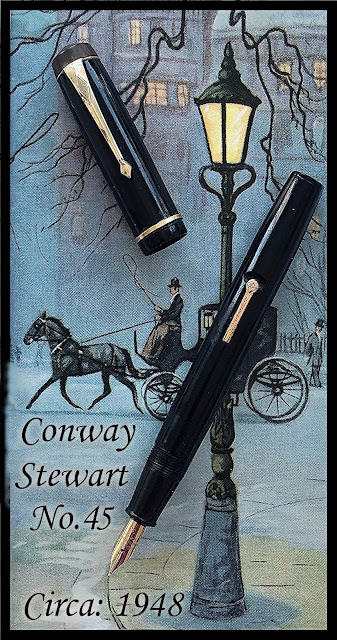
Christopher: "I will admit that I do not have much of a representation of the vintage Conway Stewart writing instruments in my pen collection. It has not been something I have chosen to focus on. Still, when this smart, clean line jet black 45 surfaced, I decided that it just would have to be a pen I would welcome.
Actually, Conway Stewart had been part of my personal history, in that attending British-run prep schools during the 1950s and early 60s, a lot of my Masters had and used Conway Stewart fountain pens. Subsequently, when I found myself in their offices for one thing or another, there on their desks were Conway Stewart pens. We, the students, bought Sheaffer student pens from our tuck shop at the school, but our very strict instructors marked our papers often with the likes of Conway Stewart pens.
This particular beauty, which just came my way, is finished in black with 14K gold filled fixtures. The cap is quite interesting, sporting a well designed Conway Stewart branded gold filled clip, held in place with a hard rubber clip screw. The narrow gold filled cap band, which was loose at the time I acquired this pen, is now held firmly in place with a wee bit of fixative . The barrel is quite substantial and flat ended, plus equipped with a lever filler. Above this barrel is a matching jet black grip section, sporting quite a nice, but rather small, 14K sold gold flexy nib. I was pleasantly surprised when servicing this pen as to just how big the sac it accepted. Needless to say, it will keep laying ink on paper consistently for quite some time.
I do not know if I will be adding to many more of the Conway Stewart pens to my collection, but this one sure has a place in may heart ongoing."
If you're looking for more information on vintage writing instruments by Conway Stewart, you can find lots of it in the Conway Stewart book of numbers (click on book to see entries), a comprehensive online reference created by the late Conway Stewart collector Jonathan Donahaye.
Our thanks to Christopher for his ongoing contributions to our online "show & tell"; we'll be featuring an American-made vintage fountain pen --also belonging to him-- later this week, so watch for it here!
Monday, December 26, 2022
Photos from our December meeting!
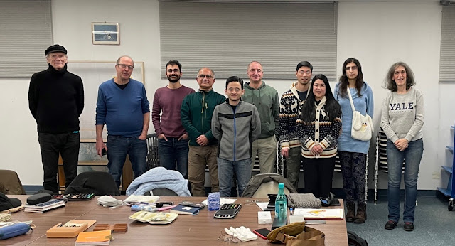
Our December meeting was surprisingly well-attended, given the horrible weather conditions. Eleven of us showed up at the Vancouver Public Library's Kitsilano branch on December 22nd for a fun evening of pen, paper and ink talk!
Here are some photos I snapped that evening...
(~please click on images to enlarge~)
We made it to the meeting! (L-R) John, Peter, Jason, Hadi, Jerred, Vladan, Alvin, Yen, Amy and me - Maja (Rene was also at the meeting, but he arrived very late, so he's not in the photo)
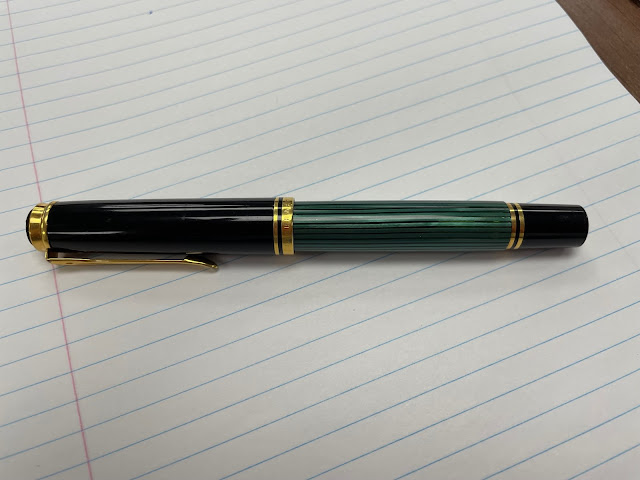
Brand-new member John brought along one of his first fountain pens, a lovely green-striped Pelikan M800 which he got back in 1987
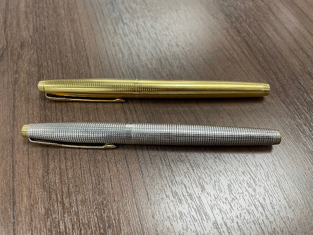
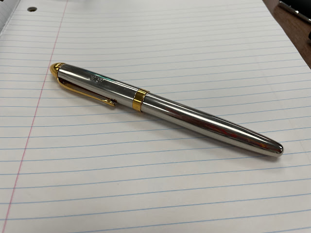
(Above) Hadi showed us two handsome Parker 75' fountain pens with a great deal of sentimental value--the top pen (the gold-filled 'Insignia' pattern) belonged to his father, while the solid sterling silver pen in the 'Ciselé' pattern was Hadi's first fountain pen, given to him by his parents when he was a young man.
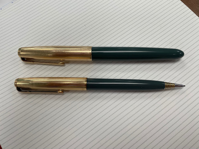
Hadi's son Jason (who lives out of town) came to our meeting with his daily user--a classy-looking vintage Parker '51' fountain pen (with matching mechanical pencil)
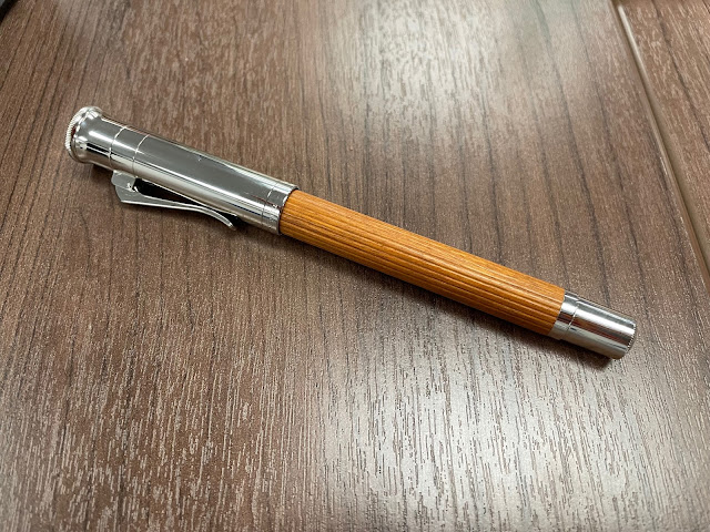
Vladan showed us some of his newest pen-related acquisitions, including this very nice Graf von Faber-Castell 'Classic Pernambuco' fountain pen, purchased at the Vancouver Pen Shop during their moving/anniversary sale. The fluted barrel is made of pernambuco, a very hard (and highly sought-after) exotic wood
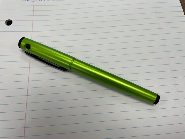
Vladan's Pilot 'Explorer' in "Lime" metallic resin. The 'Explorer' has the same nib as the Pilot 'Metropolitan', but its section lacks metal threads (which the 'Metropolitan' has), making it more comfortable to grip
Above: Jerred's gorgeous red marbled Delta 'Europa' fountain pen...
...and his Delta 'Graffiti' which was --Jerred explained-- considered more of an entry-level fountain pen
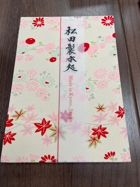
One of several lovely Japanese-made 'kimono journals' that Peter brought to show us. The journals are made by master book-binder Tsutomu Matsuda, who hand-assembles the papers in his studio in Kyoto, Japan. The journals' covers are made from vintage kimonos, so no two journals look exactly alike. Peter imports them directly from Japan and sells them via Ibis Trading, located in Vancouver
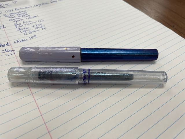
Amy's Pilot' Kakuno' fountain pens (and no, they're not special editions or limited editions--Amy decorated them herself). The nibs on 'Kakuno' pens also fit the Pilot 'Metropolitan', 'Explorer' and 'Plumix' models & others, but only the Kakuno's nibs have smiley faces engraved on them
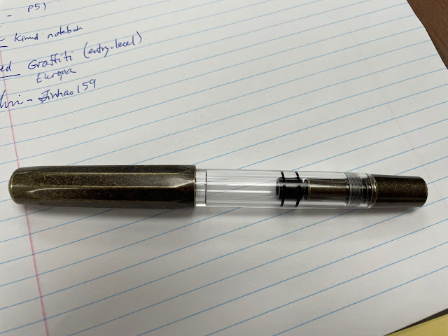
Yen's very cool Mahjohn (formerly Moonman) T1 in 'Vintage Brass' (love the look of that material!), a clipless piston-filling fountain pen with a brass cap & turning knob, and a clear acrylic barrel (note: those are my messy scribblings on the paper above, not Yen's :). Regarding the design of the pen, one online reviewer wrote: "If you have ever wondered what would happen if you leave your Kaweco AL Sport and TWSBI Diamond in a drawer together for the night, well I have an answer for you, you’d get a T1." 😂
(~text & photos by Maja~)
Here are some photos I snapped that evening...
(~please click on images to enlarge~)
We made it to the meeting! (L-R) John, Peter, Jason, Hadi, Jerred, Vladan, Alvin, Yen, Amy and me - Maja (Rene was also at the meeting, but he arrived very late, so he's not in the photo)
Brand-new member John brought along one of his first fountain pens, a lovely green-striped Pelikan M800 which he got back in 1987
(Above) Hadi showed us two handsome Parker 75' fountain pens with a great deal of sentimental value--the top pen (the gold-filled 'Insignia' pattern) belonged to his father, while the solid sterling silver pen in the 'Ciselé' pattern was Hadi's first fountain pen, given to him by his parents when he was a young man.
Hadi's son Jason (who lives out of town) came to our meeting with his daily user--a classy-looking vintage Parker '51' fountain pen (with matching mechanical pencil)
Vladan showed us some of his newest pen-related acquisitions, including this very nice Graf von Faber-Castell 'Classic Pernambuco' fountain pen, purchased at the Vancouver Pen Shop during their moving/anniversary sale. The fluted barrel is made of pernambuco, a very hard (and highly sought-after) exotic wood
Vladan's Pilot 'Explorer' in "Lime" metallic resin. The 'Explorer' has the same nib as the Pilot 'Metropolitan', but its section lacks metal threads (which the 'Metropolitan' has), making it more comfortable to grip
Above: Jerred's gorgeous red marbled Delta 'Europa' fountain pen...
...and his Delta 'Graffiti' which was --Jerred explained-- considered more of an entry-level fountain pen
One of several lovely Japanese-made 'kimono journals' that Peter brought to show us. The journals are made by master book-binder Tsutomu Matsuda, who hand-assembles the papers in his studio in Kyoto, Japan. The journals' covers are made from vintage kimonos, so no two journals look exactly alike. Peter imports them directly from Japan and sells them via Ibis Trading, located in Vancouver
Amy's Pilot' Kakuno' fountain pens (and no, they're not special editions or limited editions--Amy decorated them herself). The nibs on 'Kakuno' pens also fit the Pilot 'Metropolitan', 'Explorer' and 'Plumix' models & others, but only the Kakuno's nibs have smiley faces engraved on them
Yen's very cool Mahjohn (formerly Moonman) T1 in 'Vintage Brass' (love the look of that material!), a clipless piston-filling fountain pen with a brass cap & turning knob, and a clear acrylic barrel (note: those are my messy scribblings on the paper above, not Yen's :). Regarding the design of the pen, one online reviewer wrote: "If you have ever wondered what would happen if you leave your Kaweco AL Sport and TWSBI Diamond in a drawer together for the night, well I have an answer for you, you’d get a T1." 😂
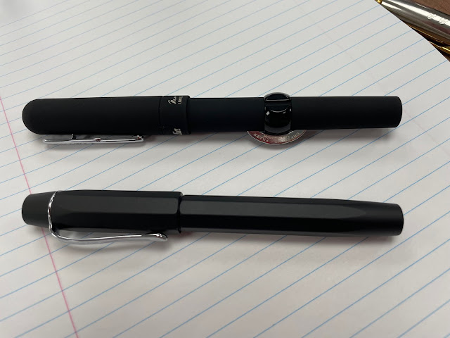
Alvin's modern Conklin 'Crescent-Filler' "Superblack" fountain pen and his Kaweco 'Original" black anodized aluminum fountain pen.
Re: the "Superblack" Crescent-Fillers, retailer Pen Chalet states: "...(the) pens are made of solid brass with the surface undergoing a new technique to create the "superblack" coating and achieve an almost 100% matte black appearance. The unique and stunning superblack finish absorbs over 99% of visible light at normal incidence which is what makes it darker than any other known substance." 😮 Wow.
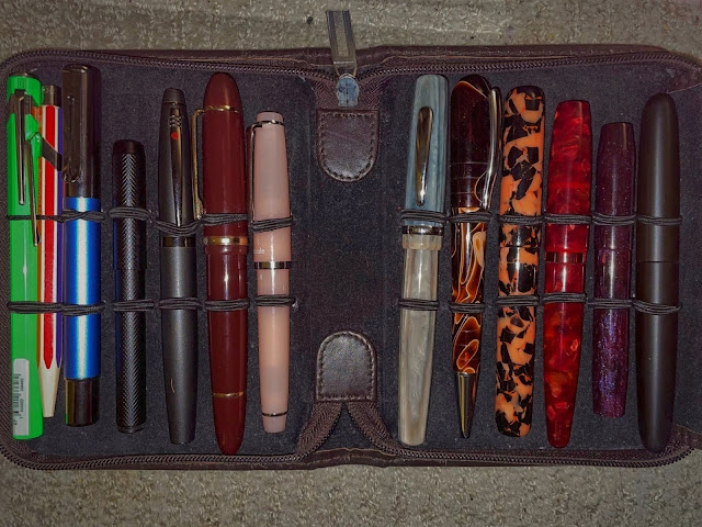
I knew I'd forget to photograph them at the meeting, so I took a very quick photo of my pens (which I purchased over *several* months lol) at home--apologies for the picture quality---(L-R) Caran d'Ache '849' fountain pen (FP) in 'Fluo Green', Caran d'Ache '849' Limited Edition 'Colour Treasure" ballpoint in "Warm Rainbow", a blue Monteverde 'Ritma', black Delike (?) metal pocket FP, Ecobra Cityline 'Ancona' FP in anthracite black metal, Jinhao X159 FP in burgundy acrylic, Sailor 'Lecoule' FP in Rose Quartz, THINK 'Hampton' FP, Taccia 'Callisto Brown' ballpoint, Woodshed Pen Company FP pen in "Hallowe'en Nights' acrylic, Karas Kustoms' 'Vertex' model in Conway Stewart's (modern) "Cherry Red" resin, Franklin-Christoph '45' Special Edition "Blackberry" fountain pen (the resin was made exclusively for F-C by Diamondcast, to their design specification) and an Ensso 'Piuma Minimalist' black ebonite FP (part of a 2022 Kickstarter campaign).
I knew I'd forget to photograph them at the meeting, so I took a very quick photo of my pens (which I purchased over *several* months lol) at home--apologies for the picture quality---(L-R) Caran d'Ache '849' fountain pen (FP) in 'Fluo Green', Caran d'Ache '849' Limited Edition 'Colour Treasure" ballpoint in "Warm Rainbow", a blue Monteverde 'Ritma', black Delike (?) metal pocket FP, Ecobra Cityline 'Ancona' FP in anthracite black metal, Jinhao X159 FP in burgundy acrylic, Sailor 'Lecoule' FP in Rose Quartz, THINK 'Hampton' FP, Taccia 'Callisto Brown' ballpoint, Woodshed Pen Company FP pen in "Hallowe'en Nights' acrylic, Karas Kustoms' 'Vertex' model in Conway Stewart's (modern) "Cherry Red" resin, Franklin-Christoph '45' Special Edition "Blackberry" fountain pen (the resin was made exclusively for F-C by Diamondcast, to their design specification) and an Ensso 'Piuma Minimalist' black ebonite FP (part of a 2022 Kickstarter campaign).
Well, that's it for the December's meeting report. Many thanks to everyone who attended the meeting! Our January 2023 meeting date & place: To be announced.
* Meeting info will be posted at the top of each webpage in big red letters * .
* Meeting info will be posted at the top of each webpage in big red letters * .
(~text & photos by Maja~)
Labels:
Caran d'Ache,
Conklin,
delta,
ecobra,
ensso,
faber-castell,
franklin-christoph,
handcrafted pens,
karas,
kaweco,
meetings,
Monteverde,
moonman,
parker,
pelikan,
Pilot,
Sailor,
taccia,
THINK,
woodshed pen co
Saturday, December 24, 2022
Friday, December 23, 2022
Newest Acquisitions (Virtual "Show & Tell") ~ part 442
(Many thanks to the eleven brave souls that came to our in-person meeting last night, despite the awful weather; I'll post some photos from it in the next few days :)
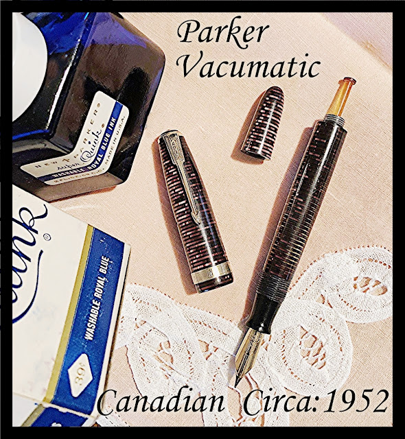
The hits keep on coming... Here's another one of Christopher's latest acquisitions--a beautiful vintage Canadian-made Parker Vacumatic !
Christopher writes: "On the vintage pen front I have several new additions which I picked up on my travels last week. Here is the first one."
(all photos courtesy of Christopher ~ please click on images to enlarge)
He continues: "Every once and a while I run across a vintage pen which, literally, I cannot live without. The second I lay eyes on this one, I was smitten! And it just kept getting better. When I got the pen home and into my workshop to restore and service, I noted immediately that it was Canadian and a good few years after the American Parker production of the Vacumatic had ceased. Checking out the Parker Date Code on the barrel it was a quite clear imprinting ’52’, or 1952. I should add that there is a lot of reference to the Canadian Parker plant in Toronto closing down their production of the Vacumatic in 1953. But according to Kenneth Parker’s journal, it was 1955 when the last full Parker Vacumatic rolled off the human assembly line. This makes perfect sense because in 1998, I drew an illustration of a pen I had in 1955. which, according to my dear olde Mum, was a Christmas gift from her and my father to yours truly that year. Since I had no idea what a Parker Vacumatic was when I drew that illustration from memory in 1998, I would have to say when I became a full blown vintage pen collector in 2010 that my illustration of this fine pen I had was none other than a Vacumatic. And to qualify further, as I recall it was a silver and pearl model."
"Turning the clock forward, the overall finish of my newly acquired Parker Vacumatic is brilliant Burgundy and Pearl. Being definitely a late third generation model, the back end of the barrel sports a plastic button Vacumatic filler covered by a jewel-less long rounded ended blind cap. Atop the other end of the pen is a Major single, inverted chevron 14K gold filled single wide banding. The Parker arrow clip does not have the blue diamond warranty but, finished also in the 14K gold filled, is still very attractive. The single jewel which covers the clip screw is jet and underneath this cap is a very impressive 14K sold gold Parker Vacumatic Canadian imprinted flexy nib. This nib sits on the Parker ‘Wide ink Channel feed that is marked on the underside with a ‘W’."
"Still, I have saved the best tell for last, and that revolves around both the other finish brilliance and a totally clear barrel transparency. So clear, in fact, that one could read through it!!! Evidently the Burgundy finish in the third Vacumatic generation is rather rare and does not surface all that much. So I guess that I would have to admit that there is nothing about this fine Parker pen that I don’t like. It will be come a cornerstone in my vintage pen collection to be used often."
(Above: Christopher's own illustration of his Parker Vacumatic from his memories of Prep School)
Our thanks to Christopher for sharing another wonderful vintage find with us!
Wednesday, December 21, 2022
Reminder: In-person meeting tomorrow (December 22)!
Don't forget our in-person meeting tomorrow - Thursday December 22- at the Kitsilano branch of the Vancouver Public Library from 6:00 PM - 8:30 PM! (click here for detailed info).
In the off-chance that that library branch has to close early, I will post the meeting cancellation here, so please check our website before you head off to the meeting.
Tuesday, December 20, 2022
Newest Acquisitions (Virtual "Show & Tell") ~ part 441
As promised, here's the second installment of Lawrence's thoughts on his pen/ink matchups! (part 1 is here)
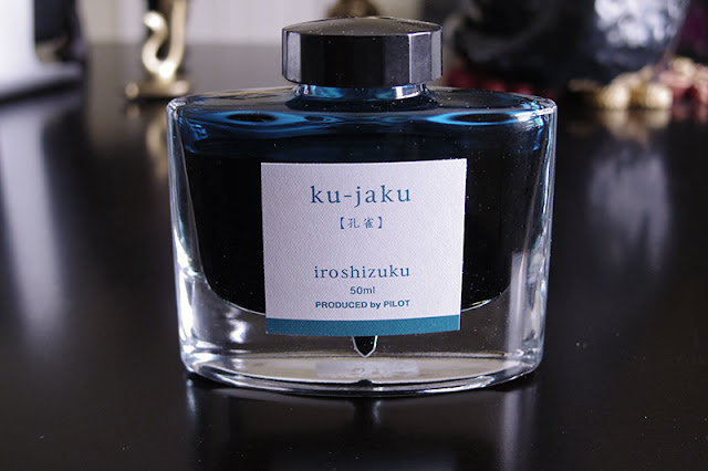
Lawrence writes: "This is, in a way, an add-on to the first group of blue inks. These inks are in the blue/green/turquoise color range. They are different enough to me, however, that I grouped them into their own category: "blue-indulgence inks". I know it's a weird category name, but these inks are specifically purchased with a pen in mind. And the pens that were matched with these inks are on the extreme higher end of things (something I would probably never, ever venture into again). And like the other group, there is a "cult-leader" of sorts and this is the Pilot Iroshizuku "ku-jaku". And the subsequent inks of this colour that came after are compared to this:
(all photos courtesy of Lawrence ~ please click on images to enlarge)
It's probably one of the best behaved inks I own. I love the deep blue green color of the ink:
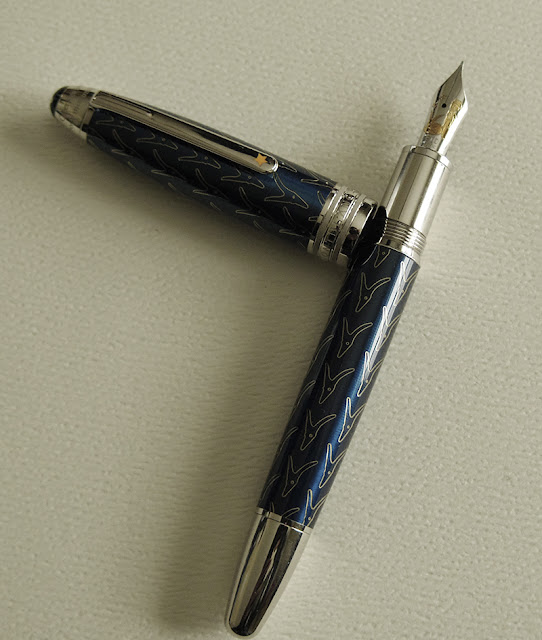
This ink was purchased for use with a specific pen: The Little Prince Solitaire (a pen that was reviewed here before):
I normally refrain from matching the same color pens with similar colored inks (in this case blue / blue), and this Little Prince pen does come with its own ink, a sepia colored ink from Montblanc called the Little Fox. It's a good match, blue / orangey. But I decided instead to break my own rule and match it with a turquoise-y kind of ink. And it worked very well, and the pen is whimsical enough that all is forgiven LOL.
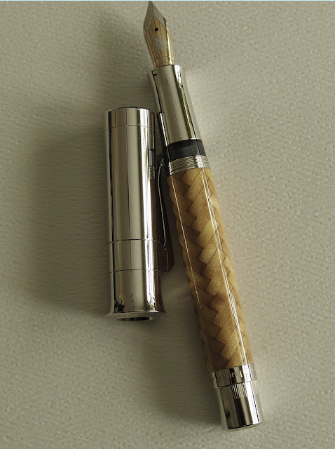
The second pen that came after this, was the very extravagant Pen of the Year 2008 by Graf von F (again, a pen that was reviewed here before:
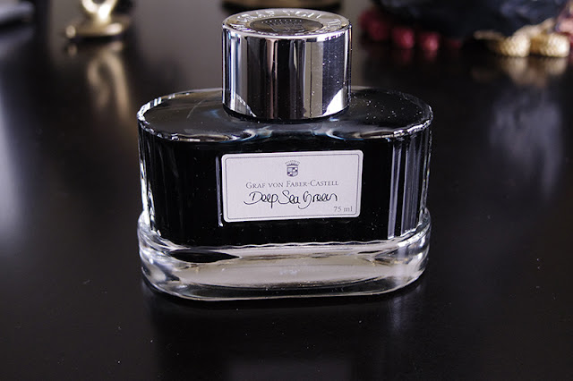
With this pen, I went the "traditional" route by matching it with a blue/greenish ink. I found one that can work: Graf von's Deep Sea Green:
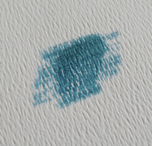
And it comes with a dark blue green color that is more blue than the ku-jaku:
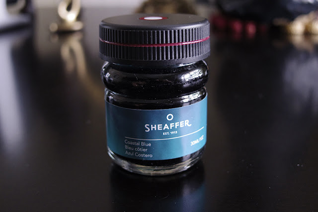
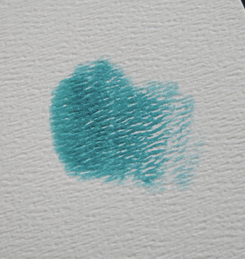
The colors work well, but the pen wrote very dry and scratchy with it. I think Graf von's nibs are stiffer in general anyway and this ink did not help. So when Sheaffer came out with Coastal Blue, I decided to try it out:
This ink worked some magic into the POY, and it wrote smoothly with less scratchiness. And this one is an even better match color-wise; it's sort of like a brighter version of the ku-jaku:
This is a bit more green than Graf von's own offerings. So with the pen's wood finish, it sort of matches like leaves on a tree.
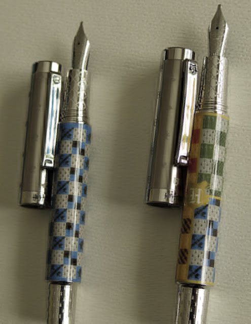
The next group of pens that came along are the Hogwarts twins (again, I had reviewed them here before):
I had initially tried sepia on these pens, but because these are 1.1 stubs I had a bit of a difficult time with skipping and baby bottoms. None of my existing brownish inks work. So I tried the Pilot ku-jaku with them just to test (I was told Pilot inks are good for misbehaving pens) and they wrote beautifully. I would have normally bought a sepia/brownish Pilot ink variant eventually, but I realized that these are in a way "school" pens (even if fictional) so they will be using the blue shade after all. In the end, I chose to have these pens stay with the ku-jaku ink, or perhaps I will buy a "nostalgia blue" variant of the Pilot inks (but I'm in no rush at the moment).
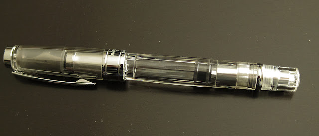
This pen/ink group is very small and limited, but considering the pens that are involved in them, it is understandable (my poor wallet can only accommodate so much frivolity LOL). But I do have occasional "visitor" pens that can try out these inks. This pen group are the demonstrators, like my TWSB 580 (below). Being what they are, they can technically take whatever color. My beloved Parker 21 sometimes pop by for a visit also (because it wants to and it can), but it sticks to the "nostalgia blue" most of the time.
That's it for now. The next group will be fairly large as many of my grail pens belong to it: the red/burgundy - black pens.
Cheers,
L"
Lawrence, thank you for taking the time to share your thoughts on your pen/ink combinations--it was much appreciated!
Lawrence writes: "This is, in a way, an add-on to the first group of blue inks. These inks are in the blue/green/turquoise color range. They are different enough to me, however, that I grouped them into their own category: "blue-indulgence inks". I know it's a weird category name, but these inks are specifically purchased with a pen in mind. And the pens that were matched with these inks are on the extreme higher end of things (something I would probably never, ever venture into again). And like the other group, there is a "cult-leader" of sorts and this is the Pilot Iroshizuku "ku-jaku". And the subsequent inks of this colour that came after are compared to this:
(all photos courtesy of Lawrence ~ please click on images to enlarge)
It's probably one of the best behaved inks I own. I love the deep blue green color of the ink:
This ink was purchased for use with a specific pen: The Little Prince Solitaire (a pen that was reviewed here before):
The second pen that came after this, was the very extravagant Pen of the Year 2008 by Graf von F (again, a pen that was reviewed here before:
With this pen, I went the "traditional" route by matching it with a blue/greenish ink. I found one that can work: Graf von's Deep Sea Green:
And it comes with a dark blue green color that is more blue than the ku-jaku:
The colors work well, but the pen wrote very dry and scratchy with it. I think Graf von's nibs are stiffer in general anyway and this ink did not help. So when Sheaffer came out with Coastal Blue, I decided to try it out:
This ink worked some magic into the POY, and it wrote smoothly with less scratchiness. And this one is an even better match color-wise; it's sort of like a brighter version of the ku-jaku:
This is a bit more green than Graf von's own offerings. So with the pen's wood finish, it sort of matches like leaves on a tree.
The next group of pens that came along are the Hogwarts twins (again, I had reviewed them here before):
I had initially tried sepia on these pens, but because these are 1.1 stubs I had a bit of a difficult time with skipping and baby bottoms. None of my existing brownish inks work. So I tried the Pilot ku-jaku with them just to test (I was told Pilot inks are good for misbehaving pens) and they wrote beautifully. I would have normally bought a sepia/brownish Pilot ink variant eventually, but I realized that these are in a way "school" pens (even if fictional) so they will be using the blue shade after all. In the end, I chose to have these pens stay with the ku-jaku ink, or perhaps I will buy a "nostalgia blue" variant of the Pilot inks (but I'm in no rush at the moment).
This pen/ink group is very small and limited, but considering the pens that are involved in them, it is understandable (my poor wallet can only accommodate so much frivolity LOL). But I do have occasional "visitor" pens that can try out these inks. This pen group are the demonstrators, like my TWSB 580 (below). Being what they are, they can technically take whatever color. My beloved Parker 21 sometimes pop by for a visit also (because it wants to and it can), but it sticks to the "nostalgia blue" most of the time.
That's it for now. The next group will be fairly large as many of my grail pens belong to it: the red/burgundy - black pens.
Cheers,
L"
Lawrence, thank you for taking the time to share your thoughts on your pen/ink combinations--it was much appreciated!
Labels:
faber-castell,
ink,
montblanc,
Montegrappa,
photos,
Pilot,
sheaffer,
twsbi
Sunday, December 18, 2022
Newest Acquisitions (Virtual "Show & Tell") ~ part 440
Don't forget our in-person meeting this week (on Thursday December 22) - details here!
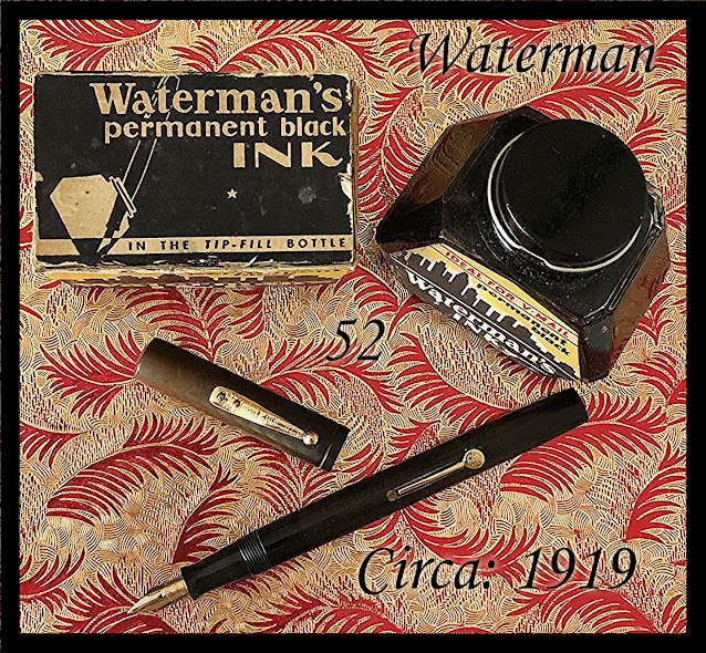
In the meantime, here's a write-up Christopher sent in for our blog about a vintage fountain pen he acquired in the U.S. a while ago...
In the meantime, here's a write-up Christopher sent in for our blog about a vintage fountain pen he acquired in the U.S. a while ago...
(photo courtesy of Christopher ~ please click on image to enlarge)
Christopher writes: "Leaving no stone unturned in my travels, I ran across yet another Waterman 52. This vintage trooper, once I turned to and restored it, is outstanding. And it is the 52x model in that the size of the barrel and cap are larger than the standard 52 but the super flexy nib, as it is, remains the standard 52 No.2 14K gold Waterman Idea nib. As for the fittings, they are 14K gold filled and the larger sized barrel made provisions for a much larger sized replacement rubber ink sack. I was so happy to get this vintage pen and, in using it in this week’s pen round up, will be happy to add it to my collection come the end of the week."
Christopher writes: "Leaving no stone unturned in my travels, I ran across yet another Waterman 52. This vintage trooper, once I turned to and restored it, is outstanding. And it is the 52x model in that the size of the barrel and cap are larger than the standard 52 but the super flexy nib, as it is, remains the standard 52 No.2 14K gold Waterman Idea nib. As for the fittings, they are 14K gold filled and the larger sized barrel made provisions for a much larger sized replacement rubber ink sack. I was so happy to get this vintage pen and, in using it in this week’s pen round up, will be happy to add it to my collection come the end of the week."
Our thanks to Christopher for the lovely photo & review! We'll be featuring part 2 of Lawrence's pen-and-ink-matchups later this week, so watch for it here :)
Saturday, December 3, 2022
In-person meeting on December 22 ! (*note the date*)
What: Vancouver Pen Club December 2022 meeting
Where: The Branch Meeting Room (located in the basement) of the Vancouver Public Library's KITSILANO branch at 2425 Macdonald Street (between Broadway and West 8th), Vancouver, BC (where we had our August, September & October meetings)
Date: Thursday December 22, 2022 (*see 'Important Info!' section below*)
Time: 6:00pm to 8:30pm (we have to vacate the room by 8:30pm, as per the library's room rental policy).
Topic: Newest Acquisitions
*Please note that this meeting date isn't on our usual third-Thursday-of-the-month calendar date. We plan to resume our usual monthly meeting schedule in January 2023 but, as always, please check this blog for updates/changes to our schedule. If you have any questions, send us an email at vancouverpenclub@gmail.com Hope you can make it to our meeting!
Subscribe to:
Comments (Atom)


