Saturday, April 29, 2023

Newest Acquisitions (Virtual "Show & Tell") ~ part 486

Today and Monday, we'll be featuring reviews of two vintage fountain pens from the Parker Pen Company's venerable 'Vacumatic' line. Our thanks to Christopher for sharing these wonderful new finds with us!

Christopher writes:
"I think what has to be the most exceptional finish in the Parker Vacumatic line was their Shadow Wave. It came near the end of the 1930s as something new and extremely innovative. Basically a finish consisting of thin vertical lines on an opaque cap and transparent black lined barrel integrated with a pearl which could be brown, burgundy, green or grey. Like the barrel transparency of the regular Parker Vacumatic, these Shadow Wave models also offered that same barrel option. The purpose, of course, was for the pen user to assess the amount of ink in the unit. There was also a jet black to round out the colour finishes. The Parker Shadow Wave Came in three distinct sizes, but definitely was considered in the Parker Junior model classification. There was the regular and most familiar double cap banded Junior. A regular Debutante model with the single cap band chased with inverted chevrons and a smaller ‘Junior Debutante’ which was much the size of the regular Parker Vacumatic Juniorette."

(photo courtesy of Christopher ~ please click on image to enlarge)

"What is most interesting about the Parker Shadow Wave line is that, to begin with, when it was introduced, the Junior model was not streamlined in design and sported both a lock down Vacumatic filler and the wide feather clip. These features soon changed when the Parker design team streamlined the Shadow Wave and also changed the filler first to a Speedline, then to the plastic button and, at the same time, dropped the second jewel from the blind cap. The blind caps -- always finished in jet black-- as time went on were also lengthened to accommodate first the Speedline, then the plastic button Vacumatic fillers. The other difference were the clips, which changed with the times from the wide feather to the split feather with the Parker branding running directly up the center. There was also a difference in length, in that the Junior clip was longer where as the Debutante and Junior Debutante were much shorter.

Although I do have a very early Shadow Wave brown ‘full sized’ Junior with a lockdown filler and wide feather clip, the other day it was my luck to run across the somewhat rarer Junior Debutante that is a full three millimeters shorter than the Shadow Wave Debutante. And this fine Parker pen is finished in a grey pearl with very good transparency. Also the outside finish is truly brilliant unlike some of the Parker Shadow pens I have seen, which usually are a bit on the dark side when it came to their finish. But what really surprised me about this pen was the fact that even at 85 years old, once washed out and inked, it came to life immediately. Needless to say, it has a proud place in my vintage pen collection."

Wednesday, April 26, 2023

Newest Acquisitions (Virtual "Show & Tell") ~ part 485

As promised, we're back with some more of Christopher's pen reviews, starting with this little vintage number below...

(photo & text courtesy of Christopher ~ please click on image to enlarge)

"Years ago, I acquired some British fountain pens and amongst them was what I had assumed was a Conway Stewart. The only imprinting on the barrel read simply, ‘Made in England’ and the cap had a insignia on it which I was not familiar with. That left the id which was clearly marked ‘Conway Steward on the nib. So logic dictated that the pen was, in fact, just that. In the time that followed, I showed the pen to another collector and he identified it as a Wyvern with a Conway Stewart replacement nib. I was a little put off with this and decided to stow the pen until I could make it right. More currently, as luck would have it, I ran across another Wyvern, and to my joy the nib in this new acquisition was the right one and allowed me to then have a complete Wyvern fountain pen."

"This is a Wyvern ‘Pixie’ from the end of the 1940s. Possibly a lesser model, but with the same quality standard which made the Wyvern company a major contender and on par with the top British pen companies of good size. At the top of the tapered clip there is a symbol that represents the Lester Dragon or Wyvern, and was the district in England where the Wyvern company was located. Although a Plain Jane in its make up and finish, there is a subtle elegance and an overall well balance to the design elements of this fine pen.

The cap sports the cap clip I have described, but this is neatly complimented with a very fine single banding. The clip is held fast by a top rivet while, at the other end of the pen, the barrel is round flat ended. This is a lever filler and, for the size of the pen, a long and narrow lever. The section is both adequate and matching black like the rest of the pen’s finish and sports a small but extremely well ground super flexy 14K sold Gold nib. As a writer, this pen is brilliant and a joy to apply to paper. I will close by saying that when the British get it right, especially with this fine pen, their efforts are well worth noting. I will be adding this UK treasure to my collection and it will not go unused.

Funny how these things turn out and to quote my good chum Mark, ‘Never discard anything when it comes to vintage fountain pens."


Many thanks to Christopher for this review! We'll be posting more of his reviews this week and next, so stay tuned ....

Monday, April 24, 2023

April meeting pics - topic: Clipless Fountain Pens !

We had good attendance at our April meeting, held on Thursday April 20th at the Kitsilano branch of the Vancouver Public Library - sixteen members, including two newcomers (Jenny and Lauren)! A good time was had by all, seeing and hearing about clipless fountain pens--both modern and vintage-- as well as our members' newest pen-related acquisitions.

(all photos by Maja, except where noted ~ please click on images to enlarge)

And here we are!

Front row (L-R) Jenny, Jared, Alejandra, Lauren, Maja and Kelley. Back row (L-R): Hadi, Christopher, Mandy, Stuart, Peter, Vladan, Luc and Rene. Missing from photo: Mindy.
(Many thanks to Nox for snapping the pic! :)


I took some shots of what our members brought in for our informal "show & tell", so here they are (roughly in the order in which we saw them during our meeting) ...
Jerred brought some cool-looking clipless fountain pens for our primary meeting theme (top to bottom)---his aluminum PenBBS '350' (which was sold with a rollerball tip), a swirly Moonman 'Wancai' pocket pen, and a PenBBS '471' pocket pen in a resin called "Amber is a Cat".

The peacock blue Mahjohn
(formerly Moonman) 'A2' capless fountain pen at the bottom of the photo--a new acquisition for Jerred--is a faceted, resin version of the popular Mahjohn A1 lacquered metal capless fountain pen. Currently, the A2 model only comes with a clip, but Jerred said he's hoping for a clipless version to be produced.
Above: Jerred's gorgeous urushi Bottegando fountain pen. I hadn't heard of this Italian maker of handmade writing instruments before, but as per their Etsy shop, they're located just outside of Verona, Italy and they produce some unique-looking fountain pens (many of them one-offs).

Two more clipless fountain pens brought in by Jerred -- LIY (Live in You) 'Future' models in the "Enchantress" (top) and "Blue Coral Sea" acrylics. I love the little metal floral roll-stops :)

I forgot to photograph it at an earlier meeting, so I snapped a photo of one of Peter's favourite fountain pens----the Pilot 'Vanishing Point' above---at our April meeting.


Above: the interior of one of the beautiful kimono notebooks that Peter's company imports directly from Japan (the Platinum 'Preppy' fountain pen --also made in Japan--is mine :)
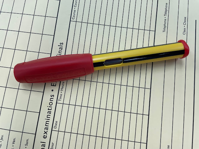
Our secondary topic is always "Newest Acquisitions", so Kelley showed us her new Lamy 'Safari' Yellow fountain pen. The green-capped fountain pen next to it is a Pilot 'Parallel' that Kelley brought in for our clipless fountain pens topic (and yes, she shortened the Pilot's long barrel herself lol). 
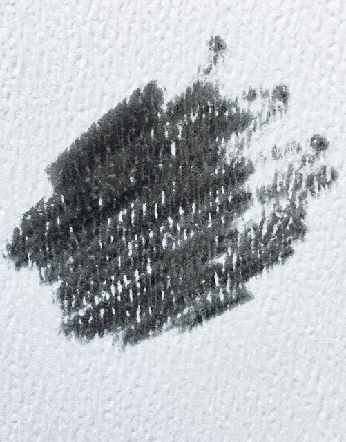
The Pilot was inked up with a very interesting silvery ink (shown above) made by Dominant Industry, an ink manufacturer from South Korea that entered the highly-competitive fountain pen ink market in 2021. Kelley said that this ink (which she described as looking like "liquid mercury") has both sheen and shimmer...


Some new acquisitions + clipless fountain pens, all belonging to Rene (L-R): a vintage Parker '51' flighter model from 1949, three nice vintage Parkers (two 'Vacumatics' and a 'True Blue' flat top), a vintage Wahl all-metal vest pocket model, a Kaweco 'Special Red' (part of Kaweco's 'Collection' line), an early Eagle glass cartridge fountain pen, two vintage Lady Sheaffers, a Benu 'Minima' in "Baikal Ice", and an aluminum PenBBS '323'. A bit of pen-related trivia - Rene won a Facebook contest to name the Benu pen's special resin material!

A closeup of Rene's antique (ca. 1890) Eagle cartridge fountain pen, the world's first cartridge-filling fountain pen! When Rene acquired the pen, it came with an intact glass ink cartridge, which is truly incredible, given the age of the pen and the fragility of the cartridge's material. There's a nice write-up on this early fountain pen model here on PenHero.com


Above: Rene's amazing Eclipse vintage fountain pen & pencil collection (which features several clipless pens).

Above: Three clipless fountain pens belonging to Vladan (top to bottom: Ensso 'Piuma' in black ebonite, a black Franklin-Christoph '46' model with a great Medium SIG---Stub Italic Gradient-- nib, and a Kaweco 'Sport' Brass), and one of his newest acquisitions - a Platinum 'Century 3776'. Vladan also showed his wonderful clipless green Kilk 'Epigram' fountain pen (not shown here, but there's a photo of it in our March meeting report).

Another new acquisition of Vladan's -- a Faber-Castell 'Ambition' Coconut, made of finely-grained coconut wood.

Stuart showed and talked about a few different clipless fountain pens, including the small all-metal Sheaffer above, and a lovely red Lady Sheaffer in the 'Tulle' pattern. He also brought a Kaweco AL Sport in Rose Gold (shown in these old photos.)

Stuart recently acquired this Lamy Safari in "Aquasky" (one of the three brand-new Lamy 'Safari' colours for 2023) from the Vancouver Pen Shop...

...and he purchased this classy German-made ROWI (Rodi & Wienenberger) fountain pen during the meeting from a fellow pen club member!


Here are the clipless fountain pens I brought for our primary meeting theme - (L-R) a vintage first-year (1940) 14k gold-filled Sheaffer 'Tuckaway' (reviewed here) with a sweet inscription, two ENSSO 'Piuma Pocket' fountain pens (in Titanium and Ultem materials), a red version of the metal Delike pocket pen I reviewed here last month, my brand-new PenBBS 323' "Orange Goddess", an ENSSO 'Piuma' in black ebonite, an HYL sparkly demonstrator eyedropper-filler (reviewed here), and a Kaweco 'Perkeo' in "Indian Summer" (another brand-new acquisition).

Above: A couple more of my newest purchases---a light blue Pelikan 'Pina Colada" fountain pen (a new Pelikan school pen model, also available in rollerball form), and a Lamy 'Nexx' in Lime---both of which I will be reviewing here in the near future.

(top to bottom) Christopher's vintage Wyvern 'Pixie', his Eversharp 'Fifth Avenue' fountain pen and Alejandra's clipless Kaweco 'Liliput'. Alejandra also showed some other clipless fountain pens of hers--a stylish Waterman 'Audace' and a Charles Lethaby 'ION' fountain pen made of titanium.

Mindy's current daily user, her trusty Pilot 'Prera' clear demonstrator fountain pen

 Mandy's Staedtler school pen, purchased over a decade ago in Austria


Last but not least, here's what Luc brought to show us...
A fountain pen handmade by a small Australian pen maker ...


...a very nice Franklin-Christoph '45' with a SIG nib...

...and a new journal from the Vancouver Pen Shop that caused a lot of excitement because its cover was made from an actual vinyl record! The notebooks come with different vinyl record covers, and they even make covers from 45s (with the plastic spindle adaptor included). How cool is that? 😁


Many thanks to everyone who came to our meeting last Thursday, My apologies for not getting around to photographing everyone's stuff-- brand-new member Lauren's lovely Kaweco 'Sport' in "Iridescent Pearl", newcomer Jenny's elegant Montblanc 'Classique' fountain pen, Nox's cool Jinhao dragon fountain pen, and some stunning vintage writing instruments (a Parker 'Duofold' set in the rare Mandarin Yellow colour, and a Wahl-Eversharp 'Gold Seal' flat-top) belonging to Hadi.

Information about our May meeting will be posted at the top of each webpage on our blog as soon as I confirm the meeting venue and date. Until then, have a great week and enjoy your pens in good health!

(~Blog post by Maja~)

Saturday, April 22, 2023

Newest Acquisitions (Virtual "Show & Tell") ~ part 484

Many thanks to everyone who attended our April meeting two days ago; I'll post a meeting review (with lots of photos) tomorrow or Monday. In the meantime, here's another installment of Lawrence's thoughts on his preferred fountain-pen-&-ink matchups (what he calls "Lavalife and pens" heh) for you to enjoy!

This review (Part 5 of Lawrence's series) features black inks and continues on after part 1, part 2, part 3 and part 4. Many thanks to Lawrence for another excellent blog post :)

(All text below by Lawrence)

"I have to say that the most versatile ink "colour" has to be black. Some people corrected me that it's not really a colour, but a shade of other colours, which is more accurate I guess as we always see ink reviews where it was mentioned that this "black has a bit of other colours in them".... It makes sense, I guess. Visually, black inks work with almost any pen, but that would be too simple in my OCD world. LOL.  This is a moderately sized group that is based mainly on one ink: Parker Black:

(all photos courtesy of Lawrence ~ please click on images to enlarge)

Like my other Parker inks, it is a no-nonsense ink.  In some lighting situations, there is actually a blue-greenish tinge to it, but it's not obvious until I compared it with other inks (more on this later).  Unlike the other inks I have, I did not get this Parker ink for a pen in mind.  I got it because I needed to complete my childhood Parker ink set (Blue, Blue-black, and Black).  While blue (and in some cases blue-black) inks are used in school, black is reserved for office / "serious" use...even teachers don't use it. LOL.  Black is the colour I see on my grandfather's office desk all the time. I am allowed to use it in his desk pen, but I never really had this desire to use it in mine.   It's one of those enigmatic "grown up" colours, and everyone in my class stayed away from this colour; it's associated too much with our parents and other "boring" grown up stuff. Although adventurous kids, like moi for example, would use blue-black to be edgy and "mature" LOL. 

Since I have the ink already, I try not to waste it, so I had some of my pens use it.  My grail group does not use it as they are mainly black pens (...but of course LOL).  The first pen that I tried this in was a Sheaffer (Lady Sheaffer Paisley Gold?):

This pen is not really part of my childhood school pens (but I did bring it to school once because I was trying to be popular LOL). Anyway, this pen was a corporate gift given to my grandfather and it's the only "office" pen from my childhood that I managed to bring to Canada with me.  For a while this was the only black inked pen that I had.  But eventually I decided I wanted to take some "risks" LOL, and try it on my vintage school pens.  The only two that I am comfortable with are the Parker 95:

And the Parker 45:
These two pens have the black section that renders them more "grown-up" to me. The other Parker school pens  (like my Parker 21) have blue sections so they are more "school-like". These two pens I also seldom brought to school due to their relatively more "office-like" nature.

As I got more pens, this Parker Black has had more use.  My Waterman Carene loved this ink very much:
This Carene I got on sale from Amazon. It's the only other Waterman that I own aside from the Elegance. It's a very reliable writer and it's a reddish pen that works with black (basically an inverse match of black pen / red ink).  Another one that looks great is the red Sheaffer I got from Staples:
I don't recall when I got this pen, but it is another one of my impulse buys. I always thought about getting a pen for "rough / everyday" use and then end up babying them anyway LOL.  This is another great writer and it works with black of course. 

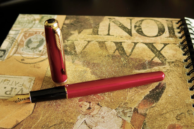
So far, this Parker black is sort of relegated to novelty use; pens that use this ink are only active occasionally. It's almost like a "backup" ink of sorts and does not have a "steady" pen partner like my other inks LOL.  It matches every pen after all. It's like this neighborhood tramp that "flirts" with everyone but does not seem to want to commit. Until....it got 'enslaved' by a demanding diva (almost like in some trashy romance novels, yes LOL).  Of all the pens that I have owned, one of the most temperamental would have been my Red Parker Sonnet.  This pen was intended to be an "update" to my vintage Parkers which I'm trying not to overuse.   It's as pretty as it was demanding (pictures don't do it justice...)
As a red pen in my OCD world, it would have been a black-ink writer anyway, but I did have a bit of fun trying out all sorts of other inks with it. This pen hated all of them, until it got to this Parker black. "I want the naughty player" it says, and so it had its eyes set on Mr. Parker Black.  I was not expecting it, as no one really recommends Parker Black for temperamental pens (maybe Parker Blue, but seldom Parker Black). I don't know why, but I'm just happy that the Sonnet wrote very smoothly, no baby-bottoming, no skipping, no issues since then with this ink.  I suppose it's meant to be. So far, this is one of two cases where I did not need to play matchmaker; the pen chose the perfect ink that it wanted to work with.  The other case has to do with my Faber Castell Neo-slim:
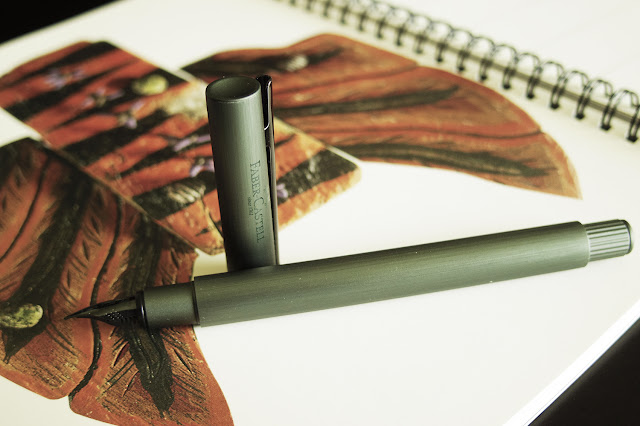
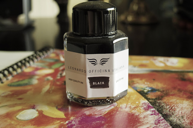
This pen I got on impulse because of the colour. I mistakenly thought the FB logo was a palm tree (at least to my not-so-awesome eyesight). I'm into Tiki's and I thought this would make a nice Tiki / tropical themed pen.  Anyway, like the Red Sonnet, this pen ended up being very picky as well, mainly due to its particular nib design. While the Sonnet is a diva, this pen I would call "misunderstood" LOL.   I tried the Parker Black to see if it would calm down, but it did not like that either.  So I decided to open up the new bottle of Leonardo Black ink that Maja gave me:


So now I can have a comparison to Parker Black. In some lighting Leonardo has a bronze-tinge  So if I compare the two side by side, it becomes very obvious. I guess "black" really is a darker shade of something after all. Normally this may trigger another new level of OCD colour match...but my eyesight is bad enough that black is black is black...so for now I'm fine LOL.  I was initially saving this ink for future red pens that I may want to get. I am hoping that there will be a nice Darth Maul themed pen in the future (the ones I saw online by Sheaffer and Platinum are half-arsed), and so this Leonardo will be perfect for this hypothetical Maul pen (Montegrappa are you seeing this review? <3) . Anyway, the Neo-slim loved it, so for the time-being it is matched with the Leonardo Black.

As mentioned in the beginning, this ink group should have been the largest since all my pens work with black ink. But maybe because I did not have to constantly "search" for the perfect black ink, I only ended up with two LOL. In the future, I'm hoping to diversify and try black from other ink brands. The Aurora Black is apparently the "perfect" black ink...I hope to acquire that next."

Thursday, April 20, 2023

Newest Acquisitions (Virtual "Show & Tell") ~ part 483

~ At the risk of sounding like a broken record, a small reminder that our April meeting is tonight at the VPL's Kitsilano branch 😁~ All details here ! ~

I didn't know anything about this brand before, but when I did some research for this review, I found out that the Nóta line of stationery and desk accessories was first introduced by Indigo in August 2021. On the Indigo website, the products are described as "Responsibly designed stationery and desk essentials to write your story in style."

In addition to notebooks, pencil cases and hundreds of other items, the
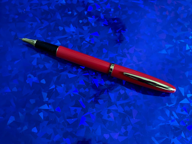
Nóta line includes a fountain pen model that is exclusive to Indigo (link). I'd seen the pens on their website before, but they were always full retail price ($24.99-29.99 CAD), so I didn't buy one. Late last month--when I was ordering a book from Indigo--I checked and saw that some of the Nóta fountain pens were on sale for 50% off, so I added one of the glossy red ones (on sale for $14.99 CAD) to my cart, placed my order (w/free shipping ;)... and this is what arrived...

(all photos by Maja ~ please click on images to enlarge)

The set included: one Nóta fountain pen, three black ink cartridges and one "Fluid Ink Refill - Black Ink" --ie. a bottle of black fountain pen ink (Note: the cartridges and supplied converter are not standard international ones).

The torpedo-shaped fountain pen is made of glossy red lacquered metal with gold-coloured trim and weighs 25 grams. I can't find any manufacturer's name anywhere on the pen. It's 13.7cm long capped, 11.5cm uncapped (nib tip to barrel end) and 14.7cm posted. The grip section is slightly flared with a maximum diameter of about 9.5mm (these are all my own measurements).  The pen has a really nice soft-but-secure capping action, posts securely and feels well-balanced in the hand when used posted (as I prefer to use this pen).


The gatefold window has a magnetic closure and a somewhat amusing message printed on the back - "Ink left in the tip can dry out. Please rehydrate in a small amount of water or ink bottle for next use".


Just out of curiosity, I looked up the FSC (Forest Stewardship Council International) label on the back of the cardboard packaging (above). The "FSC Mix" label signifies that "The product is made with a mixture of materials from FSC-certified forests, recycled materials, and/or FSC-controlled wood. While controlled wood doesn’t come from FSC-certified forests, it mitigates the risk of the material originating from unacceptable sources." Cool!

The instruction manual that came with the pen is definitely geared towards the new fountain pen user, and the pen's converter is referred to as an "ink absorber" in the pamphlet.

This fountain pen model is available in three colours---burgundy, blue (a bluish-grey) and green (which looks like teal to me), but the green set doesn't have a bottle of ink--just cartridges ---so it's priced a bit lower. The red one that I bought is a true red, though, and its packaging nicely matches the pen colour.


A bit of drama ---the first time I uncapped the pen, I didn't see the nib and thought they'd sent me a rollerball by mistake!

Then I took a better look at the writing end... ...and saw that it was, in fact, a fountain pen. Whew!

Its rather odd-looking hooded nib reminds me of a Crocodile '216' hooded nib and the hooded nibs on some Picasso fountain pens. Both of these pen companies are/were in China, so I wasn't surprised to see that my Nóta fountain pen was made there, too. 

There's no nib width marked on it that I can see, but it writes like a Western Fine/Extra Fine. I have to be honest---it's not a particularly smooth writer. I'll check the tine alignment and if it's alright, I might try smoothing the nib a bit with some very fine Micromesh (there isn't a lot of tipping material on the nib).

The pen feels quite well made, though, and
the nib looks pretty cool, so I'm not disappointed in my purchase; I'm just glad I didn't spend more than $15 CAD on the set. Your mileage may vary, as they say.

(~Blog post by Maja~)

Tuesday, April 18, 2023

Don't forget our meeting (Thursday April 20th)!

Don't forget our April meeting, which is happening this week on Thursday April 20 !

It's at the Kitsilano branch of the Vancouver Public Library from 6:00 PM - 8:30 PM! (click here for detailed info, including meeting themes/topics). 

Any questions? If so, please contact us at vancouverpenclub@gmail.com
Hope to see you there! (and no RSVPs needed!)

Monday, April 17, 2023

Newest Acquisitions (Virtual "Show & Tell") ~ part 482

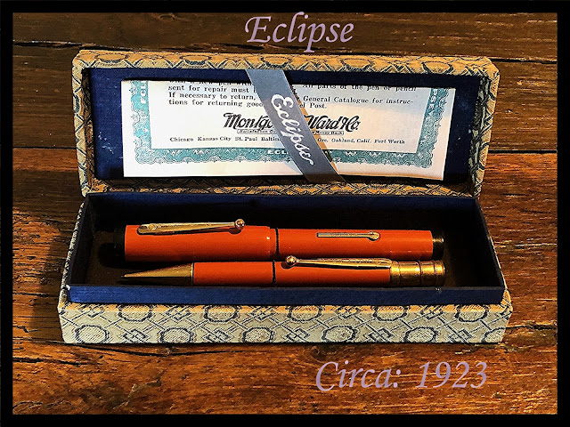
 Here's one more vintage pen review before we switch to modern ones for a bit----a set that was inspired by Parker's iconic vintage 'Duofold' "Big Red" model!

(photo courtesy of Christopher ~ please click on image to enlarge)

Christopher: "A while back, I acquired an impressive ‘Big Red’ design Eclipse from the early 1920s. Then, just the other day, a matching mechanical pencil came my way. After servicing both items, I really thought they deserved to be housed in a proper vintage pen case with suitable related ephemera. As luck would have it, I had picked up just the right display box locally. It was not rocket science to make an attractive tie down insert card and equip it with elasticated cords. As for the related Eclipse ribbon and the Montgomery Ward Department Store warranty card, those were all available on the internet with a bit of digging. I am very pleased and satisfied with the end result. which will be enjoyed whenever I use this lovely Eclipse set."

Our thanks to Christopher for his review of this nice vintage set; we'll be back with more of his reviews in the next week or so :)

Saturday, April 15, 2023

Newest Acquisitions (Virtual "Show & Tell") ~ part 481

Here's a lovely vintage (actually, it's now an antique as it's 100 years old!) fountain pen that Christopher showed at our March meeting (and speaking of meetings -- don't forget our April meeting on Thursday April 20--full details here)...

(photos courtesy of Christopher ~ please click on images to enlarge)

And here's Christopher's write-up about it:

"In Chicago during 1902, The United Drug Company was founded with the trademark branding, “Rexall”. What followed was the blossoming and spreading of what we now know as the ‘Drug Store’ all over North America. There were many different drugstore companies that followed, but it was Rexall that started the ball rolling. And one of their first quality fountain pens was the Signet. Unlike their lesser quality pens, the Signet was made by the De Witt – La France Company of Cambridge, Massachusetts with a focus on the best of the best.

This Signet is of remarkable quality for a house brand pen. The finish on the barrel and cap is 1/20th 14K Gold Filled and beautifully chased with inverted chevrons between groups of vertical lines. This is a flat top and bottom pen, and a snapfil lever filler. The cap clip looks ever so much like a Wahl clip and sports a patent on the top that attaches it to the cap. The section is long and thin and is finished in jet black plastic. Atop this grip is a stunning 14K Gold No.2 Mabie Todd flexy nib. This fine pen posts at all of 6 ¼ inches, but caps back to 5 inches. Still, to my mind, what is the best thing about this pen and really had me scooping it up was what is engraved at the top of the barrel, “Sold Only at the Rexall Stores.” I close by adding that this pen has a certain elegance which just will not let you put it down!"

Our thanks to Christopher for shining a spotlight on this beautiful antique fountain pen --- it still looks fantastic at age 100! ;)

Thursday, April 13, 2023

Newest Acquisitions (Virtual "Show & Tell") ~ part 480

From Parker to another one of the "Big Four" vintage pen companies, courtesy of Christopher...

(photo courtesy of Christopher ~ please click on image to enlarge)

Christopher writes:
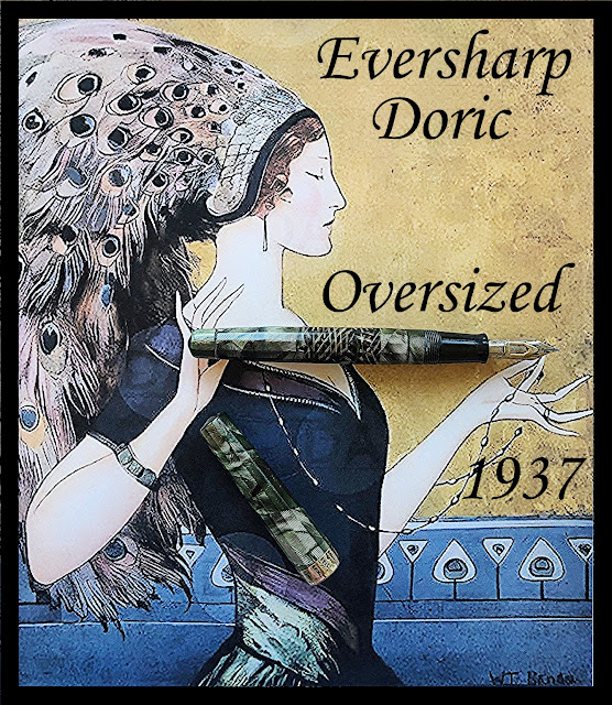
"Wahl really had their eye on all elements of good design when they released their Doric line of fountain pens and mechanical pencils. Design complemented with elegance, which set this line of fine pens apart for most, if not all, others. And there was just so much creative thought involved, even in the naming of the different colours. What other pen company would call their green (under their Airliner colours), Silver Green Shell and that is exactly what came my way in the oversized model.

The Doric is basically the Wahl Company’s streamlining of their older flat top pens during the late 1920s, but with a faceted finish in a lot of cases this just added to the Dorics overall beauty. One thing that is immediately evident is that the caps on the Dorics are long, which accents the streamlining. And the oversized model which is not --in my hands-- quite a big pen, posting at all of 6 ¼ inches but caps back at 5 ¼ inches. This is a later model Doric that has the super Deco 14K Gold Filled cap band which, unlike the earlier one, comes down in and slightly under the open end of the cap to provide protection against cracking when the pen is posted. This is a Eversharp ‘One Shot’ Vacuum Filler which is somewhat similar to the Sheaffer Vac – fill mechanism. But the real magic of this pen is definitely at the other end. For atop a long black section is a ‘Adjustable’ 14K Large No.4 flexy nib. Now this nib comes complete with a sliding open arrow shaped bar mechanism which allows for the user to adjust the nib from fine to semi broad or whatever suits their fancy. Still, that is not all in the innovative department because just under the feed and sticking out of the section in a spring loaded lever which allows for the ink flow to be shut off when the cap is installed back onto the pen.

I cannot express how pleased I am with this new addition, but I will admit that it is missing its clip but I do not see that is a challenge for me to find a replacement. In closing, I should add that in inking this trooper, it truly lays down the ink splendidly and the nib is nothing but flexible. It will be a pen --once completed-- that I use often."

Many thanks to Christopher for sharing this vintage classic with us! For an in-depth look at the different generations of the beautiful 'Doric' model, check out this profile on Richard Binder's website.

Tuesday, April 11, 2023

Newest Acquisitions (Virtual "Show & Tell") ~ part 479

We'll be featuring some of Christopher's latest vintage finds here for the next week or so, starting with this nice Parker fountain pen. Our thanks to Christopher for this informative write-up and accompanying photo!

(click on image to enlarge)

Christopher writes:
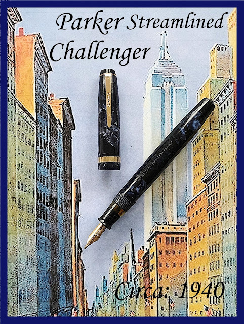
"For some reason unbeknownst to me, there does not seem to be an abundance of the lovely azure blue pearl Parker Challengers around. And I would have to add, especially in their last incarnation. In over a decade of serious vintage pen collecting, this has to be the only one I have run across.

The Challenger was first introduced by Parker as part of their economy line around 1935. It came, subsequently, in two sizes - the larger Standard model and the smaller Slender, both selling for the attractive price of $2.75. And as with most Parker fountain pens, there was also a matching Challenger mechanical pencil priced at $1.25. Plus, an attractive range of colour finishes offered in a smart Grey 1935 - 1939, an exquisite Burgundy 1935 - 1940, a Jet Black 1935 - 1939, an azure pearl Blue only in 1940 and a deep range of Green 1935 – 1940. The clips of this first generation were ball ended with the Parker branding running vertically down the center. But as with a lot of Parkers pens, in 1939 the company chose to streamline the entire model range and, in doing so, redesigned and tapered the clip but, at the same time, retained the company branding.

Post dating the 1939 redesign, this pen which I am featuring in this article, sports the smartly appointed tapered arrow clip with a medium width cap banding. All of the fittings on this pen are 14K gold filled, which, in turn, really complements the striking blue pearl finish on both the cap and barrel. At the end of this barrel, under a well designed jet blind cap, is the typical and totally dependable Parker button filler. The button itself in this pen is nickel plated, unlike a lot I have seen in brass. Holding the clip fast in place is a matching jet plastic conical cap screw. Atop the barrel on this Standard sized Parker Challenger is a jet black grip, which sports both a well made feed and just a brilliant 14K Gold, Canadian imprinted, medium flex nib. Both nib and barrel are Parker date Coded the fourth quarter of 1940. As for posting, this pen hits the 5 ¾ inch mark. but caps back to a more than pocketable 5 1/8th inches. One last feature, which should not be overlooked, is that the section comes complete with a transparent ink view window. As for condition, this pen came to me hardly used and is, in turn, near mint. It also is a great writer, laying down the ink on paper both with an even flow and consistency. It is too bad that in less than a year, having to my mind hit the nail on the head, Parker took the Challenger line off the market."