
I was so happy when Lawrence sent in another installment of his thoughts on his favourite fountain-pen-and-ink matchups (or what he calls "Lavalife and pens"; ). This review (Part 4) continues on after part 1, part 2 and part 3...
Lawrence's review:
This is a fairly small group which only includes a handful of pens. This group I call "Purple Pleasures" (for reasons you'll see later on LOL). This ink/pen group is basically an "offshoot" of the Syrah group (i.e., the "grail group"), and was an "unintended byproduct" of my search for the perfect colour for my grail pens. This group was based on Montblanc's Lavender purple:
(all photos courtesy of Lawrence ~ please click on images to enlarge)


Most of my grail pens are black so they match well with it. But instead of the gothic vampire vibe, this gives me more of a "happy" Sesame Street's The Count vibe. Still good, but not too satisfying for me.
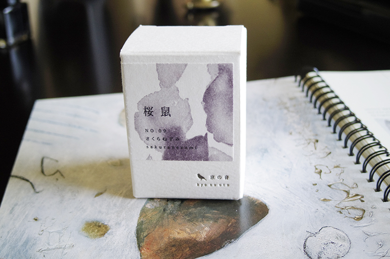
Because of my "hoarding" tendencies LOL, I, of course, have more than one purple/violet ink. The other one I got was J. Herbin's Poussiere de Lune. Most J. Herbin inks have this "faded" look, but this one is actually quite "saturated" (relatively speaking). I admit, I got this ink because of the name LOL (I know it's a silly reason to get an ink but whatever):


On a shopping spree at Nikaido, I obtained an unusually coloured pen (at least for me it is). This is the Faber Castell Neo-slim olive green, which I lovingly named my "Tiki pen" (I have reviewed this pen before):


My Waterman Elegance is one of these pens. I sort of got the idea from an online review of this pen using purple ink, so I tried it out and it's okay. However I do have another ink group that this pen is more suitable for (which I will talk about in future installments):

Another pen that I tried with this group is the Kaweco sport brass. I don't really feel anything for this particular colour match, but this pen happens to be a 1.3 stub and it shows off a really cool shading effect from the purple inks. The Montblanc Lavender Purple, in particular, looks great with this larger nib size:

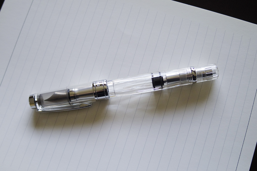
My demonstrators of course will take whatever ink. The one the I have using purple is my TWSBI 580:
The only grail pen I have that ended up regularly sampling the purple is my Visconti Homo Sapiens 1.3 stub. Again, this also because of the stub nib and the way the purple inks look with thicker lines:

As for my Neo-slim, my match-making attempts did not pan out very well. It ended up leaving this group due to the problems it had with the nib drying up. However, there is a nice closure to this saga....as of this writing the Neo-slim is happily on a heavenly escapade with an Italian black ink named Leonardo (courtesy of Maja) LOL.
That's it for this group.
Wow! Our thanks to Lawrence for another fun and informative review (and all the photos that accompanied it). Thank you for the kind words, Lawrence; I can't wait for the next installment :)

No comments:
Post a Comment