Many thanks to everyone who attended our April meeting two days ago; I'll post a meeting review (with lots of photos) tomorrow or Monday. In the meantime, here's another installment of Lawrence's thoughts on his preferred fountain-pen-&-ink matchups (what he calls "Lavalife and pens" heh) for you to enjoy!
This review (Part 5 of Lawrence's series) features
black inks and continues on after
part 1,
part 2,
part 3 and part 4. Many thanks to Lawrence for another excellent blog post :)
(All text below by Lawrence)
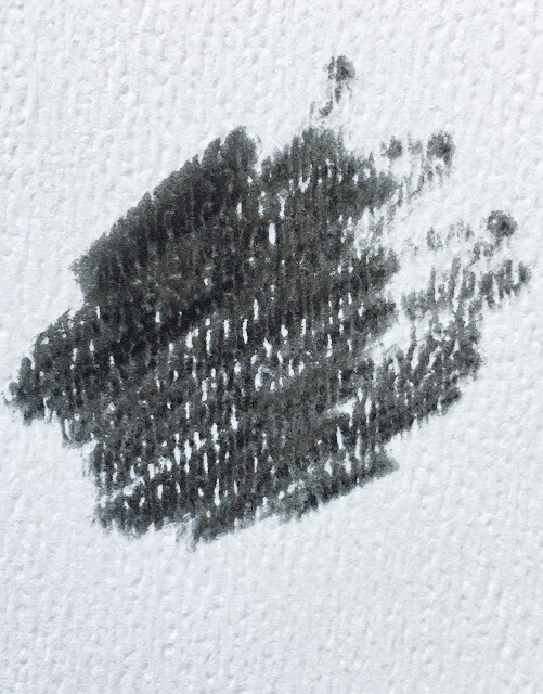
"I have to say that the most versatile ink "colour" has to be black. Some
people corrected me that it's not really a colour, but a shade of other
colours, which is more accurate I guess as we always see ink reviews
where it was mentioned that this "black has a bit of other colours in
them".... It makes sense, I guess. Visually, black inks work with almost
any pen, but that would be too simple in my OCD world. LOL. This is a
moderately sized group that is based mainly on one ink: Parker Black:
(all photos courtesy of Lawrence ~ please click on images to enlarge)
Like my other Parker inks, it is a no-nonsense ink. In some
lighting situations, there is actually a blue-greenish tinge to it, but
it's not obvious until I compared it with other inks (more on this
later). Unlike the other inks I have, I did not get this Parker ink for
a pen in mind. I got it because I needed to complete my childhood Parker
ink set (Blue, Blue-black, and Black). While blue (and in some cases
blue-black) inks are used in school, black is reserved for office /
"serious" use...even teachers don't use it. LOL. Black is the colour I
see on my grandfather's office desk all the time. I am allowed to use
it in his desk pen, but I never really had this desire to use it in
mine. It's one of those enigmatic "grown up" colours, and everyone in
my class stayed away from this colour; it's associated too much with our
parents and other "boring" grown up stuff. Although adventurous kids,
like moi for example, would use blue-black to be edgy and "mature" LOL.
Since
I have the ink already, I try not to waste it, so I had some of my pens
use it. My grail group does not use it as they are mainly black pens
(...but of course LOL). The first pen that I tried this in was a
Sheaffer (Lady Sheaffer Paisley Gold?):
This pen is not really part of my childhood school pens (but I did bring
it to school once because I was trying to be popular LOL). Anyway, this
pen was a corporate gift given to my grandfather and it's the only
"office" pen from my childhood that I managed to bring to Canada with
me. For a while this was the only black inked pen that I had. But
eventually I decided I wanted to take some "risks" LOL, and try it on my
vintage school pens. The only two that I am comfortable with are the
Parker 95:
And the Parker 45:
These two pens have the black section that renders them more
"grown-up" to me. The other Parker school pens (like my Parker 21) have
blue sections so they are more "school-like". These two pens I also
seldom brought to school due to their relatively more "office-like"
nature.
As I got more pens, this Parker Black has had more use. My Waterman Carene loved this ink very much:
This Carene I got on sale from Amazon. It's the only other Waterman that
I own aside from the Elegance. It's a very reliable writer and it's a
reddish pen that works with black (basically an inverse match of black
pen / red ink). Another one that looks great is the red Sheaffer I got
from Staples:
I don't recall when I got this pen, but it is another one of my
impulse buys. I always thought about getting a pen for "rough /
everyday" use and then end up babying them anyway LOL. This is another
great writer and it works with black of course.
So
far, this Parker black is sort of relegated to novelty use; pens that
use this ink are only active occasionally. It's almost like a "backup"
ink of sorts and does not have a "steady" pen partner like my other inks
LOL. It matches every pen after all. It's like this neighborhood tramp
that "flirts" with everyone but does not seem to want to commit.
Until....it got 'enslaved' by a demanding diva (almost like in some
trashy romance novels, yes LOL). Of all the pens that I have owned, one
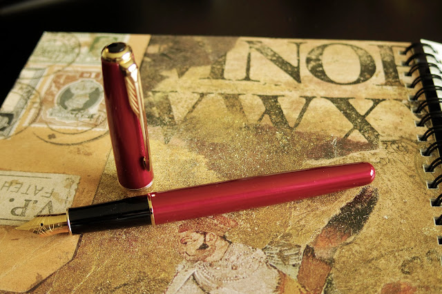
of the most temperamental would have been my Red Parker Sonnet. This
pen was intended to be an "update" to my vintage Parkers which I'm
trying not to overuse. It's as pretty as it was demanding (pictures
don't do it justice...)
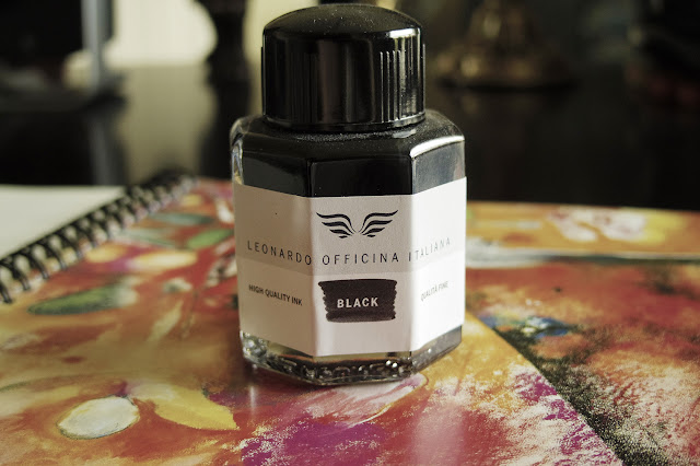

So now I can have a comparison to Parker Black. In some lighting
Leonardo has a bronze-tinge So if I compare the two side by side, it
becomes very obvious. I guess "black" really is a darker shade of
something after all. Normally this may trigger another new level of OCD
colour match...but my eyesight is bad enough that black is black is
black...so for now I'm fine LOL. I was initially saving this ink for
future red pens that I may want to get. I am hoping that there will be a
nice Darth Maul themed pen in the future (the ones I saw online by
Sheaffer and Platinum are half-arsed), and so this Leonardo will be
perfect for this hypothetical Maul pen (Montegrappa are you seeing this
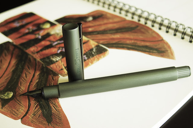
review? <3) . Anyway, the Neo-slim loved it, so for the time-being it
is matched with the Leonardo Black.
As
mentioned in the beginning, this ink group should have been the largest
since all my pens work with black ink. But maybe because I did not have
to constantly "search" for the perfect black ink, I only ended up with
two LOL. In the future, I'm hoping to diversify and try black from other
ink brands. The Aurora Black is apparently the "perfect" black ink...I
hope to acquire that next."


No comments:
Post a Comment