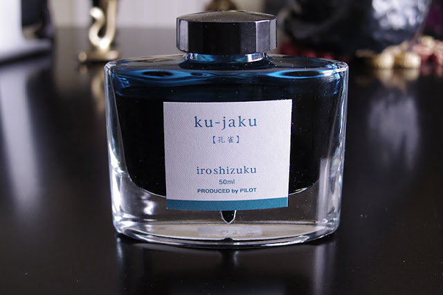
Lawrence writes: "This is, in a way, an add-on to the first group of blue inks. These inks are in the blue/green/turquoise color range. They are different enough to me, however, that I grouped them into their own category: "blue-indulgence inks". I know it's a weird category name, but these inks are specifically purchased with a pen in mind. And the pens that were matched with these inks are on the extreme higher end of things (something I would probably never, ever venture into again). And like the other group, there is a "cult-leader" of sorts and this is the Pilot Iroshizuku "ku-jaku". And the subsequent inks of this colour that came after are compared to this:
(all photos courtesy of Lawrence ~ please click on images to enlarge)
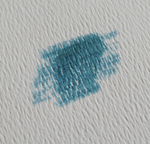
It's probably one of the best behaved inks I own. I love the deep blue green color of the ink:
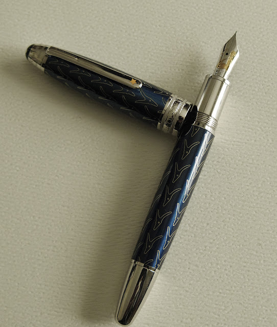
This ink was purchased for use with a specific pen: The Little Prince Solitaire (a pen that was reviewed here before):
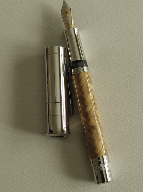
The second pen that came after this, was the very extravagant Pen of the Year 2008 by Graf von F (again, a pen that was reviewed here before:
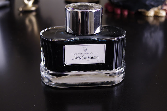
With this pen, I went the "traditional" route by matching it with a blue/greenish ink. I found one that can work: Graf von's Deep Sea Green:
And it comes with a dark blue green color that is more blue than the ku-jaku:
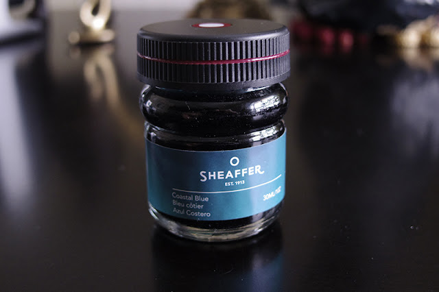
The colors work well, but the pen wrote very dry and scratchy with it. I think Graf von's nibs are stiffer in general anyway and this ink did not help. So when Sheaffer came out with Coastal Blue, I decided to try it out:
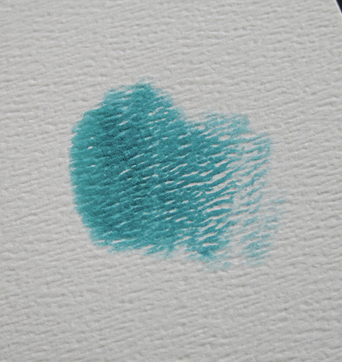
This ink worked some magic into the POY, and it wrote smoothly with less scratchiness. And this one is an even better match color-wise; it's sort of like a brighter version of the ku-jaku:
This is a bit more green than Graf von's own offerings. So with the pen's wood finish, it sort of matches like leaves on a tree.
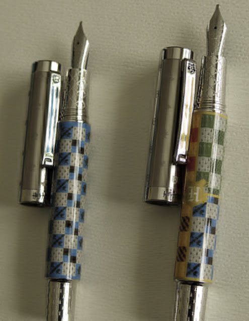
The next group of pens that came along are the Hogwarts twins (again, I had reviewed them here before):
I had initially tried sepia on these pens, but because these are 1.1 stubs I had a bit of a difficult time with skipping and baby bottoms. None of my existing brownish inks work. So I tried the Pilot ku-jaku with them just to test (I was told Pilot inks are good for misbehaving pens) and they wrote beautifully. I would have normally bought a sepia/brownish Pilot ink variant eventually, but I realized that these are in a way "school" pens (even if fictional) so they will be using the blue shade after all. In the end, I chose to have these pens stay with the ku-jaku ink, or perhaps I will buy a "nostalgia blue" variant of the Pilot inks (but I'm in no rush at the moment).
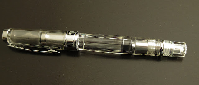
This pen/ink group is very small and limited, but considering the pens that are involved in them, it is understandable (my poor wallet can only accommodate so much frivolity LOL). But I do have occasional "visitor" pens that can try out these inks. This pen group are the demonstrators, like my TWSB 580 (below). Being what they are, they can technically take whatever color. My beloved Parker 21 sometimes pop by for a visit also (because it wants to and it can), but it sticks to the "nostalgia blue" most of the time.
That's it for now. The next group will be fairly large as many of my grail pens belong to it: the red/burgundy - black pens.
Cheers,
L"
Lawrence, thank you for taking the time to share your thoughts on your pen/ink combinations--it was much appreciated!


No comments:
Post a Comment