
And now for something completely different.... (and wonderful :)
My fellow pen club member Lawrence is obsessed with a big fan of matching fountain pens with certain inks - in fact, he labels his pen-and-ink-matching "OCD". A while back, he mentioned to me that he was thinking of doing a series of blog posts about the inks he likes to use in certain fountain pens. I expressed a lot of interest in this, so he asked if I thought it might be of interest to other readers of this blog. I replied with an enthusiastic "Yes!", so a few weeks later, he sent me the following text and photos. I hope you enjoy reading about the inks Lawrence uses in his fountain pens as much as I did :)
(all text & photos by Lawrence ~ please click on images to enlarge)

And the inks in this group are sort of variants of this color:

It's the most basic of basics. No nonsense type of ink. And this is sort of in my mind what I think of the color "blue" in general.
There are variations of this group that I sort of lump together. One of them is the indigo-ish variant that S.T. Dupont has:

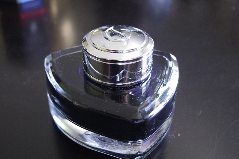

The one I do have featured though, is the Caran D'ache ink:


So, this entire group contains ink colours that I used in school (these are also the main group that the school will allow and "blue-black" is already pushing it for those students who want to be "edgy" LOL). And, of course, the main pens that I use with them are my "nostalgic childhood" ones:
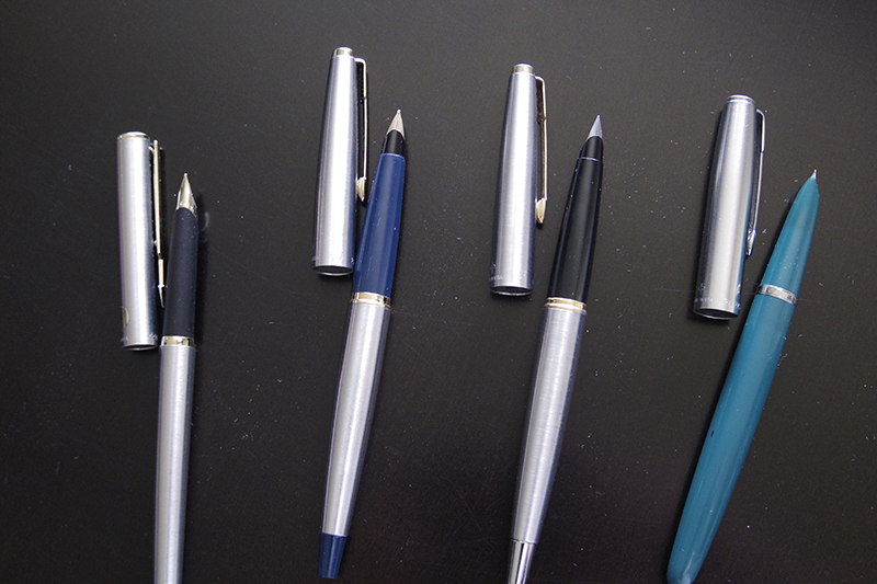
I do have some modern pens that I write with using this ink group:

The Faber Castell Basic (left), a Monteverde Artista, and a MB "tribute" pen. The Monteverde, because it's a demonstrator, can get away with a lot more colors than the other two. So, in the other pen-ink installments, the demonstrator pens may appear again.
Lawrence - thank you so much for this :) I'm really looking forward to another installment of your pen & ink matching series, sometime down the road!

No comments:
Post a Comment