


Our next meeting will be held on Thursday October *22* at the Renfrew branch of the Vancouver Public Library from 5:30-7:30pm - full details *here*!
The Vancouver Pen Club was founded in 2006 as a way of sharing our knowledge of & enthusiasm for the fountain pen hobby with others ~ Both modern and vintage writing equipment enthusiasts welcome!
Contact us at vancouverpenclub@gmail.com
Now, here's a vintage fountain made by a company that sounds like it might be a British brand, but isn't. Intrigued?
Read on about Christopher's newest acquisition...
Christopher: "The Warwick Pen Company was located in Rhode Island, New York during the early 1950s, but reached out to the Salz Bros company, after it became the Stratford Pen Company, to manufacture a very nicely styled, lever filler fountain pen. I picked up a number of these Warwick pens in a range of most attractive colours but ended up retaining only one in the Jet Black.
(photos courtesy of Christopher ~ please click on image to enlarge)
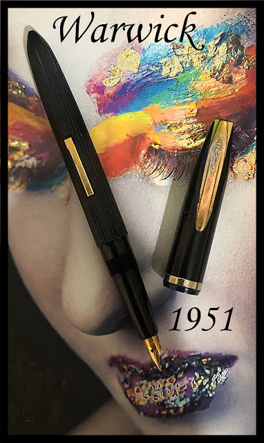
"This Warwick pen sits very well in hand to write with, measuring all of 6 ¼ inches in length posted, but caps back to a pocketable 5 ½ inches. It is a thick pen where the barrel meets a somewhat long tapered grip section sporting quite a small, but smooth, ‘Signature’ marked 14K gold plated nib. But really what makes this pen outstanding for me, is the attractive design started with a vertical corded line barrel that has a pointed end. This barrel is, in turn, complemented with a plain black plastic finished matching cap that has a rather wide arrow-shaped Warwick branding clip. The filling lever, cap clip and ring are also gold plated to finish, in my mind, what appears to be a really nice pen. Oh yes, definitely a third tier contender, but well worth the consideration."
Our thanks to Christopher for sharing another great vintage find with us!
He writes: "This acquisition is about a couple of decades old, so not sure if it counts as new 😂. But it is a pencil crayon set by Berol Prismacolor that I have not used. I got this at Chapters but instead of using it I ended up buying separate colours from Opus instead."
(all photos courtesy of Lawrence ~ please click on images to enlarge)

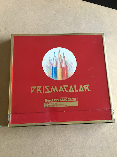
... that can be propped up. It has 60 colours."
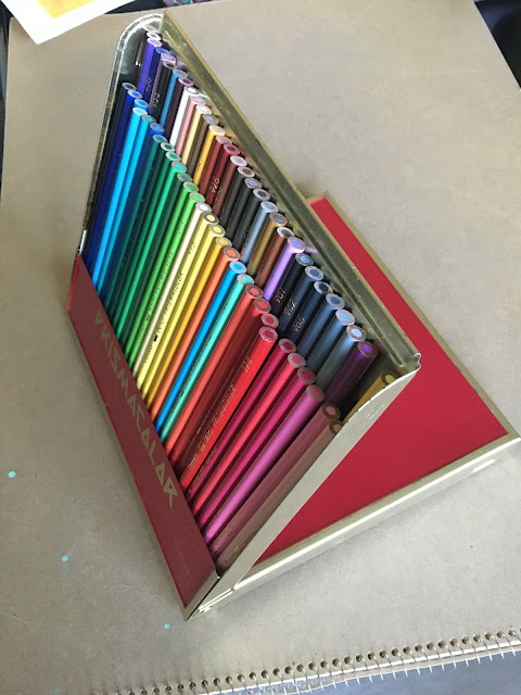
"It looks so good together as a set. That’s why I
decided to buy them separately to use and keep this set intact. This is
one of those times when I broke the protocol of using pens and
stationery that I bought. I know also that I will probably not use all
60 colours as I manually blend my colours anyway, so I thought okay let’s
keep them together. Just this once 😂 "

"Before computer graphics and its precise pixel perfect possibilities and unlimited undos, I spent a good deal of time experimenting with different mediums. I eventually tried pencil crayons. I know it has the reputation of being a children’s art tool, like regular crayons, but I discovered that it gave me very precise lines and depending on the brand, I am able to get nice saturated colours and awesome shading.

"I have tried a few different brands and this one is one of the best. Also it does not break easily like other brands. As you may be able to see from some of the sample artworks (yes from my younger years lol) I had to press rather hard to get the saturated colours and blending."

"I drew a lot of dragon stuff then. I like this particular style of dragon. I love the book, The Flight of Dragons by Wayne Anderson and these dragons are inspired by this. I think there is actually a cartoon of the same name with dragons based on this book.
Looking at this set makes me nostalgic. Can’t believe how time flies. This phase of my life with dragons and coloured pencils played a big part in my decision to pursue art as a career."
Many thanks to Lawrence for sharing his photos and artwork (love that wonderful dragon!). Vancouver Pen Club members - if you have any newest acquisitions you'd like to share on our club's blog, please send them in, and I'll post them here.
Thanks in advance!
~Maja
(please click on images to enlarge)

(No, the pen didn't come with a Swiss Army knife---it's just a prop ;)
Though it sounds like a Japanese company, Namisu is actually the name of a small design studio based in Fife, Scotland. The 'Nova' fountain pen was designed by Adrien Cols and María
Millan of Namisu and introduced in September 2015 in a highly successful Kickstarter campaign.
The first Namisu pens I ever saw in person belonged to fellow pen club members Ben and Natasha, who brought some to our meetings a few years ago. I was really into acrylic pens at the time, though, so Namisu pens weren't on my pen-buying radar. About a year ago, fellow VPCer Stuart acquired a Namisu 'Nova Aluminium' prototype in "Satin Black" (which he reviewed here ... and raved about to me :) so last November, I finally caved in and bought one for myself when they had a sale on 'Nova Aluminium' prototypes in the "Comet Grey" colour. The 'Nova Aluminium' models were initially only made in those two colours for the Kickstarter campaign, but are now available in two additional colours (red and blue).
Side note: the 'Nova' form is/was also made in titanium, bronze and ebonite as the 'Nova Studio' line, and in copper and brass as the 'Nova Copper' and 'Nova Brass' models, respectively. These models all had the same basic design as the 'Nova Aluminium' pens, but with fancy finials in the case of the 'Nova Studio' pens.

A word about prototypes: Current 'Nova' models have matching sections, but the section on my prototype isn't the same colour as the rest of the pen, so I'm guessing that's why it's a prototype (oh, and although the section looks shiny in my photos, it actually has the same matte, satiny finish as the rest of the pen). I was curious to see what other 'Nova Aluminium' "Comet Grey" prototypes looked like ... and I found one on Reddit, but it was a much darker grey than mine. The Redditor that owned the pen also said that his cap and barrel were two different shades of grey (fifty shades of grey?? lol).
Soooo, how much did I pay for my pen? Well, I bought it from Namisu's official website at 50% off for £18.33 + £8.00 shipping---a great price for a very
well-made fountain pen. It arrived safe and sound, in a simple clear plastic
tube with the Namisu name on it.

According to their 2015 Kickstarter campaign, "...the Nova fountain pen is designed to be used without posting the cap. The weight has been carefully distributed to avoid fatigue during long writing sessions." I usually post my fountain pens, but this one I use unposted because it is very well-balanced unposted, and feels good in the hand that way..
Model data (from Namisu.com):
Length (Length uncapped) – 139mm (128mm)
Aluminium Weight (Weight uncapped) – 29g (20g)
Maximum diameter: 15.5mm
Grip diameter: 12mm
.jpg)
The pen is made of aircraft-grade aluminum with a scratch-resistant anodized satin finish that feels very smooth and pleasantly cool to the touch. The fit and finish is very good, and the cap screws on/off with just one full turn. The design is minimalist and elegant (and I love the matching conical ends on the cap and barrel). I also like the clipless nature of the design, although I must admit my pen does like to roll around on my desk, as it lacks any barrel stop.
.jpg)

The other pen-related acquisition I got at around the same time is a Dee Charles leather two-pen sleeve in "Midnight Red" that I bought from Penchalet.com. I hadn't heard of this American maker of leather goods before, but I love red stitching on black pen cases so when I saw this one on sale, I didn't hesitate to add it to my order (I checked just now, and it's still on sale for $17.59 USD plus shipping!).


(The top of the sleeve can be folded down, and it fits my Namisu 'Nova' & Kaweco 'Steel Sport' fountain pens comfortably inside)
Important note: I'd read some reviews on Pen Chalet's site (before I bought the pen sleeve) that said the leather material was stiff and didn't have much give to it, making for a rather tight fit. After my pen sleeve arrived, I inserted two thick wooden spatula handles in it, and left them there overnight, to stretch the leather out a bit. It worked, and now I can fit two medium-sized pens in there without worrying about pulling off their caps when removing the pens from the sleeve. They're still a snug fit, but that's not a bad thing as you don't want the pens falling out, either! As for oversized pens, I don't know--the sleeve may or may not be able to accommodate them. The case is very well made, though, looks stylish, and protects the pens inside it very well.
(photos & review by Maja)

The Morrison Patriot did require modification and the Morrison Company came up with the novel idea of changing the flat topped cap by cutting the flat top at a 45 degree angle and inserting the military emblem of each of the services with a raised metal cameo. They also made the finish on the US Army, Air Force and Marine Corp. in a olive drab colour, while they stuck with a jet black for the US Navy. The Cameos atop the pen caps were beautifully made and, in some cases, 14K gold filled and even enameled. The clips were the standard Morrison ball ended ones and the caps also sported a rather thin cap ring."

Because the US was at war, materials like rubber were considered limited by the US military, so much so that the idea of a lever filler was out of the question for the Morrison military Patriot. Still, once properly serviced, this syringe filler works well. As for a suitable nib, again steel in war times was limited, so the Morrison Pen Company did not scrimp and simply applied one of their 14K gold, good quality large ones. All in all these were and still are magnificent fountain pens. "

Finally, and to honour the US Navy’s finest hour during World War
2, I featured my newly acquired Military Morrison Patriot with an image
of the USS Missouri defending the cause. This was a battleship that my wife, Chris and I toured while in Hawaii years ago."

For more information on this interesting wartime pen model, check out Richard Binder's article - Profile: Morrison’s Patriot. Our thanks to Christopher for sharing his own fine example with us!
A few days ago, we featured a vintage Wearever fountain pen recently acquired by Christopher. Today, we're featuring another pen by the same maker that he recently acquired:
Christopher: "The name Wearever, amongst vintage pen collectors, has most running
the other way. I remember well my first experience with them going back
to my prep school days in the mid 1950s. The reality with this brand of
writing instruments was that they were cheap enough to buy, but tended
to leak. Turning the clock forward to more current times, as a vintage
pen collector I was warned that investing in Wearever pens was not a
wise move and that they were definitely on the lowest rung of the third
tier pen ladder. So, as time went by, whenever I came across a pen with
the Wearever branding, I avoided it like the plague.
Then, at a
pen club meeting, one of the members, David Moffatt told me about an
exception. He related that the Wearever Company did actually make one
particular model which stood out as not a bad pen. The Pacemaker
had a number of very credible features, the best of which was a 14K
gold nib. So taken with David’s enlightenment that I set my sights on
acquiring one of these Pacemakers, but along the way I discovered that
there were several other Wearever models, which also had better than
steel nibs."
(photo courtesy of Christopher ~ please click on image to enlarge)
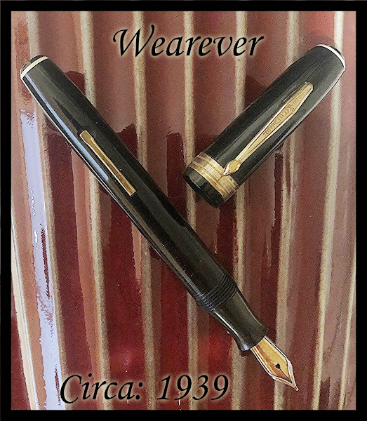
"It was Rene, another pen club member, who further enriched my knowledge of these upper-end Wearever pens, since he was quite taken with them as well. There was the Zenith which looked toward Parker for its design and also had a 14K gold nib. And the Deluxe, which had a steel reinforced casing around yet another Wearever 14K smaller gold nib. But this brings me to a most current score at my end. Yet another Wearever model - ‘The Supreme’. At least I think this is a Wearever Supreme, but with a few interesting differences. The pen is quite large posting at all of 6 ¼ inches and even capped it measures an inch shorter. The overall finish is a high luster black plastic, finished at each end with white bands. The cap clip is typical of Wearever, but with a flat arrow at its end. The cap also sports quite a wide and nicely detailed ring, and this pen is a lever filler that takes a fair bit of ink in a No.20 rubber ink sack.
But I have saved the best for last, because atop a rather substantial grip section is another one of Wearever’s steel reinforced casing 14K gold nibs. And this nib, may I add, is larger than the one also steel encased in the Wearever Deluxe. Finally, I will happily add that unlike the previous reports I had got on most, if not all, of the Wearever nibs, steel or otherwise, this gold point is a fine smooth writer. Definitely a wonderful addition to my vintage pen collection."
Our thanks to Christopher for sharing his latest find (and his enthusiasm for vintage pens) with us!
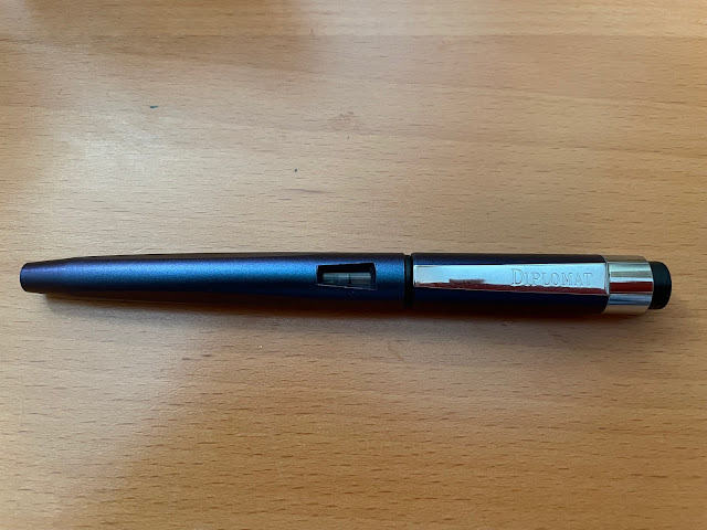

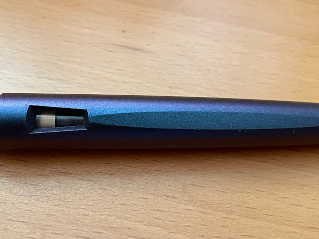
The pen weighs only 14 grams, so it's well-suited for long writing
sessions. The long, upturned metal clip (which has "DIPLOMAT" engraved in tasteful block letters on it) is springy, and clips onto thicker clothing easily.
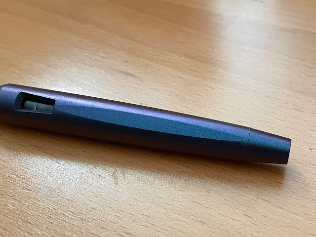
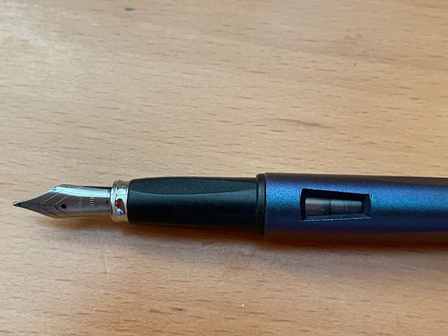
The "Prismatic Purple" material is a lovely, non-slip, lacquered resin with a matte finish. This iridescent mix of purple, pink, and dark blue hues is a Goulet Pens exclusive in the United States. According to the Goulet Pens webstore, the pen's packaging "... may say "John Doe" on the outer box label as this is how the color is known outside the US." (as weird as that sounds, it's true)
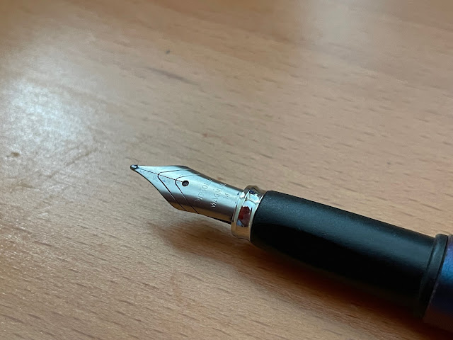
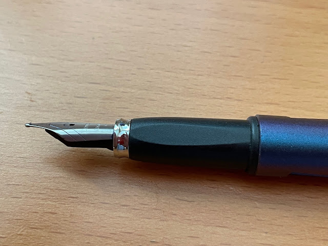
The #5 JoWo steel nib is engraved "Diplomat", "Magnum" and "M" (for Medium). The pen comes in Extra-Fine, Fine, Medium, and Broad nib widths, which was a nice surprise as most economy models don't offer EF and/or B nibs.
The finish on my pen's nib is matte, but the pen's chrome trim is shiny. Years ago, I bought the same model in red, and it had a matte nib & matte trim. Apparently, Diplomat is gradually transitioning to polished steel nibs, so I wonder if they were using up their supply of matte nibs on pens with shiny trim?? Or perhaps the nib on mine was a replacement ?? No matter--the nib writes wonderfully. It has some feedback, but it's not toothy---a perfect balance for me. I didn't notice any flex with my nib, but I didn't expect any, based on the nib (a Fine) on my red pen...
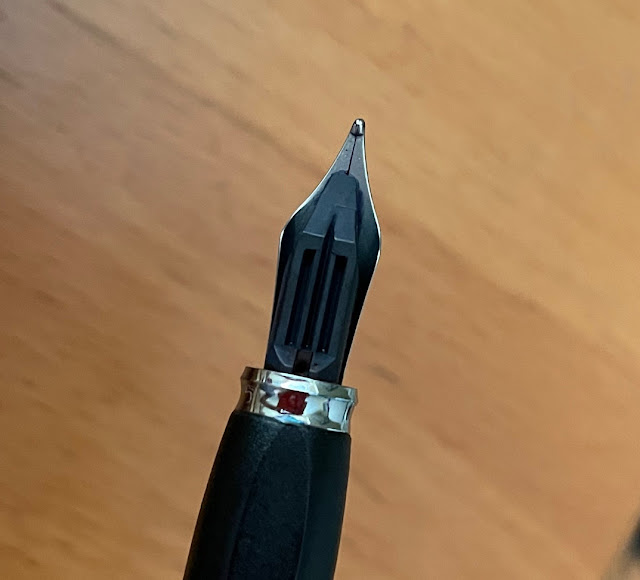
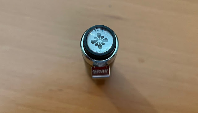
Above: The cap's finial, with the words "Diplomat" and "Germany" encircling the company's ink drop flower logo. Earlier versions of the pen (e.g. my red version) had finials that just said "Product of Germany" and "Diplomat" with no logo.
Canadian online retailer Blesket.com's price ($25 CAD) is the lowest online price I could find (taking into account the disparity between Canadian domestic and international shipping rates). I bought my red version of this pen several years ago at Nikaido, but I don't believe they sell this model any longer.
I think the pen is a very good deal at that price--it's well-made, reliable, and it has a great steel nib - one of my favourites, actually (in addition to Faber-Castell's). Diplomat is celebrating its 100th anniversary in 2022, and it's nice to see that this model is still being produced because it's a very good entry-level fountain pen. I do plan to buy more Diplomat fountain pens in the future --- they offer higher-end models as well ;) -- but I'm really enjoying this "Magnum Soft Touch". Many thanks to Joe and Sara of Nikaido for the pen! 😀
(photos & review by Maja)
Well, if you believe (the majority of) this year's Groundhog Day predictions, it looks like we're in for a few more weeks of winter, so here's a very shiny vintage pen to brighten your day!
Christopher writes: "It is always great to find a pen of major historical interest, and such was the case the other day when a near mint first model Sheaffer RA1 Stratowriter ballpoint came my way. This is one amazing pen with an equally fascinating provenance. As the story goes, just prior to the mid 1940s, a number of companies were in the process of introducing what was to become the revolutionary ‘Ballpoint pen’. It was the wave of the future and it seemed that whoever could bring it out first, stood a good chance of cornering the international pen market. There were a number of contenders. Some with no interest in quality, while others were investing a great deal of time and money on advanced high-end design. The first ballpoint to hit the market in 1945 was brought out by Milton Reynolds, a Chicago businessman and promoter. Unfortunately, his ballpoint pen was more of a gimmick which really didn’t work. But just behind Reynolds, the Eversharp Company had invested millions on their design of a quality ballpoint pen which did work. Still, being second at home plate did not guarantee success and Eversharp ended up losing as much as it gained with the exercise.
During the following year, Sheaffer saw its turn up to bat. Actually two years earlier, the US War Department had approached the Sheaffer company to develop a ballpoint pen for military use. So Sheaffer knew there was a good market if they could come up with a reliable, good ballpoint. Subsequently, in late 1946, Sheaffer introduced the RA1 Stratowriter which came with a ‘Miro-Crafted’ ink cartridge. And, unlike the competition, when this ink cartridge was empty, it could be easily removed and replaced. Also, the new Stratowriter had a retractable tip, operated by a button at the top of the cap. It was a press and twist mechanism to get the point out and the reverse to bring the point back into the barrel."
(photo courtesy of Christopher ~ please click on image to enlarge)
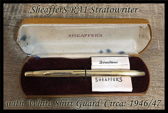
Christopher continues: "And Sheaffer had decided to enter this new pen market with outstanding quality rendering their new Stratowriter with a 14K Gold Filled finish from stem to stern over the entire pen. There was even consideration given to a special presentation Stratowriter box but, within several months, it was evident that some of these fine pens had a slight tendency to leak. So to offset this problem, Sheaffer introduced the ‘White Shirt Guard’. This was a matching 14K Gold Filled cap that slipped over the business end of the pen when not in use. Plus, when the pen was in use, this guard cap had been cut out on two sides so that it could be posted over the cap end of the pen, but the cut out would allow for this guard to slip around the cap clip. The Stratowriter sold well for Sheaffer in its first couple of years, then was adapted to a good number of the other Sheaffer models to appear in sets.
Although the Sheaffer Stratowriter Micro-Crafter ink cartridge is long gone, there are refill solutions available for this pen on the internet. For me, this wonderful item ticks all the boxes and although I have not leaned toward ballpoint pens, the Sheaffer Stratowriter is definitely the exception."
I love vintage ballpoints :) Congratulations on your latest find, Christopher, and thanks for sharing it with us!
Speaking of nice pocket fountain pens....
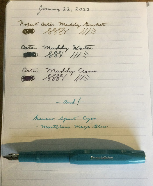
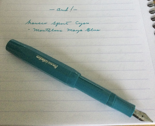
Here's Stuart's new Kaweco 'Sport' in "Cyan" colour, along with three new Robert Oster "Muddy" inks, all recently purchased at the Vancouver Pen Shop in downtown Vancouver:
(all photos courtesy of Stuart ~ please click on images to enlarge)
Last month, a little package arrived, unexpectedly, in the mail. In it was a beautiful vintage Japanese long/short pocket pen. "What are long/short pocket pens?", you ask? Well, here's an excerpt from the blurb for "Japanese Pocket Pens" (written by nibmeister Richard Binder) that explains their background, and why they were referred to by that name:
"In the early 1960s, the space race and Hideo Shima’s radical new bullet train, perhaps leavened by the futuristic American automotive stylings of Harley Earl, spawned great changes in the Japanese aesthetic, and a new type of fountain pen burst onto the market. Called “pocket pens,” these pens appeared in myriad trim variations under dozens of manufacturers’ names. Their unifying characteristic was an extraordinarily long gripping section mated with a very stubby barrel, a design concept explored before and since by a number of Western manufacturers."


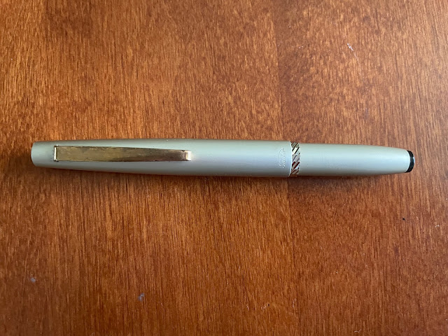


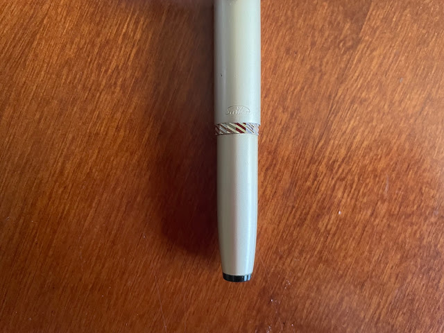 (Above: the beautiful, 15-sided metal section ring and, above it, the Sailor logo, tastefully engraved at the end of the pen's cap)
A quick word about my pen's provenance:
October 2026 meeting details : Location : The Branch Meeting Room of the Vancouver Public Library's RENFREW branch at 2969 East 22...

