Sunday, January 9, 2022
Newest Acquisitions (Virtual "Show & Tell") ~ part 309
(please click on images to enlarge)
The wax seal kit was unused and came with a stick of sealing wax and a wooden-handled stamp with two initials on it. I checked online and found that this kit retails for 30 Euros at the Cartoleria Pantheon in Rome, so the $3.99 CAD I paid for it was a great deal. The little Santa is a novelty ballpoint I got for a dollar at a hospice thrift store.
This particular sealing wax doesn't come with a wick, so it's a bit trickier to use as you need to continually apply heat to melt the wax onto the paper (vs. just lighting a wick and letting the wax melt). I looked and found an excellent guide to making wax seals on JetPens.com here that was very helpful.
Above: This is the bottom of the stamp that came with the wax seal kit. It shows two initials in a rather elaborate cursive font. Of course, the initials are a mirror image of how they'd appear once pressed into the melted wax, so....
...I flipped the image and I think it now shows the initials L and H. I'll try the wax seal kit on the next envelope I use to mail a handwritten letter, and let you know if I'm right about the initials. I'm going to try to write more hand-written letters this year, and I think this might encourage me to do so :)
(photos & review by Maja)
Friday, January 7, 2022
Newest Acquisitions (Virtual "Show & Tell") ~ part 308
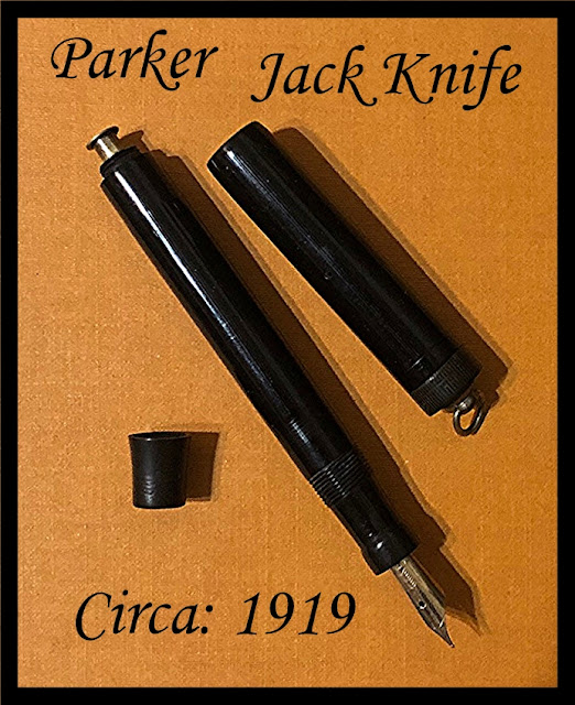
....and from Lawrence's modern Parker to Christopher's vintage (actually, antique) Parker we go!
In Christopher's words:
"I have often felt that the vintage pen collector purist misses out on some really nice and fascinating pens. But, at the same time, I also feel that a vintage pen’s history can leave lots of room for exceptions. Case in point is this Parker Jack Knife short ribbon ring top which just came my way. Truly an exceptional pen regarding its condition, but probably would leave a lot of pen collectors scratching their heads. Still, in taking a good look at this piece and considering the Parker history, it all seemed to make perfect sense to me. First off, the barrel, cap and grip are Bakelite which tends to have a distinctive high gloss sheen over the later plastics. A space age material supplied by the Dupont company which Parker branded Permanite. Possibly the Bakelite was not as stable as what Dupont had been developing in the way of plastics but, nevertheless, George Parker realized that plastic was going to take over the age-old hard vulcanized rubber moving into the future. Still, as a header and footer on this fine Parker Jack Knife pen, both the cap screw and the blind cap are in the black hard rubber and probably old factory shelf stock. The cap is void of a band but, like the first Duofold Parker pens, not unattractive. The button filler originally introduced by Parker in 1915 is such an impressive filler, tucked neatly away when not in use under a tapered but flat bottom ended blind cap. This pen measured six inches posted from stem to stern, but caps back to an extremely pocketable five and three quarter inches.
I was told that the ring top pens were just as much men’s as they were ladies', but for their length. The longer ring tops were definitely for the fairer sex and were acquired with cloth ribbon to be hung as jewelry when not in use around the neck. The shorter ring tops often hung from watch chains off gentlemen’s waistcoats or were neatly tucked into vest pockets where their size was just not an issue."
(photo courtesy of Christopher ~ please click on image to enlarge)
"Finally, this leads me to the one feature on this pen which might
stump the purist, for the black Bakelite grip section sports a Parker
Vacumatic ‘Slender’ 14K gold arrow nib. But is this nib incorrect for
the pen? Well, if the original owner dropped this pen, damaging the nib,
and in doing so returned it to the Parker Company at a later date for
sorting out, if a Duofold nib was in fact unavailable, I am sure Parker
would have just replaced the damaged point with whatever was of similar
quality but available at the time. This could also apply to a pen repair
shop or jeweler who had to turn to Parker at the time for a suitable
nib. So, the way I look at it is the Vacumatic nib in this pen is just
part of its history and with that perfectly expectable. And my what a
fine writer this nib proved to be. Just enough flex to satisfy and
definitely a very smooth line on paper.
So in turn this pen is becoming a part of my collection and in my view rightly so."
Christopher, many thanks for sharing yet another wonderful vintage find with us!
Wednesday, January 5, 2022
Newest Acquisitions (Virtual "Show & Tell") ~ part 307
From one modern red fountain pen to another! This is Lawrence's lovely acquisition...
(all photos courtesy of Lawrence ~ please click on images to enlarge)
I got the F point nib and here is the nib:
The thing that was a bit annoying in the end for me was the converter. It's not a twist converter, but a sliding one. Supposedly this is to help fill the pen with one hand, but the mechanism is not smooth and it gets jammed often...so in the end what seems like a good idea became something of an annoyance.
This converter also has a ball-bearing inside that "shakes" the ink up a bit while you use it, supposedly to help the flow (well it didn't...LOL..more on that later).
I got this pen as an "update" of my beloved vintage Parker, and I wanted this Sonnet to act as a "proxy" for my vintage pen (I know it sounds crazy...but sort of like an "ambassador" for my vintage Parkers LOL).
The pen is beautiful to look at, the gold / black / red is a great combo.
(According to this page, the date code on the cap band --the single vertical line, followed by the letter "I" seen above-- represents the first quarter of the year 1994)
It has a made in France / Parker name on the cap.
I know this is not really a "big deal" as Waterman (a French company) has acquired Parker, or is it the other way around ? (Ed. note: Both companies are owned by Newell Brands). Anyway, this takes me back to my elementary years, when my vintage Parkers were still actively being used. Most of the Parker pens everyone had were made in the USA, but I had this classmate who had a French Parker. She called it "My French Parker" in capital letters LOL. Anyway, it struck me as quite unusual and, as a kid, I wanted my own "French Parker"...and now I do....in red no doubt.
Now we get to the writing part. I have owned pens with diva vibes (eg. my POY 2008) but most of these diva pens don't behave that way when writing; they are mostly very well-behaved and totally proletariat. But this Parker looks diva-ish and plays the part; it does not like any ink I put in it except Parker black. It skips like crazy until it got to the Parker black, then it worked fine, wrote smoothly, and is happy. Which is totally fine because I had this OCD thing with black/red combos -- black pen / red ink--and so this Red Sonnet will naturally "need" to have black ink anyway. So it worked out in a way."
Our thanks to Lawrence for his photos & review of this classic modern fountain pen--a perennial favourite-- as well as his ongoing contributions to our pen club's virtual "show & tell :)
Monday, January 3, 2022
Newest Acquisitions (Virtual "Show & Tell") ~ part 306
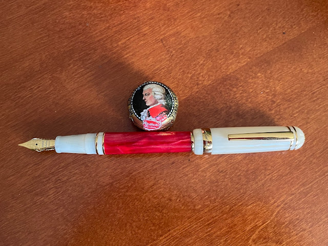
Hope your new year is off to a good start! Yesterday's blog post had a little sneak peek of my new Laban '325' fountain pen in the "Flame" colour. Here are some close up photos of it...
(please click on photos to enlarge)
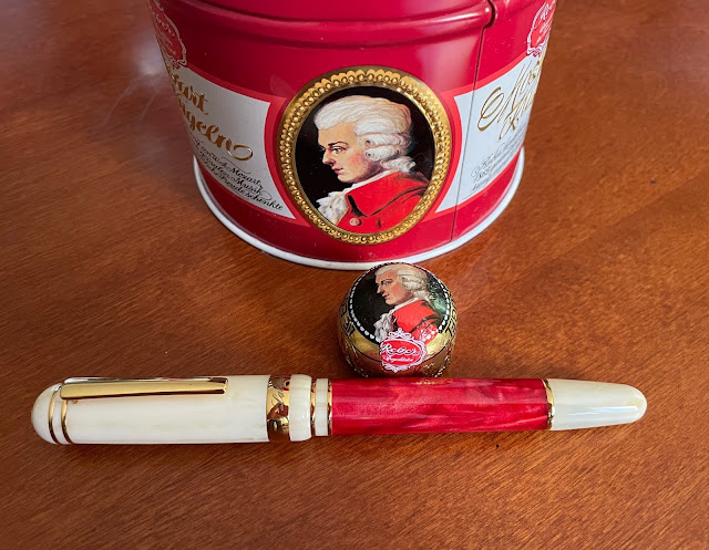
I purchased the pen from my fellow pen club member Andy with Christmas gift money from my father. I already owned an orange '325' "Sun" fountain pen and loved the design, so I decided to buy the red version from Andy via Craigslist.
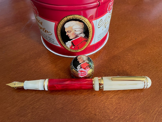
I reviewed (at some length *ahem*) the orange version of this pen in this blog post last summer, so I won't go into details about the features of the pen again. Suffice to say, this new '325' is as beautiful as its cousin...
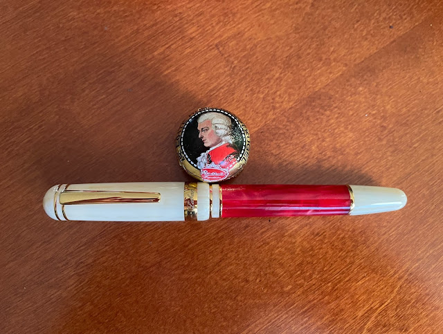
I love how the off-white/cream colour of the section, cap and barrel end complements the marbled red colour so well....
This '325' has an XF (extra-fine) gold-plated steel nib and it writes as smoothly as the Medium nib on my orange '325'. When I first started collecting fountain pens (over 20 years ago), I was wary about XF nibs as I thought they would all be scratchy compared to their wider-nibbed counterparts. A Sailor 'Sapporo' with an XF nib changed all that. Now, I have several XF-nibbed fountain pens in my collection.
The Mozartkugel candy in my photos is a throwback to a Christmas I spent with my cousins in Vienna in 1992. While there, I purchased the second fountain pen I ever owned--a Pelikan 'P10' school pen--which I still own.
I hope the 2021 holiday season was a happy one for you, and that you were able to spend some time with family (or close friends who are like family) despite this global pandemic. Many thanks to Andy for selling me this gorgeous fountain pen, and to my dear Dad for this lovely Christmas present.
(Photos & review by Maja)
Saturday, January 1, 2022
Happy New Year 2022 !
(above: Maja's new Laban '325' "Flame" fountain pen ~ review in tomorrow's blog post! ~ please click image to enlarge)
Friday, December 31, 2021
Newest Acquisitions (Virtual "Show & Tell") ~ part 305
Happy New Year's Eve!
As 2021 draws to a close, I'd like to, once again, thank everyone in our pen club who sent in photos and
reviews for our virtual "show & tell" this year - all were very
much appreciated :) We'll keep the online show & tell going until we
can safely meet again in person, so please keep those reviews & photos coming! Now, onto today's featured newest acquisition...
(~please click on images to enlarge~)
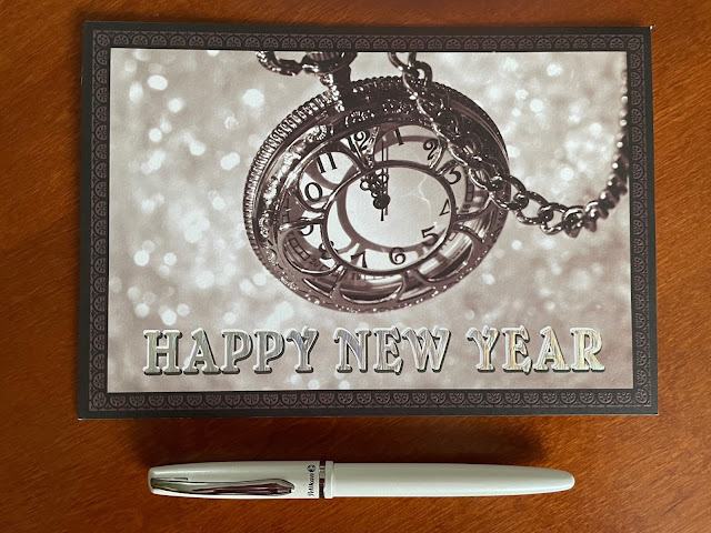
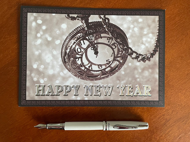
I'd purchased a Pelikan 'Jazz Pastel' ballpoint (model K36) in apricot a few months ago and really liked it (so much that I reviewed it here). I'd seen the fountain pen version of the 'Jazz' --the Pelikan 'Jazz Elegance' (model P36) -- sold as a set with a matching ballpoint on Amazon.ca, but I only wanted the fountain pen, so I didn't purchase it. While browsing Stylo.ca, I noticed that they sold the fountain pen separately, so I added it to my Stylo.ca order.
The fountain pen uses a cartridge/converter filling system and only comes in one nib width--Medium. The steel nib has the Pelikan bird logo on it, but no indication of its nib width (the Pelikan sticker on the pen, however, indicates that it is a Medium). My pen's nib lays down a very smooth line somewhere between a Fine and a Medium, and is a nice, reliable writer with no start-up issues.
The shiny metal section is narrow and rather slippery, but its hourglass shape prevents my fingers from sliding off the pen. I know that sounds really bad, but the section is actually quite comfortable to hold, although I wind up holding the pen lower than I normally do. I use the pen posted - it has a nice balance to it and, at 6 inches posted, it's not overly long. You could use it unposted, but I find it a bit too short for my hand.
The friction-fit cap snaps onto the section with an audible 'click' and stays on well. The chrome-plated spring-loaded clip (which shares the same beak-shaped design as the ballpoint's) clips onto both paper and clothing easily and securely. According to a Drop.com description for the pen, the clip can flex out by nearly an inch due to the spring inside!
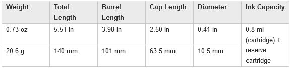
Now, here's some more data about the fountain pen, courtesy of Pelikan-collectibles.com:
For $20 CAD (not including shipping), I think the Pelikan 'Jazz Elegance' fountain pen is worth the price if you're looking for an affordable, everyday fountain pen that has a classy look to it.
A word about the price: You can find the pen for a much lower price at some European online pen stores, but you have to factor in shipping costs, possible duties and brokerage and/or processing fees; Stylo.ca offers free shipping within Canada for orders of $49 CAD or higher, which is a very low threshold for free domestic shipping.
(~photos & review by Maja~)
Wednesday, December 29, 2021
Newest Acquisitions (Virtual "Show & Tell") ~ part 304
The little star of today's show & tell is my new fountain pen made by Analog Notes, a small American penmaker located in Bloomington, Indiana.
The pen was first advertised for sale on their Facebook page at the end of July, and the post said: "Indiana, we're all for you! Check out this amazing Cream and Crimson material special request from @turntpenco . I couldn't be more pleased with how this pen turned out. This is for all you Hoosiers out there!"
I didn't see that Facebook post, but I'd recently heard about Analog Notes from my fellow pen club members Louise and Natasha, so I took a look at the company's Instagram account (note: you might have to log into Instagram to see it) I really liked the fountain pens I saw there, so I went to their Etsy store (they have no official website yet) and immediately spotted a beautiful fountain pen I knew I had to have. I couldn't believe someone else hadn't snatched it up already, so I bought it right away. The price was $92 USD plus $13 shipping, which I thought was a good price for a handmade fountain pen.
I waited patiently for the pen to arrive (knowing it might take a bit longer to get here during the busy Christmas season) and it finally showed up, safe and sound...
(please click on images to enlarge)
The pen came gift-wrapped in green tissue paper, along with a a cool holographic sticker and a very nice handwritten note from the pen maker (Ronnie) thanking me for my business.
The packaging consisted of a very simple, but pretty, cardboard box with a little cutout window...
....and peeking behind that window was my new Analog Notes 'Faraday' fountain pen in the gorgeous "Hoosiers" resin (made by the Turnt Pen Co)!
Isn't it gorgeous? (In his note to me, Ronnie said it was "one of (his) favorites", and I can see why!) When I first saw Ronnie's photos of it on etsy, the swirling white and red colours reminded me of an Eton mess, a decadent British dessert made of strawberries, merangue and whipped cream (I first tried one at the Irish Heather restaurant during a Pelikan Hub event).
(I didn't have an Eton mess handy for the photo above, but I had some
leftover cranberry sauce, so I made a granola parfait for breakfast)
Back to the pen... Its section matches the rest of the pen (a design feature I love) and flares slightly at the end closest to the nib. The pen's cap doesn't post, but at 5.1 inches/ 13 cm from nib tip to barrel end, the pen is long enough for me to use unposted. It's not a heavy pen (capped weight = 21 grams; barrel & section weight = 14 grams ) so it's good for long writing sessions.
The pen comes with an ink converter, but also takes international ink cartridges. I was surprised to discover that the section takes nearly 13 turns (!!) to unscrew from the barrel. Wow. The good news is that since the barrel has no metal parts, the pen makes a good candidate for conversion to an eyedropper filler :) The cap takes three turns to unscrew. which might annoy some users who are in a hurry to cap and uncap their pen, but it doesn't bother me at all.
It's a bit tricky to spot in my photos (it's not difficult if you're looking at the pen in person), but there are lots of sparkly bits in the resin....
...and some clear parts to it, as well... which creates a beautiful effect. I love the resin because of its colours, and because it has such depth to it. And it looks, well, yummy....
The pen came with a plain JoWo steel nib, which is a #6 size nib. I ordered a Medium nib for my particular pen, and it writes very smoothly. The nib is wet & juicy and has no start-up issues.
All in all, I love the pen and am very happy with my impulse buy. Thank you very much, Ronnie, for this wonderful handmade fountain pen!
Since this isn't my first handmade fountain pen made by a smaller pen maker, I thought I'd share a few shots of it next to another great handmade pen--my lovely Rockster "TroubleShooter 1313" fountain pen in "Doolittle" resin (reviewed previously here):
As you can see, the Analog Notes fountain pen is a bit wider and longer than the Rockster, although their caps are the same length.
Their sections are also the same length, but the threads on the Analog Notes pen are longer; this may or may not matter to you, depending on where you grip your pens (ie. higher or lower on the section). The Rockster takes one-and-a-half turns to unscrew its cap vs. three turns for the Analog Notes pen.
The key difference in design is that the Rockster can be posted, whereas the Analog Notes pen cannot (although, as I mentioned earlier, it's long enough for me to use unposted).
Finally, here are some specs for the Analog Notes 'Faraday' model fountain pen, courtesy of the official product brochure:
(note: the "Body Length" referred to above is the length of the barrel without the section attached)
( ~ photos and review by Maja ~ )
Monday, December 27, 2021
Newest Acquisitions (Virtual "Show & Tell") ~ part 303
Christopher writes:
"The Parker 61 was just such an advanced pen when it came on the market in 1956. It was Parker’s next big kick at the can regarding the pen market. There had been the 21, which was targeted at the student and the more conservatively price-conscious buyer, and the 41, which was released around the same time as the 61 but also aimed at the more price-wise shopper but the 61 was definitely a model which stood on its own, mainly because of its very advanced filling system. Parker had invested considerable research time and development money to design this no fuss space age 61 filler and its ease of use made everything else at the time seem dated. Still, and at the same time, as easy as the inking was, getting the old ink out to clean the 61 was seemly another mater. So, in spite of Parker’s ongoing advertising blitz in publications like Life Magazine and Saturday Evening Post, in the end, Parker had to dump the amazing ‘Capillary action 61 filler’ and replace it with their old standby, the Parker aerometric filler. Although deemed probably necessary by the manufacturer, personally I think that it was a step backwards and with it, in the later years Parker did not apply the same earlier quality to the 61. So sadly with a bad rap and customer confusion, the Parker 61 passed on into pen history.
Personally, over the years I have acquired a number of lovely Parker 61s and thoroughly enjoyed using them. Fortunately, I have stuck with the earlier capillary filler model and, granted, it took a wee bit of getting use to, but nothing that would stump an avid vintage pen enthusiast. Still, and more currently, I was blessed with one superb mid 1960s Parker 61 Deluxe set. This set can be easily dated to the mid 60s because it contained not the typical back up matching pencil but a first year, cap-activated matching 61 Jotter ball point."
(photo courtesy of Christopher ~ please click on image to enlarge)
Christopher continues:
"The set is finished in the Parker rage red, a colour that is deep, but definitely not burgundy. The fixtures are 14K Gold filled but the Parker cap arrow clip is 14K rolled Gold. The fountain pen has a hooded 14K gold, plathenium tipped nib similar to the Parker 51 and also matches both the Lucite feed and collector, but unlike the 51 (which dropped its second barrel end jewel), the Parker 61 maintained its second jewel throughout its entire history. The tassie to complement this second jewel is also 14K gold filled. And I think more as a mark of excellence, Parker applied a tiny thin metal arrow just shy of the nib on the hooded grip section. In the case of this particular set, this tiny embellishment is 14K gold filled but if the fittings are steel, so is this tiny arrow to match. This pen has a smooth fit posting with an overall length of 5 ¾ inches, but caps back to a reasonable 5 ¼ inches. Just a tad longer then the accompanying matching 61 ballpoint pen.
The cap-activated first year matching 61 Jotter ballpoint is also a feature of this set, with the same fittings and cap clip, but as with all Jotters, a single jewel pen. Still, I have definitely saved the best for last, because the so-called jewels in the crown regarding this set are the caps. In 1956, Parker introduced the ‘Rainbow’ cap with their 61 as the Heirloom cap with different layers of pink and green gold. This combination produced a beautiful and stunning effect on both pen caps of my set. There were a number of different Parker 61 Rainbow caps, but in the years that followed, only the Heritage Rainbow cap survived. Parker had its fair share of troubles and challenges with the production of these brilliant caps and eventually they were dropped.
If you are in the market, as a vintage pen collector, for a pen that to my mind ticks all the boxes, the 61 has to be a contender. I am welcoming this fine set into my collection where it will see a lot of good use."
Above: 1957 Doris Day Parker '61' ad from 'Life' magazine
Above: “She Gave Me a Parker 61 (Happy Birthday to Dad)” by Norman Rockwell (1959), which was used in a Parker '61' ad campaign
Our thanks to Christopher for his photo and review of this great vintage Parker set!
Saturday, December 25, 2021
Newest Acquisitions (Virtual "Show & Tell") ~ part 302
Hope you're having a peaceful and relaxing holiday season :) Today's featured newest pen-related acquisition is a Lamy fountain pen belonging to Stuart, who bought it from the Vancouver Pen Shop a few weeks ago...
(all photos courtesy of Stuart ~ please click on images to enlarge)
Stuart: "Here’s shots of my white and red Safari, with the coloured water Montblanc ink bottles included for extra Christmas cheer! The Monteverde Hope Green ink is perfect for the holiday, too."
Thank you, Stuart, for the photos of your handsome new Lamy 'Safari'! (love the idea of filling the empty Montblanc ink bottles with coloured water :)
Thursday, December 23, 2021
Newest Acquisitions (Virtual "Show & Tell") ~ part 301
We're back with our online "show & tell"! Today we're featuring a gorgeous fountain pen made by Gioia, an Italian pen company founded in 2014. VPCer Jessica is the lucky new owner of the pen, and without further ado... here's her review! (hey, that rhymes ;)
(all text below by Jessica)
"First and foremost, I’d like to say a huge thank you to Maja. She is the reason this pen is even in my collection. So thank you Maja!!
Some of you have had the misfortune of hearing me go on
about pretty pens and this one is no exception:
(all photos courtesy of Jessica ~ please click on images to enlarge)
It sure is gorgeous from the colours to the engraving of the gulf of Naples on the cap:
This
is the Gioia Partenope in Avorio:
The colour scheme apparently was inspired by a Naples cloudy day. This is my second Gioia and I adore both of them.
This exact pen was actually the first Partenope Avorio produced by Gioia as the serial number reads 001:
It was sent to Stephen
Brown for the purpose of a review which you can find here: https://youtu.be/11EioWCXp5Q His
gives much more insight about it than I ever could 😆 (Though
I do disagree about the comment regarding the gray section and blind
cap, now that I know what had inspired the colour scheme!) I had no idea
the pen was even available for purchase on Stephen Brown’s website until
Maja told me about it, at which point I harassed him until he responded
and agreed to sell me the pen.😅
A few differences I would like to point out though, between this first pen and the newer ones produced today, after having seen other, more recent, reviews. The pen now comes in a sturdy cardboard box instead of the book shaped wooden box. Probably because it’s cheaper to produce. The enameled logo at the end of the cap now matches the gray at the other end of the pen, whereas this pen has a dark blue background. Lastly, the standard Jowo nib is now engraved with the Gioia logo and this pen has only the classic Jowo scroll work:
Also, the “rollerball” section
Stephen mentioned is actually a “ballpoint” section. I am unfortunately not familiar with the distinction between the two. Also, who uses a rollerball/ballpoint
anymore?! 😜
This pen is now in my “to be buried with” collection and I do not foresee that changing anytime soon. 😆 "
You're welcome, Jessica--the pen definitely went to the right home 😀---and thank you so much for sharing your wonderful new fountain pen with us!