Friday, November 19, 2021

Newest Acquisitions (Virtual "Show & Tell") ~ part 286

Just a quick review of a couple of affordable German ballpoints that arrived in the mail recently--an apricot Pelikan 'Jazz Pastel' (model K36) ballpoint and a blue Senator ballpoint:

(~please click on images to enlarge~)


 The 'Jazz' is a newer (circa 2015) Pelikan pen that I bought on Amazon.ca, while the Senator ballpoint is an older model I found on eBay (I'm assuming it's older because the Deutsche Bank advertising imprint was changed to just the DB logo in 2010). The Senator was actually a bit tricky to find because the auction title was "Senator Werbekugelschreiber", which means "Senator promotional ballpoint" in German.


The Pelikan 'Jazz Pastel' is a twist-action ballpoint pen that takes Parker-style refills. The Senator takes a completely different type of refill--a very thin, tubular metal refill with a very narrow tip end. I've seen this latter type of refill used in some older ballpoints and it's a bit challenging to find, but I've had good luck at the Vancouver Pen Shop in downtown Vancouver in the past.


The Pelikan ballpoint has a nice heft to it, and it feels really good in the hand. It's an all-metal pen with a matte lacquered finish that is pleasantly cool to the touch. Total weight: 24 grams.

Coming in at a feather-light 8 grams, the Senator ballpoint is a much lighter pen. The Senator was also lighter on my wallet--the Pelikan cost me $16.56 CAD + $4.99 shipping from Austria, whereas the Senator was a
mere €4.88 ($7 CAD) including shipping from Germany (to be fair--the Pelikan is new, whereas the Senator was second-hand). Both ballpoints are approximately 5.25 inches / 13.3 cm in length.

(above: the 'Jazz' ballpoint with Pelikan's famous beak-shaped clip and the Pelikan logo below it).

The ballpoint is from Pelikan's "Jazz Pastel" line, which comes in blue, lavender, limelight, mint, rosé and apricot colours. Mine is the apricot, but to me, it looks like a peachy shade of pink, rather than a light orange colour (which is how I'd describe "apricot"). I really love the colour of my 'Jazz' ballpoint :)

There are three other 'Jazz' ballpoint lines---the "Jazz Classic", the "Jazz Velvet" and the "Jazz Elegance", but the "Jazz Pastel" line appealed to me the most because of its lovely, gentle colours and all-matte finish. The ''Elegance' ballpoints seem to have a similar matte finish as the 'Pastels', but they only come in white or black. The only fountain pens in the 'Jazz' line currently are the 'Jazz Elegance' fountain pens, but they also only come in white or black, and are only sold as a set (steel-nibbed fountain pen + twist-action ballpoint pen).

~ Photos & review by Maja ~

Wednesday, November 17, 2021

Newest Acquisitions (Virtual "Show & Tell") ~ part 285 (part 4 of 4)

(And now, the conclusion to Lawrence's four-part review of his Graf von Faber-Castell 'Pen of the Year 2008' fountain pen!)

Lawrence: "So we can now put the whole thing together: "

"So, my theory is that this whole setup is BOTH a retailer display and most likely how the pen is to be sold (for greater unboxing effect). I got the pen direct from Graf von, so it shipped with the components separately. If I had gotten this from a boutique, then I would have no doubt been given the pen in this put-together setup for extra worship/unboxing points, I guess.
This is the entire group in their boxes: "

"The pen's box gives a "fake import factory box" vibe LOL. Which reminded me of when I worked as a designer for a wholesale giftware company, this is how they ship and make things. The item sometimes ships separately, with the display on its own box. To protect both. And normally the box is called a POS display (point of sale display) and is not sold to the customer, but as a unit to be replenished. In this case, because of the limited edition nature of the product, it gets sold together.

I love this pen, I feel guilty, but I have no regrets. One bonus (if we can call it that) is that I did not pay full price for this pen. It was discounted to a point where it is the same price as my little prince solitaire. If it was the original price, I most likely would not get it. The pen itself looks very subdued and, at a glance, it will pass as one of Graf von's higher end pens, but not a POY. Most of the POYs have a very over the top and opulent look to them. This one is just elegant and beautiful. Pictures don't do it justice.

I am not super familiar with the Graf von line, I do have the reasonably priced Faber-Castell pens and they write the same way as this POY. They are all reliable pens that don't skip and write smooth (not as soft as my other pens, but decent writers). This pen is not a regular part of my grail pen group, but it does get used regularly. I know that a lot of people buy this pen as "investment" and more likely will not open nor use the pen, but I am in the camp that believes that a pen (no matter the price point) needs to fulfill its "divine destiny" and write something already LOL."

Big thanks to Lawrence for this comprehensive (and entertaining) review of a very special fountain pen, and for all the photos he included with it :)

Fellow Vancouver Pen Club members: if you have a new pen-related acquisition you'd like to share on our club's website, please email me your photos and reviews! The photos don't have to be professional-quality...and no, the items don't have to be expensive; I recently posted about an old National Geographic magazine (with a great Sheaffer ad) of mine a few days ago, lol!
Thanks in advance,
~Maja

Newest Acquisitions (Virtual "Show & Tell") ~ part 285 (part 3 of 4)

(Part 1 and Part 2 of Lawrence's review of his new Graf von Faber-Castell 'Pen of the Year 2008' covered the unboxing of the fountain pen, the elaborate packaging it came in, and Lawrence's first impressions. Now, here in part 3, Lawrence shares his thoughts on the rest of the pen, and an accessory he bought specially for it...)

Lawrence: "Okay, now a close up of the nib: "

"We can see the coat of arms for Graf von again here. The nib is fairly smooth, but not "magical" like my MB Daniel Defoe. It does not skip, but writes stiffly and kind of on the dry side. I got a medium nib (it comes in F, M, B), but it writes like a Fine. I guess I should have gotten the B nib instead but, oh well, it is still nice. 

We see that darker strip of transparent dark blue window for the ink. I don't like it as much, to be honest, as it ruins the flow of the piece. We are talking metal, wood, metal...interrupted by a utilitarian plastic ink window..then metal, and then the nib. They could have a more elegant solution to this, perhaps by making an ink window as part of the metal section....but it's a tiny pet peeve..the rest of the pen is awesome. I do find myself using the ink window because it's there and it is useful, but if I have a choice, I can certainly live without it. My pens, the demonstrators aside, have no ink windows and I survived just fine.

Because of the impractical box, I decided that I would get a pen case for it. And the pen case comes, of course, in a fancy box with a drawstring bag (like seriously WTF excuse my typing....):"


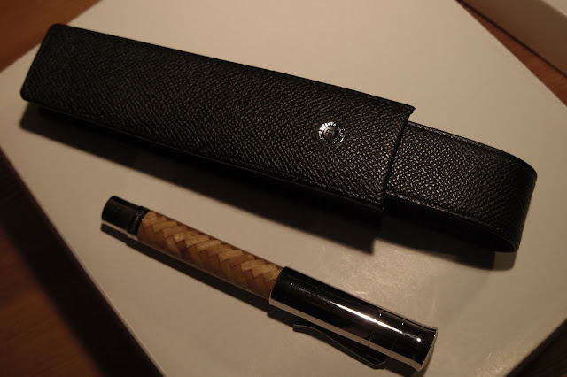
"The pen case is black leather (I think it comes in camel too, but black is a safe colour): "
"The case is specifically made for POY (Pen of the Year) pens. It is larger in size and is supposed to show them off better."


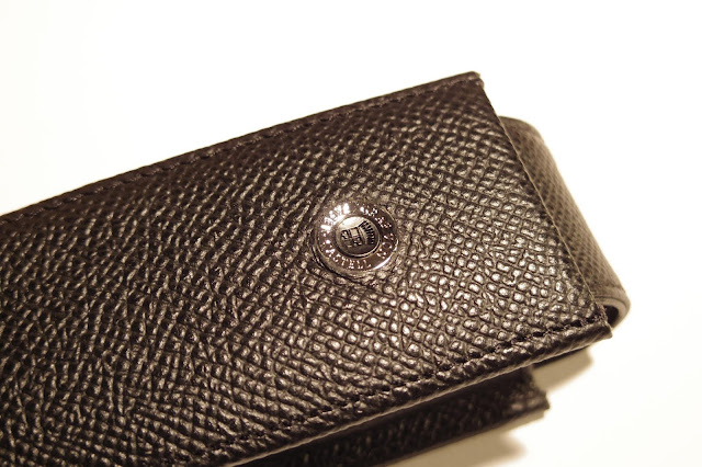
"And it has this button with the coat of arms (but, of course....)"


One more part of Lawrence's review to go! (link to part 4)

Monday, November 15, 2021

Newest Acquisitions (Virtual "Show & Tell") ~ part 285 (part 2 of 4)

(Continuing Lawrence's unboxing/review of his new fountain pen, the Graf von Faber-Castell 'Fountain Pen of the Year 2008' - part 1 was posted here ... )

Lawrence: "So I kind of explored this over-the-top box to see if it's as "impractical" as I think it is...."

(all photos courtesy of Lawrence ~ please click on images to enlarge)


"So the "pen holder" is some sort of flimsy plastic. The other part with the 2008 thing is solid plastic (with the 2008 plaque made of some polymer). You can see that the top compartment can be potentially repurposed for other things.
I have no intention of using this box and I have promptly put it back to its double packaging and then back into the cabinet for safe-keeping.
Now on to the pen itself.....
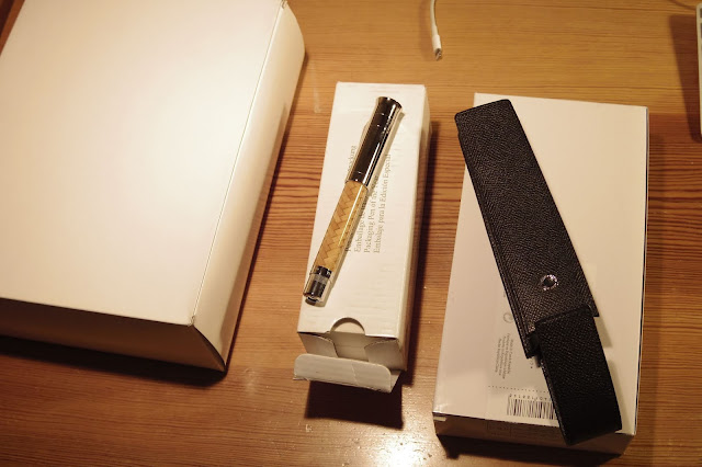
The pen came in a smaller box that looks like this: "


"It is enough to protect the pen from shipping I guess. But we can see that the pen is definitely not meant to be sold in this box (like I mentioned before, I will take a guess and elaborate more later).
The pen, once taken out, is beautiful to behold."


"The wood inlays are apparently done by hand and very difficult to do, I can appreciate that. The inlays are made of Satinwood. There is a historical / sentimental choice for using this wood. The word satin visually describes the glowing effect on the barrel. The cap has the company coat of arms."


"The end cap (which unscrews to reveal the actual piston) has a gemstone on it, a citrine (my birthstone for November...I guess it updates...I remember it being topaz...anyway, this is a bonus as I did not know about citrine, only that I like the color)."


"The piston once the cap is off: "


"The pen uncapped:"


We'll continue with parts 3 & 4 of Lawrence's review on Wednesday (Nov. 17) !

Newest Acquisitions (Virtual "Show & Tell") ~ part 285 (part 1 of 4)

The year 2008 saw many exciting events -- the XXIX Summer Olympics in Beijing, Barack Obama winning the U.S. Presidential election...and the release of this gorgeous fountain pen, recently acquired by our fellow Vancouver Pen Club member, Lawrence! It's part of its manufacturer's Pen of the Year series (started in 2003), which features an annual release of a Limited Edition fountain pen of historical significance. 

Lawrence was kind enough to include photos of the actual unboxing of his beautiful new pen, so we'll break his review into four parts---parts 1 & 2 today and parts 3 & 4 on Wednesday.
So, without further ado, let's turn it over to Lawrence...

(all photos courtesy of Lawrence ~ please click on images to enlarge)

 Lawrence: "As promised, I'm sending the review / pictures of the POY (Pen of the Year). This will be in few parts as I have taken tons of photos for this.

Basically, I will start with the unboxing of the "box" (I opened it for the first time for this photoshoot so it's actually my first time seeing the box for the pen). Here goes....

So the box came in a box in another box (inception...)
:"

Box 1


Box 2


The real box:


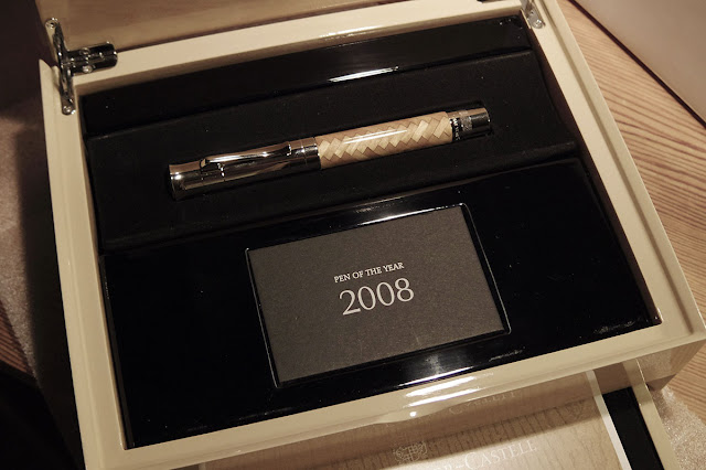
"The packaging seems rather ridiculous, but I think there may be a reason for this (which I will take a guess at later on). So it's a wooden box, with two compartments one for the pen: "


"And a smaller drawer for the pamphlet explaining how beautiful and awesome the pen is blah...blah..."


(Lawrence's review is continued in part 2 ...)

Saturday, November 13, 2021

Newest Acquisitions (Virtual "Show & Tell") ~ part 284

Acquired a few weeks ago from a great seller on eBay -- the September 1960 issue of  'National Geographic', with this wonderful Sheaffer 'PFM' (Pen for Men) ad on the back cover:

(~all photos by Maja ~ please click on photos to enlarge~)
(To see super-sized images of photos
: left-click on photo, then right-click & select "Open image in new tab" /"View image", then left-click on image in the newly-opened tab)


Look familiar? :)


For more information on Sheaffer's famous 'Pen for Men' fountain pen, check out Richard Binder's excellent write-up on it---Profile: Sheaffer’s PFM

Many thanks to eBayer 'gpickles04' (Gord) for his excellent customer service!
~Maja

Thursday, November 11, 2021

Newest Acquisitions (Virtual "Show & Tell") ~ part 283

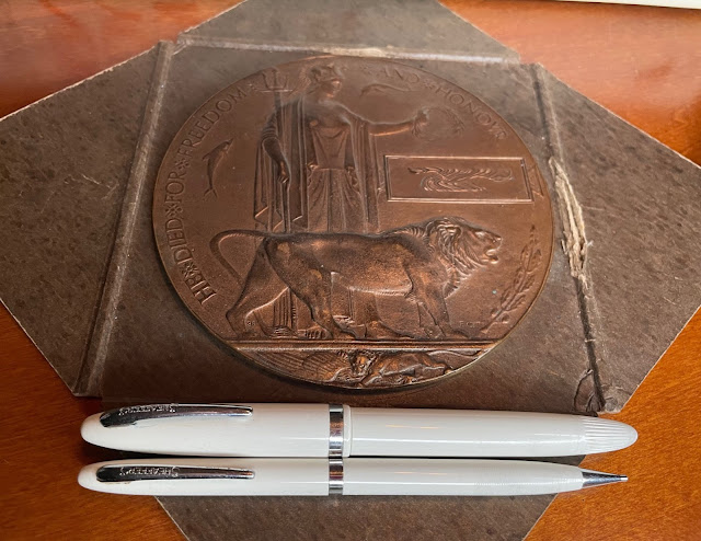
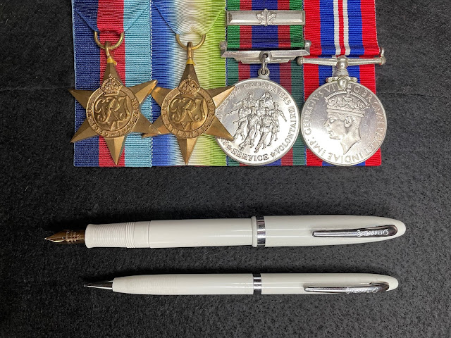
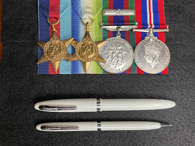
In honour of Remembrance Day, I took some photos of a recent acquisition - a vintage Sheaffer's doctors/nurses set - with my husband's grandfather's WWII medals and his grandfather's uncle's WWI memorial plaque:

(~ please click on images to enlarge~)

Large bronze memorial plaques like this one were given to the next-of-kin of all British Empire service personnel who died as a result of World War I. It is said that 1,355,000 of these plaques were issued. This plaque was given to the family of my husband's grandfather's uncle, who was in the Royal Navy and perished in 1917 at the age of 24.


These war medals were given to my husband's maternal grandfather, who enlisted in WWII at the tender age of eighteen. He served aboard several destroyers in the Royal Canadian Navy.


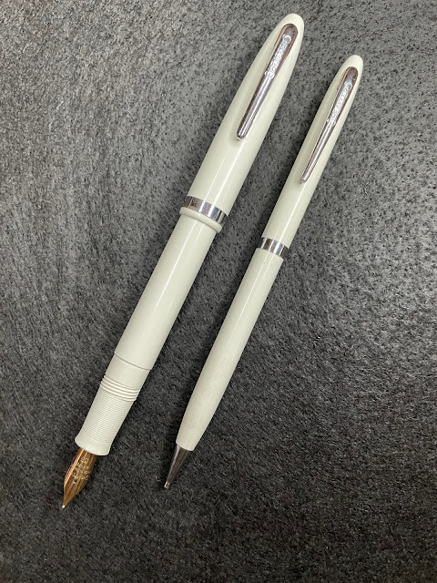
Now, let's take a little closer look at this nice vintage Sheaffer set (which I acquired from a seller in Nova Scotia, via eBay), which consists of a fountain pen and matching mechanical pencil...

I'm not sure if it's a vintage Sheaffer doctors set or a nurses set because it didn't come with its original packaging, but a doctors set in this particular model was mentioned on Penhero.com. The pen's filling mechanism is definitely Sheaffer's Touchdown-filling mechanism, and this one is the "Tip-Dip" version which doesn't require that the entire nib be submerged in the ink bottle (which, in turn, made for less-messy filling). The 'Tip-Dip' filling system was used in Sheaffer 'Cadet' and 'Craftsman' fountain pens from 1953 to around 1963.

Mine is a Sheaffer Touchdown 'Cadet' set made of white injection-molded plastic, but the pen's nib has an open Sheaffer 14K gold nib (marked 'Made in Canada" and "33") and 'Cadet' models only came with stainless steel nibs. Because of this, I suspect the pen is a 'Cadet' with an upgraded 14k nib. The Penhero article (link above) mentions that early 'Cadet' pens had black sections but later ones had matching sections, so mine appears to be one of the later versions. 

I haven't been able to find any advertising for Sheaffer doctor/nurse sets, but I came across a few photos of them online. Complete sets consisted of: a white fountain pen with matching white mechanical pencil, and a thermometer encased in what looks like the fountain pen body (also white).  

The pencil in my 'Cadet' set is very slim, but elegant, and uses a twist-action to propel and retract the lead inside. The fountain pen's nib-trim mismatch doesn't bother me at all--it's still a lovely pen...and it's part of a set that seems quite difficult to find--I've only found three similar sets/pens online (including fellow VPCer Christopher's Sheaffer 'Admiral' nurses fountain pen featured here on our blog). There's a bit of pitting to the pencil's clip, and the pen has a couple of very small cracks near its clip; otherwise, my set is in very good shape. All in all, a great find from Eastern Canada, and one I'm extremely pleased to have in my vintage Sheaffer collection.

(~ photos & review by Maja ~)

Tuesday, November 9, 2021

Newest Acquisitions (Virtual "Show & Tell") ~ part 282

First, the backstory to this one....

Back in the day, I owned a Taccia 'Doric' fountain pen. It was a lovely, large modern fountain pen made of a beautiful striated blue resin...but I had an issue with its grip section. With its intricate engravings, the section looked great, but it was made of a thick metal which made the pen a lot heavier than I liked... so I traded it away to a really nice guy on Pentrace (who, in turn, sent me a lovely fountain pen to add to my Think pen collection). I loved the Think pen I got in trade, but still thought about the Taccia once in a while, and wished that it had had a different section, because it was such a great pen otherwise...

Flash forward six and a half years later  --  I see a Taccia fountain pen for sale on Pentrace that looks like a Taccia 'Doric', but it has lacks the metal cap band and has a resin section....a matching resin section! Why I didn't jump on that sale right away, I'll never know (ok, it's because I really wanted to buy the seller's modern Parker 'Duofold' first ;) but a few months (!) later, I finally contacted the seller and asked if he still had the Taccia for sale. I didn't expect him to answer "Yes"...but he did! I quickly bought the pen from him and it arrived, safe and sound.

Meet my new Taccia 'Premier' "Swisher Pens" Special Edition fountain pen ...

(~please click on images to enlarge~)

It's a gorgeous flat-topped fountain pen in a creamy resin with coffee-coloured streaks, giving it a sort of woodgrain effect. At 14.5 cm capped, it's fairly large but uncapped, it's about 12.8 cm long, which I find is the perfect size to use unposted  (so I actually don't post this pen). If you do choose to post it, it comes in at a whopping 17.5 cm in length, but it's not heavy--according to my digital kitchen scale, it weighs 28 grams with no converter or cartridge in place. Its section diameter is 0.5 inches / 1.25 cm at its widest point, which makes for a comfy grip for my hand.

 
There was at least one other 'Premier'  Limited Edition made for Swisher Pens and it had olive/black/white stripes (called "Mint Green", I believe) with a matching section. I don't know the official name for the material my pen was made of but I love it! (and I love the matching section, a design feature I really, really like)


(above: the Swisher Pens imprint on the barrel)

Swisher Pens was a pen store (brick & mortar and online) located in Virginia Beach, VA that was known for its great selection, prices and customer service. Sadly, the business shut down in 2011. I'd bought several pens from Chuck Swisher over the years (starting from the earliest days of my pen-collecting hobby), but I never knew that he had Taccia special edition pens made for his pen shop until I saw this one for sale last year. The fact that I wound up acquiring a pen made for a pen seller I liked and respected makes this pen even more special to me.


Like the Taccia 'Doric', the Taccia 'Premier' has a clip jewel that you could spot a mile away :) The two Taccia models shared the same clip shape, but the 'Doric' clip is a ruthenium (dark grey) one, whereas the 'Premier' clip is polished chrome.


Its nib is an ordinary IPG (Iridium Point Germany) monotone steel nib in Medium that writes well, but I really wish it had the Taccia name engraved on it, especially with it being a special edition. I shouldn't complain too much, though, since I found this wonderful fountain pen purely by accident...and so many years after trading away its cousin. I love using it and am proud to have it in my pen collection.

Many thanks to Doug Vicary (who posts as "Doug" on Pentrace's famous "green board" , its sales board) for selling me this great fountain pen, and for his excellent customer service over the years. And a belated congratulations to Pentrace (the first pen community I ever joined) on its 21st birthday last month; I met a lot of good pen friends there, and it's still a great place to talk (and buy ;) pens.

(~ photos & review by Maja ~)

Sunday, November 7, 2021

Newest Acquisitions (Virtual "Show & Tell") ~ part 281

 A few days ago, we featured a beautiful Benu fountain pen belonging to Jessica, and today we have more pen "eye candy" for you, also courtesy of Jessica! It's a lovely fountain pen made by a new pen company based in Italy and...well, let's let Jessica tell the story of how she came across it...

Jessica: "I first learned about the Gioia fountain pens through Stephen Brown’s YouTube channel, sbrebrown (Don’t you just love the intro to all his reviews?) The pen he showed was the Gioia Partenope. I pretty much fell in love with the Gioia brand immediately. Based in Naples, I believe they started producing commercially in 2020. Gioia means joy in Italian and boy do they ever bring it! 😄

Anyway, fast forward a few weeks after that fateful YouTube review,
😂 I found out that Gioia was launching the Alleria. Immediately, I got in touch with Kirk Speer and begged him to order it for me and put my favourite cursive italic grind on it. (Little teaser, I may have a new favourite grind now!)

After waiting a few more weeks for the pre-sale to be over, I promptly forgot about it.
😳 Then on a rainy Thursday afternoon, I received my pen. As soon as I saw that it was from Pen Realm, my heart skipped a beat and the package was ripped open...."

(all photos courtesy of Jessica ~ please click on images to enlarge)


"Behold, my beautiful Joy in all her glory. From the ruthenium hardware to the mesmerizing pearly blue resin (minus the glitter I might add!), I knew I had to ink it right away! Of course, two days prior, I had rearranged my bottles of ink and the perfect blue shade of Waterman Mysterious Blue was nowhere to be seen. I lost patience so I inked it with Noodler’s Squeteague Teal
. 🤷🏻‍♀️ "


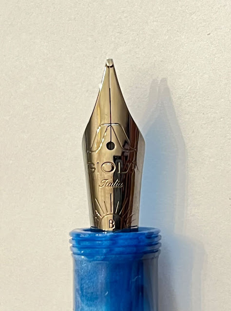
"The Alleria has a piston filling system and a steel nib. Mr. Speer from Pen Realm did a tremendous job on the cursive italic grind on the original broad nib."


"(And just look at that marvelous sunburst engraving!)"

  "I had no doubt the writing experience would be stellar "


"The barrel’s just the teensiest large in my hand. The widest point is about 15.6mm. I must say that a piston filling system normally wouldn’t be my first choice if the pen wasn’t a demonstrator, but when you’re in love, 🥰 you overlook certain little “imperfections.” 😆

"My pen seems to have been numbered. This isn’t a limited edition pen though so I’m not sure what the number on the barrel means. My photos are taken under artificial lighting so the colour appears to be a cool, deeper blue. In person it is a more muted medium blue with a warm undertone."

What a gorgeous pen...and what a great nib on it! Our thanks to Jessica for letting us shop vicariously for pens through her recent purchases! 😉

Friday, November 5, 2021

Fountain Pen Day 2021! (Friday November 5th)


Celebrating the 10th anniversary of Fountain Pen Day!

From the official website (now FountainPenDay.com) :

"Taking place on the first Friday in November each year, Fountain Pen Day is celebrated by enthusiasts worldwide as a time to embrace, promote, and share the use of fountain pens."

(Discounts, giveaways and promos listed here!)

Enjoy your fountain pens on this special day...and every day! 😀